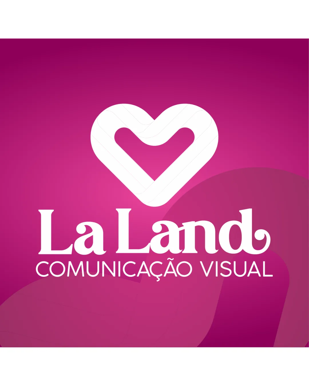
La Land COMUNICAÇÃO VISUAL logo review
4/5
Logo score Combination mark category

La Land COMUNICAÇÃO VISUAL

creative152248 Essential logo review

A strong, positive brand mark well-suited for a creative visual communications company. Fine-tuning for small-scale readability would enhance its professional application.

Combination Mark Contemporary, Bold, And Friendly Creative/visual Communication
4.5/5
Legibility
3.5/5
Originality
4/5
Balance
4/5
Scale
Your next steps

What to fix first

Focus on the changes that matter. Keep what makes the logo work.

What to preserve

A modern heart symbol communicates creativity and positive emotion, paired with a bold serif wordmark to suggest reliability and warmth for a visual communications brand.
1

Simplify or strengthen tagline and decorative letterforms for small-size use.

High priority Medium effort

Current detailing reduces clarity in small formats.

Improves readability and professional utility.

Detailed review

Logo performance breakdown

Not scored

Brief & logo match

Fits a creative/visual communication company by communicating warmth, creativity, and approachability.

4.5/5

Legibility

  • Primary wordmark is highly readable.
  • Tagline is clear at reasonable sizes.
  • The ornate 'L' may reduce readability at very small sizes.
3.5/5

Originality

  • Distinctive heart symbol construction.
  • Combined use of symbol and expressive type gives some uniqueness.
  • Heart icon is a relatively common motif.
  • Wordmark style, while friendly, is not highly original.
4.5/5

Color harmony

  • Bright magenta conveys creativity, energy, and approachability.
  • Good contrast with white wordmark for legibility.
  • Bright colors can be limiting for formal or B2B settings.
Pink#E94FC5
White#FFFFFF

Estimated colors. Use the original design file for exact values.

Create a full color palette using these colors

Create new palette

4/5

Balance alignment

  • Strong vertical alignment of elements.
  • Good spacing between symbol, wordmark, and tagline.
  • Tagline could be more visually integrated.
Uploaded logoAlignment guide overlay

Inspect spacing with the guide. Optical balance may differ from geometric centering.

4/5

Scalability

  • Heart symbol can work independently.
  • Wordmark is bold enough for most use contexts.
  • Decorative elements may lose clarity at small sizes; tagline at risk of becoming unreadable.
5/5

Misinterpretations

  • No plausible secondary or inappropriate readings.
4/5

Symbol & text fit

  • Heart mark complements the friendly, welcoming tone of the wordmark.
  • Mild stylistic dissonance between geometric mark and serif type.
Try your own review

Wondering how your logo performs?

Get a clear logo score, key risks, and priority fix ideas before your client or audience sees it.

Review my logo