 View review
Logo score
Logo review of
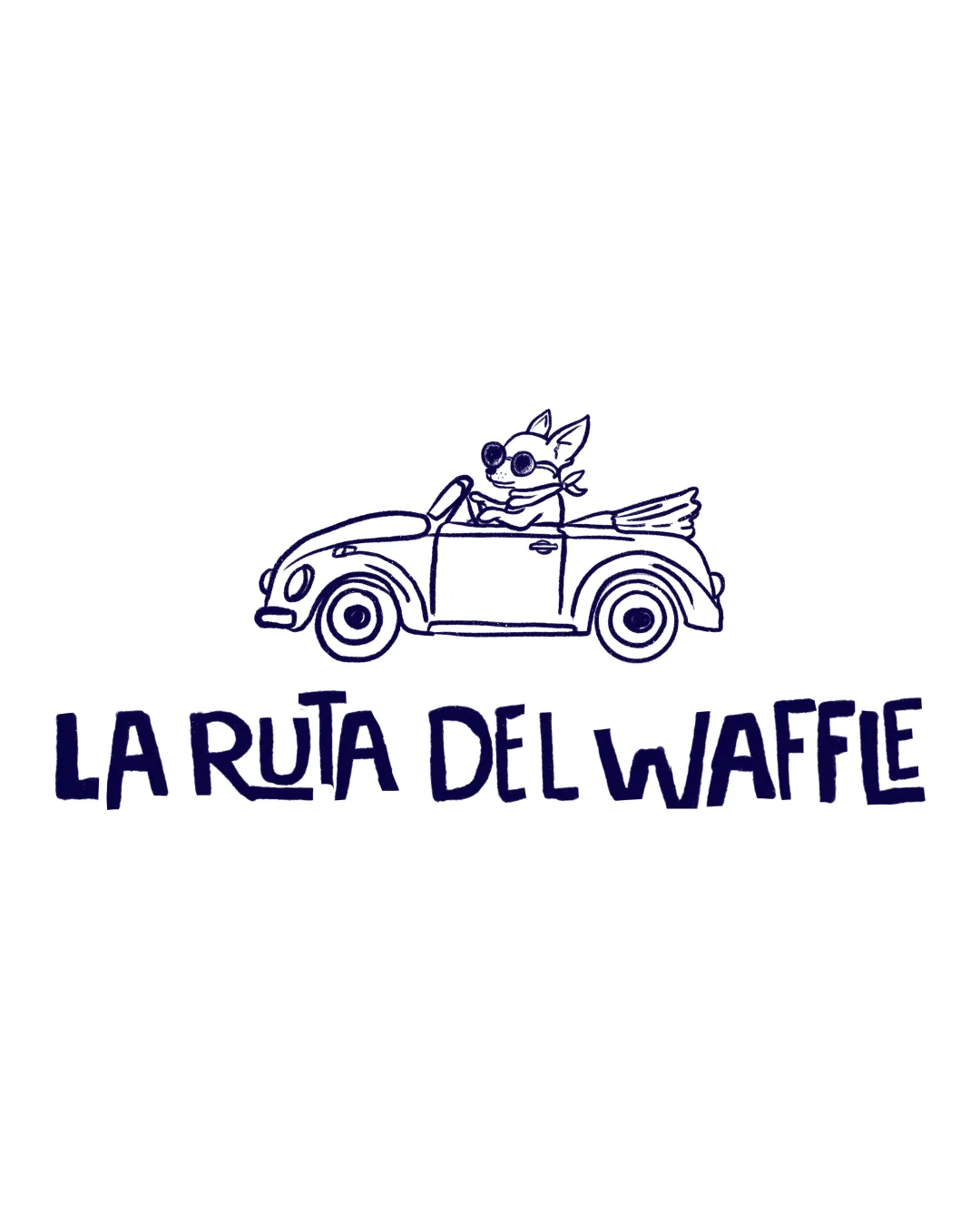
La Ruta Del Waffle
Ready for presentation with minor refinements to illustration weight and text alignment.
Legibility
Originality
Misread
Balance
Scale
Action plan
What to fix first
The most important fixes to handle before polishing the full presentation.
1
Increase line thickness or simplify illustration details to improve mark clarity at small sizes.
High priorityLinework may disappear or blur in small-scale usages.
Impact: Ensures Logo Remains Legible And Recognizable In All Applications. · Effort: Medium
2
Refine text alignment for greater polish while retaining playful feel.
Medium priorityText baseline inconsistencies are minor but noticeable.
Impact: Elevates Professional Perception Without Losing Brand Character. · Effort: Low
Detailed review
Logo performance breakdown
Legibility
 Text is clear and easy to read Font style is playful but maintains readability
Originality
Distinctive, whimsical character and car illustration Hand-drawn style adds uniqueness
Color harmony
Consistent monochrome color scheme fits the style
 May lack impact in color or greyscale applications
Black Iris
#18143A
White
#FFFFFF
Your palette is close. Explore sharper color combinations with Colorfly.design before updating the logo.
Explore palettesBalance alignment
Text and illustration are well balanced with a clear hierarchy
Slightly uneven text baseline may appear less polished

Scalability
Simple line work helps with scale reduction
Thin, detailed illustration lines may lose clarity at smaller sizes
200x250 px
100×125 px
50×62 px
Misinterpretations
No inappropriate or confusing visual readings
Logo structure & brief match
Both elements share a playful, hand-drawn character
Minor disconnect between level of detail in mark and simplicity of text
Playful, Accessible Branding For A Possible Food Truck Or Café: Hand-drawn style and fun motif suggest a casual, approachable brand experience.
Mobile Or Traveling Food Concept: Car motif with a happy animal conveys movement and adventure, fitting a route or journey theme.
Try your own review
Review my logo
Wondering how your logo performs?
Get a clear logo score, key risks, and priority fix ideas before your client or audience sees it.
Keep exploring