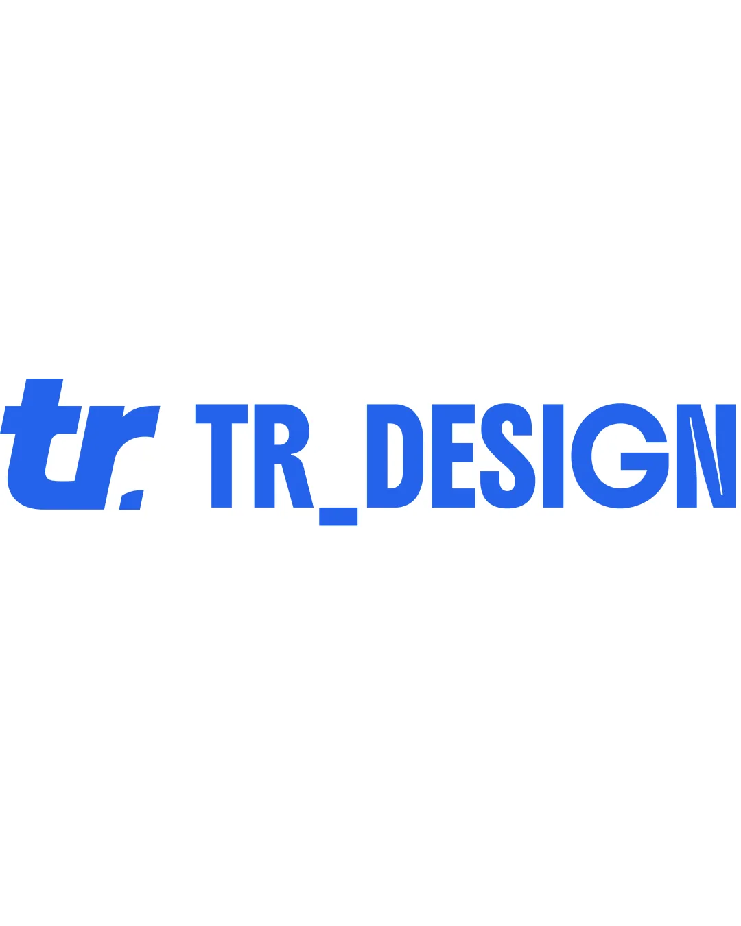
TR DESIGN logo review
3.6 / 5
Logo score
Logo review of

Tr Design

Decent starting point, but needs more visual integration and creative flair to be compelling for a graphic design freelancer.

Combination Mark Bold Minimalist Sans-serif Graphic Design
4/5
Legibility
3/5
Originality
5/5
Misread
3/5
Balance
4/5
Scale
Action plan

What to fix first

The most important fixes to handle before polishing the full presentation.

1

Reduce visual disconnect between monogram and wordmark—consider adjusting spacing, size, or integrating a shared design element.

High priority

Current separation makes the elements feel unrelated, which weakens brand cohesion.

Impact: Creates A More Unified Brand Impression And Improves Overall Balance And Recognition. · Effort: Medium

2

Refine monogram to introduce a unique or clever design twist relevant to graphic design.

Medium priority

A more inventive monogram will help differentiate from generic lettermarks.

Impact: Enhances Distinctiveness And Memorability. · Effort: Medium

Detailed review

Logo performance breakdown

4/5

Legibility

Checkmark icon Text is clear and bold
Checkmark icon Good spacing between letters

Warning icon The underscore in 'TR_DESIGN' creates a slight visual break that may disrupt readability

3/5

Originality

Checkmark icon Custom monogram has a distinctive 'tr' treatment

Warning icon Monogram is fairly conventional and lacks a unique twist

4/5

Color harmony

Checkmark icon Single strong blue communicates clarity and modernity

Warning icon Monochrome palette may lack flexibility for various branding needs

Blue
#2575FC

Your palette is close. Explore sharper color combinations with Colorfly.design before updating the logo.

Explore palettes
3/5

Balance alignment

Checkmark icon Overall alignment is straight and clean

Warning icon The monogram and text relationship feels visually disconnected due to size and spacing differences

logo 200x250 pixels scalability test alignment grid overlay
4/5

Scalability

Checkmark icon Simple shapes scale down well
Checkmark icon Bold lines remain distinct at small sizes

Warning icon The thin gap created by the underscore risks disappearing at very small sizes

logo 200x250 pixels scalability test

200x250 px

logo 100x125 pixels scalability test

100×125 px

logo 50x62 pixels scalability test

50×62 px

5/5

Misinterpretations

Checkmark icon No inappropriate or confusing visual readings

3 / 5

Logo structure & brief match

Checkmark icon Matching blue color and type style create a visual link

Warning icon Stylistic disconnect and spacing between monogram and wordmark reduce cohesion

Checkmark icon Designer Freelance: Logo's use of bold, clean typography fits professional graphic design identity, but the monogram could be more inventive to stand out in a creative industry.

Try your own review

Wondering how your logo performs?

Get a clear logo score, key risks, and priority fix ideas before your client or audience sees it.

Review my logo