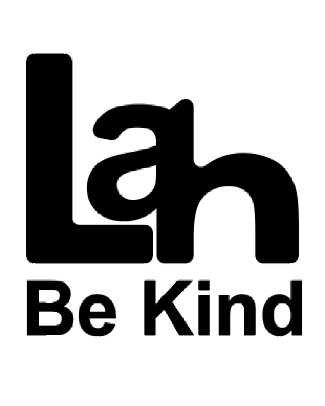
Lah Be Kind logo review
4.0 / 5
Logo score

Logo review ofLah Be Kind

Solid direction with strong message, but readability and optical balance need improvement for professional apparel use.

Combination Mark Bold Geometric Sans-serif Apparel
4/5
Legibility
4/5
Originality
5/5
Misread
3/5
Balance
4/5
Scale
Review next
Action plan

What to fix first

The most important fixes to handle before polishing the full presentation.

1

Refine the 'Lah' letterforms so each character is more immediately distinguishable, especially at smaller sizes.

High priority

Current logotype may confuse first-time viewers.

Impact: Improved Brand Recall And Readability. · Effort: Medium

2

Adjust balance or spacing so 'Lah' feels visually centered and harmonious.

Medium priority

Current left-heavy weight could be distracting.

Impact: More Professional Appearance And Stronger Shelf Presence. · Effort: Low

Detailed review

Logo performance breakdown

4/5

Legibility

Checkmark icon 'Be Kind' tagline is clear and highly readable.
Checkmark icon Simple bold sans-serif choice aids legibility.

Warning icon The primary 'Lah' text is somewhat ambiguous due to merging letterforms.

4/5

Originality

Checkmark icon Custom merging of letters adds uniqueness.
Checkmark icon Tagline introduces a human, kind message.

Warning icon Could be further differentiated from other letter-merging logos.

5/5

Color harmony

Checkmark icon Simple black on white is classic and versatile.

Black
#000000

White
#FFFFFF

3/5

Balance alignment

Checkmark icon Strong alignment in tagline.
Checkmark icon Overall geometric consistency.

Warning icon 'Lah' letter arrangement feels optically heavy on the left.

logo 200x250 pixels scalability test alignment grid overlay
4/5

Scalability

Checkmark icon Bold forms will hold up well at small sizes.
Checkmark icon One-color execution maximizes versatility.

Warning icon Merging of 'a' and 'h' may lose clarity at very small sizes.

logo 200x250 pixels scalability test

200x250 px

logo 100x125 pixels scalability test

100×125 px

logo 50x62 pixels scalability test

50×62 px

5/5

Misinterpretations

Checkmark icon No visible inappropriate or embarrassing shapes.

4 / 5

Logo structure & brief match

Checkmark icon 'Be Kind' tagline pairs logically with bold main text.

Warning icon Minor disconnect between playful tagline and heavy top letterform.

Checkmark icon Industry: The bold, modern style fits well with apparel branding, communicating friendliness and approachability.

Try your own review

Wondering how your logo performs?

Get a clear logo score, key risks, and priority fix ideas before your client or audience sees it.

Review my logo