View review
Logo score
Logo review of
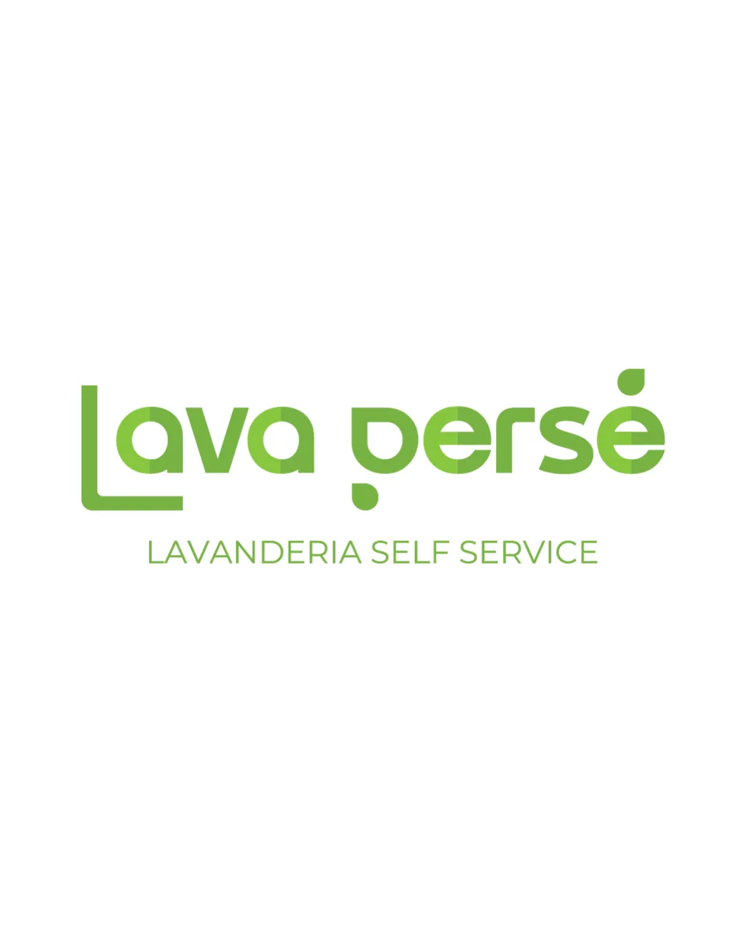
Lava Persé
Review the detailed scores below to see what is working and what should be refined first.
Objective AI feedback. Your creative decision.
Legibility
Originality
Misread
Balance
Scale
Detailed review
Logo performance breakdown
Legibility
 Text is mostly clear. Modern font style.
 The unique letterform of 'p' may be slightly confusing.
Originality
Unique approach to letterforms.
Certain letters are standard, offering less uniqueness.
Color harmony
Consistent color scheme. Green is soothing and clean.
Balance alignment
Good alignment between text elements.
Slight imbalance due to stylization of letters.

Scalability
Simple design ensures scalability. Works well on various formats.
200x250 px
100×125 px
50×62 px
Misinterpretations
No misinterpretations detected.
Try your own review
Review my logo
Wondering how your logo performs?
Get a clear logo score, key risks, and priority fix ideas before your client or audience sees it.
Keep exploring