layered checkmark or abstract V shape logo review
4.5/5
Logo score

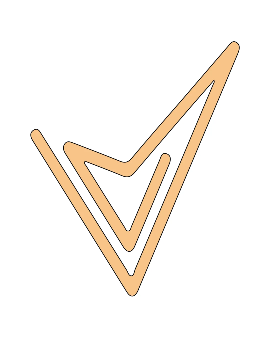
layered checkmark or abstract V shape

Review the detailed scores below to see what is working and what should be refined first.

Abstract Symbol Minimal, Geometric, Linear Technology
4/5
Originality
5/5
Balance
4/5
Scale
Detailed review

Logo performance breakdown

4/5

Originality

  • Layered or multiplied effect adds a unique twist to a common checkmark or V symbol.
  • The repetition introduces depth and suggests reliability or process, which could be fitting for many industries.
  • The basic checkmark/V shape is a common, somewhat generic foundation.

5/5

Color harmony

  • Limited, harmonious palette increases flexibility.
  • Positive and approachable look with the use of peach.
peach#F1C08D
white#FFFFFF
black (stroke)#000000

Estimated colors. Use the original design file for exact values.

Create a full color palette using these colors

Create new palette
5/5

Balance alignment

  • Symmetrical and well-balanced composition with evenly spaced shapes.
  • Consistent stroke weight throughout contributes to visual harmony.
Uploaded logoAlignment guide overlay

Inspect spacing with the guide. Optical balance may differ from geometric centering.

4/5

Scalability

  • Simple, bold geometric lines enhance scalability for digital platforms.
  • Distinct silhouette allows for recognizability even at smaller sizes like app icons.
  • Thin line weight may become less visible on small applications such as embroidery or small merchandise.
  • Lack of contrast with light backgrounds could reduce visibility unless used with a stroke or solid fill.
5/5

Misinterpretations

  • No inappropriate or misleading shapes detected.
  • Clear and positive checkmark symbolism.

Black & white

Does the shape still work without color?

These tests are available only for logos uploaded in vector (SVG) format.

Background contrast

Find the surfaces where your logo stays clear.

These tests are available only for logos uploaded in vector (SVG) format.

Blur & silhouette

A 3px blur softens fine details so you can check whether the overall shape stays recognizable. If key gaps close or elements merge, the logo may rely too heavily on detail.

These tests are available only for logos uploaded in vector (SVG) format.

Try your own review

Wondering how your logo performs?

Get a clear logo score, key risks, and priority fix ideas before your client or audience sees it.

Review my logo