Explore micro-version or slight refinement for 'Le' script at very small sizes
The script could lose legibility at reduced scales, affecting application versatility.
Improves clarity and reproduction flexibility for the script element.
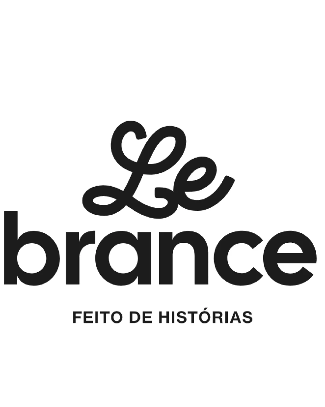
A polished, original and emotionally resonant logo well-matched to the described brand values.
Focus on the changes that matter. Keep what makes the logo work.
The script could lose legibility at reduced scales, affecting application versatility.
Improves clarity and reproduction flexibility for the script element.
The script 'Le' and geometric 'brance' achieve a warm yet professional tone; minimalist and approachable.

Inspect spacing with the guide. Optical balance may differ from geometric centering.
Get a clear logo score, key risks, and priority fix ideas before your client or audience sees it.
More credits needed
Add credits to continue without losing your work.
Then $7/month. Cancel anytime.
Essential logo review with AI
Estimated progress