Wondering how your logo performs? 🧐
Get professional logo reviews in seconds and catch design issues in time.
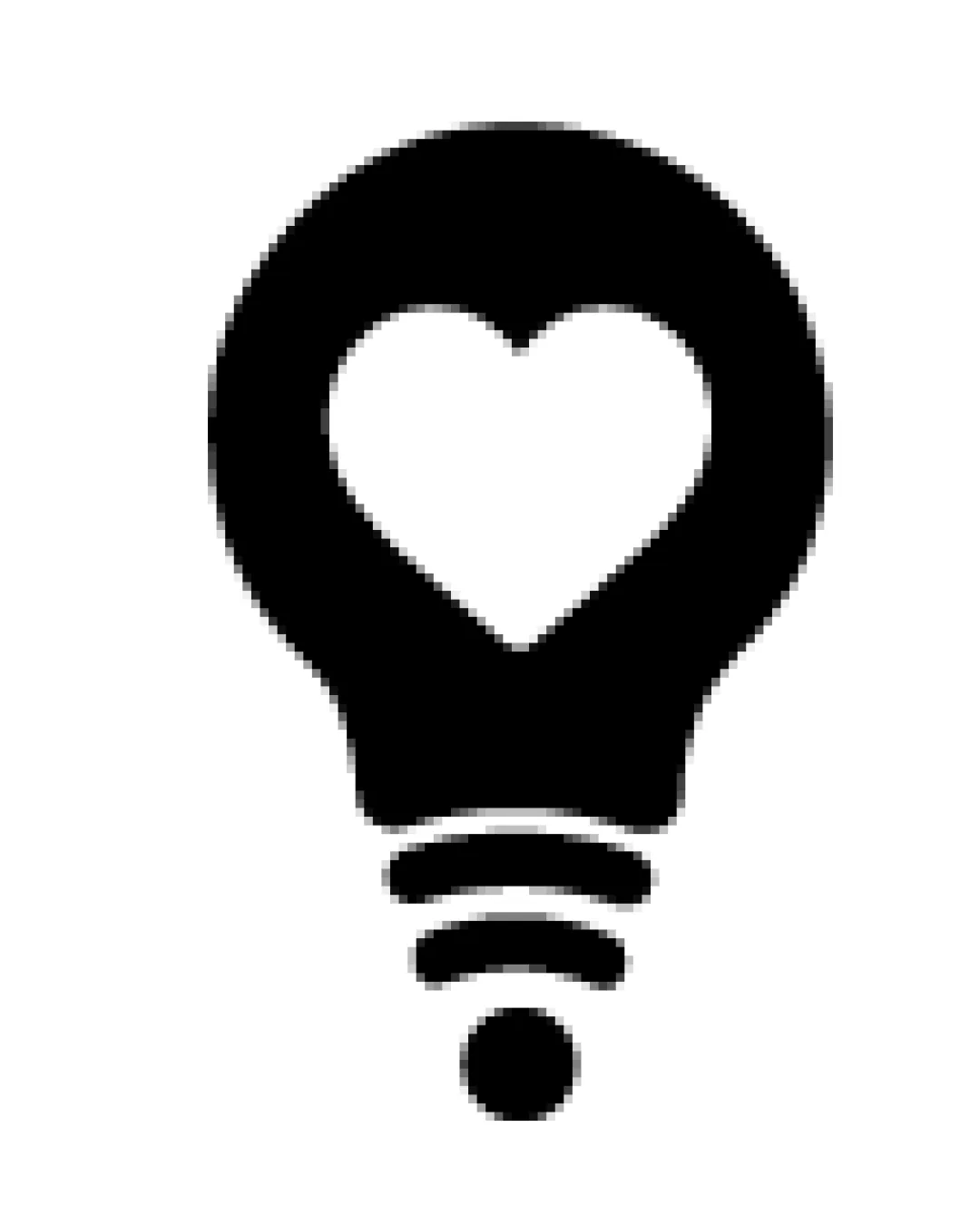
Try it Now!Logo review of light bulb with heart in center, radiating lines b..
 Logo analysis by AI
Logo type:
Style:
Detected symbol:
Negative space:
Business industry:
Review requested by AlexandraCardoso
**If AI can recognize or misinterpret it, so can people.
Structured logo review
Scalability versatility
![]() Simple form and strong silhouette ensure clear visibility at small sizes.
Simple form and strong silhouette ensure clear visibility at small sizes.![]() Single-color design is adaptable for most backgrounds and merchandise.
Single-color design is adaptable for most backgrounds and merchandise.
![]() Tiny details in the radiating lines may become less distinct at very small sizes such as app favicons or embroidery.
Tiny details in the radiating lines may become less distinct at very small sizes such as app favicons or embroidery.
200x250 px
100×125 px
50×62 px
Balance alignment
![]() Central alignment and symmetrical composition provide excellent balance.
Central alignment and symmetrical composition provide excellent balance.![]() Heart shape is well-centered within the bulb, and the radiating lines are evenly spaced beneath.
Heart shape is well-centered within the bulb, and the radiating lines are evenly spaced beneath.

Originality
![]() Creative use of the heart shape inside a light bulb gives the logo personality.
Creative use of the heart shape inside a light bulb gives the logo personality.![]() A harmonious blend of universally recognized symbols (bulb and heart) with clever negative space.
A harmonious blend of universally recognized symbols (bulb and heart) with clever negative space.
![]() Light bulb and heart are both common symbols, so the combination, while thoughtful, is not completely unique.
Light bulb and heart are both common symbols, so the combination, while thoughtful, is not completely unique.
Aesthetic look
![]() Minimalist and modern aesthetic with clean lines and uncluttered space.
Minimalist and modern aesthetic with clean lines and uncluttered space.![]() Visual impact is strong due to the bold solid fill and geometric clarity.
Visual impact is strong due to the bold solid fill and geometric clarity.
Dual meaning and misinterpretations
![]() Imagery is concise and universally positive, with no inappropriate or confusing dual meanings.
Imagery is concise and universally positive, with no inappropriate or confusing dual meanings.
Color harmony
![]() Monochrome palette provides strong contrast and flexibility.
Monochrome palette provides strong contrast and flexibility.![]() No unnecessary use of multiple colors; keeps visual focus tight.
No unnecessary use of multiple colors; keeps visual focus tight.
Black
#000000
White
#FFFFFF


