 View review
Logo score
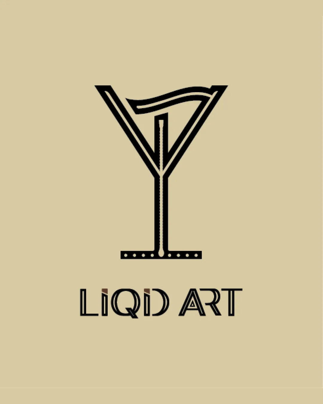
Logo review ofLiqid Art
Review the detailed scores below to see what is working and what should be refined first.
Legibility
Originality
Color
Balance
Scale
Action plan
What to fix first
The most important fixes to handle before polishing the full presentation.
1
Fix possible misinterpretation
High priorityGreater abstraction of the brush or glass could lead to misidentification for unfamiliar audiences
Impact: High · Effort: Medium
Detailed review
Logo performance breakdown
Legibility
![]() Text is generally readable from a moderate distance
Text is generally readable from a moderate distance![]() Unique character styling conveys a modern and creative vibe
Unique character styling conveys a modern and creative vibe
![]() The stylized 'Q' and 'I' can be confusing at smaller sizes or first glance
The stylized 'Q' and 'I' can be confusing at smaller sizes or first glance![]() Letter spacing and unique geometric cuts may impact quick comprehension, especially for unfamiliar viewers
Letter spacing and unique geometric cuts may impact quick comprehension, especially for unfamiliar viewers
Originality
![]() Creative fusion of a martini glass and a paintbrush stroke for a dual-meaning visual
Creative fusion of a martini glass and a paintbrush stroke for a dual-meaning visual![]() Uncommon typographic treatment adds character
Uncommon typographic treatment adds character
![]() Martini glass as a motif can lean towards cliché in the hospitality or art-bar sector without further distinction
Martini glass as a motif can lean towards cliché in the hospitality or art-bar sector without further distinction
Color harmony
![]() Restrained use of black on beige creates a sophisticated, modern contrast
Restrained use of black on beige creates a sophisticated, modern contrast![]() High contrast between logo and background enhances clarity
High contrast between logo and background enhances clarity
Beige
#E3D1AA
Black
#191714
Balance alignment
![]() Vertical alignment between logomark and wordmark is centered and visually stable
Vertical alignment between logomark and wordmark is centered and visually stable
![]() The bottom bar and dots visually outweigh the more delicate top, making the design bottom-heavy
The bottom bar and dots visually outweigh the more delicate top, making the design bottom-heavy![]() The connection between the symbol and the wordmark feels loose and not fully integrated
The connection between the symbol and the wordmark feels loose and not fully integrated

Scalability
![]() Simple linework is relatively easy to reproduce in most sizes
Simple linework is relatively easy to reproduce in most sizes![]() Distinct shape of the symbol may work on large signage or digital applications
Distinct shape of the symbol may work on large signage or digital applications
![]() Thin lines and small dots in the stem might disappear or blur at favicon or embroidery scale
Thin lines and small dots in the stem might disappear or blur at favicon or embroidery scale![]() Text stylization loses clarity at very small reproductions
Text stylization loses clarity at very small reproductions
200x250 px
100×125 px
50×62 px
Misinterpretations
![]() Martini glass + paintbrush stroke effectively combine hospitality and creativity themes
Martini glass + paintbrush stroke effectively combine hospitality and creativity themes
![]() Greater abstraction of the brush or glass could lead to misidentification for unfamiliar audiences
Greater abstraction of the brush or glass could lead to misidentification for unfamiliar audiences
Symbol & text fit
![]() Both wordmark and logomark use geometric, structured lines
Both wordmark and logomark use geometric, structured lines
![]() Symbol is much larger and heavier than the wordmark, creating a hierarchy imbalance
Symbol is much larger and heavier than the wordmark, creating a hierarchy imbalance
![]() Style coherence is present, but scaling and alignment are not fully harmonized, especially with the more playful type
Style coherence is present, but scaling and alignment are not fully harmonized, especially with the more playful type
Try your own review
Review my logo
Wondering how your logo performs?
Get a clear logo score, key risks, and priority fix ideas before your client or audience sees it.
Keep exploring