View review
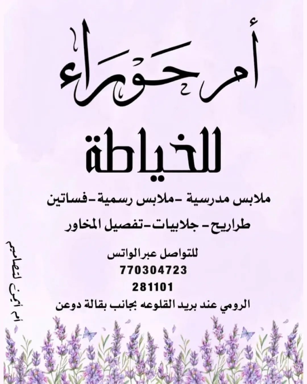
أم حوراء للخياطة
A pleasant, industry-appropriate logo with clear, feminine appeal, but it needs simplification and stronger integration for professional use.
Objective AI feedback. Your creative decision.
What to fix first
The most important fixes to handle before polishing the full presentation.
Simplify floral illustration and calligraphic flourishes for small-scale and print adaptability.
High priorityDetail loss and complex forms limit application across formats; simplification will support broader use.
Impact: Improves Scalability And Professional Versatility. · Effort: Medium
Enhance visual integration between text and floral base.
Medium priorityReducing the 'stacked' feel will make the logo more cohesive and memorable.
Impact: Unifies Design And Strengthens Brand Recognition. · Effort: Medium
Logo performance breakdown
Legibility
Main wordmark ('أم حوراء') is clear despite decorative calligraphy.
Subtext and services are readable.
Calligraphy flourishes make the logotype slightly harder to read at a quick glance.
Originality
Use of Arabic calligraphy with lavender illustration is pleasant and relevant.
Calligraphic style and floral motif are common in tailoring or women's service brands, reducing uniqueness.
Color harmony
Color palette is soft, feminine, and supports theme.
Text contrasts well with background.
Black
#221818
Lavender
#BFAAD9
White
#FFFFFF
Purple
#4D658D
Your palette is close. Refine the color roles and combinations before updating the logo.
Build brand colorsBalance alignment
Central layout with visually balanced text and floral base.
Text hierarchy is clear.
Horizontal wordmark could be visually anchored better to the illustration below.
Scalability
Wordmark and flower illustration are distinct at standard sizes.
Small flourishes and floral detail may be lost at small sizes; design complexity limits one-color or embroidery adaptation.
200x250 px
100×125 px
50×62 px
Misinterpretations
No negative or ambiguous interpretations present.
Logo structure & brief match
Floral illustration supports feminine, artisanal feel.
No clear visual integration; elements feel somewhat separate.
Industry Relevance: Fits tailoring/fashion services with feminine and artisanal cues.
Target Audience: Appeals to a female clientele seeking personalized or bespoke tailoring.
Wondering how your logo performs?
Get a clear logo score, key risks, and priority fix ideas before your client or audience sees it.