Refine arch detail for better clarity at small sizes
Prevents the arch from merging with letters or becoming indistinct.
Improves scalability and retention of motif
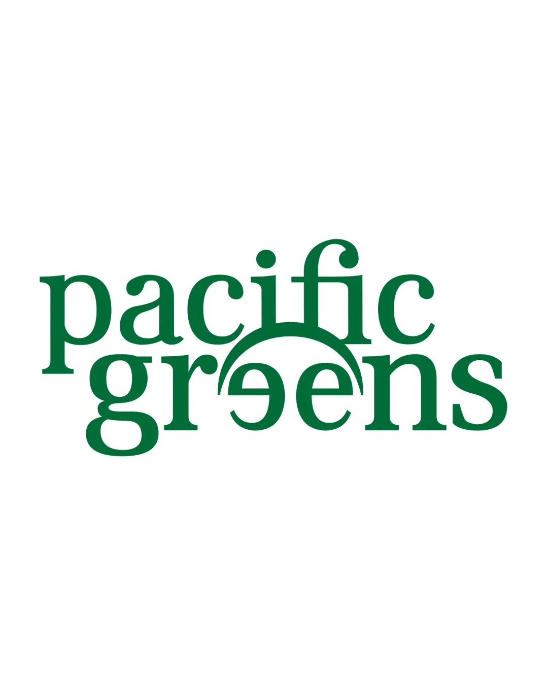
Distinctive and well-suited for a modern, plant-based brand; minor refinements will maximize impact and usage versatility.
Focus on the changes that matter. Keep what makes the logo work.
Prevents the arch from merging with letters or becoming indistinct.
Improves scalability and retention of motif
Critical for consistent on-pack and digital usage.
Ensures strong performance on various backgrounds and materials
Further polishes hierarchy and legibility.
Could improve overall visual flow and balance
The organic arch and green color signal plant-based and healthy values.
Sophisticated serif font and unique detail feel suitable for confident, modern audiences.
Font and motif evoke trust and confidence with a contemporary edge.
Estimated colors. Use the original design file for exact values.
Create a full color palette using these colors
Create new palette
Inspect spacing with the guide. Optical balance may differ from geometric centering.
Compare the detail at different sizes. Labels show the full image dimensions.
Does the shape still work without color?
Find the surfaces where your logo stays clear.
A 3px blur softens fine details so you can check whether the overall shape stays recognizable. If key gaps close or elements merge, the logo may rely too heavily on detail.
Stands out in plant-based health market due to rejection of typical leaf or plant graphics.
Strong category fit with distinctive twist—arch detail provides memorability against many generic competitors.
Wordmark and green palette instantly communicate 'plant-based'; serif logo unusual in this space.
Potential lack of immediate 'leaf' motif could confuse only at first glance.
Unique arch motif provides good market separation.
Serif font alone would be generic, but arch-connection lifts distinctiveness.
Signals contemporary, trustworthy, and healthy positioning; fits consumer expectations.
Could benefit from an optional supporting mark for social avatars.
How the logo may work in practice, and what to check before production.
Clean, readable and distinct at standard package scale.
Full detail may be lost—consider a simplified or initials variant.
Will scale nicely on web applications.
Verify the arch's clarity and explore increased spacing.
High readability and strong brand impact at large size.
The logo versions to prepare before sending final files to a client or team.
The uploaded asset includes a wordmark.
A single solid artwork color is visible, excluding the background. Test fine detail at the intended production size.
Only if the brand uses a tagline: prepare a wordmark with it for larger placements, alongside the tagline-free version.
Prepare a compact mark for avatars, favicons, and restricted spaces.
Prepare a light version for dark brand backgrounds.
Put the design into words. Use these notes to build your client presentation.
The elements that make up the identity.
A two-level wordmark in a modern serif font: 'pacific' on top, 'greens' below, unified by a custom arch rising from the 'g' to the 'e'. The green color underscores the plant-based message.
The arch element is a visual metaphor for growth or sunrise, suggesting vitality and naturally aligning with health and sustainable living brands.
A rich, organic green spot color is used throughout for a cohesive, eco-conscious feel.
The story and thinking behind the design.
This wordmark combines a sophisticated serif with a unique arch element, symbolizing growth, vitality, and a contemporary approach to plant-based living.
Get a clear logo score, key risks, and priority fix ideas before your client or audience sees it.
More credits needed
Add credits to continue without losing your work.
Then $7/month. Cancel anytime.