Wondering how your logo performs? 🧐
Get professional logo reviews in seconds and catch design issues in time.
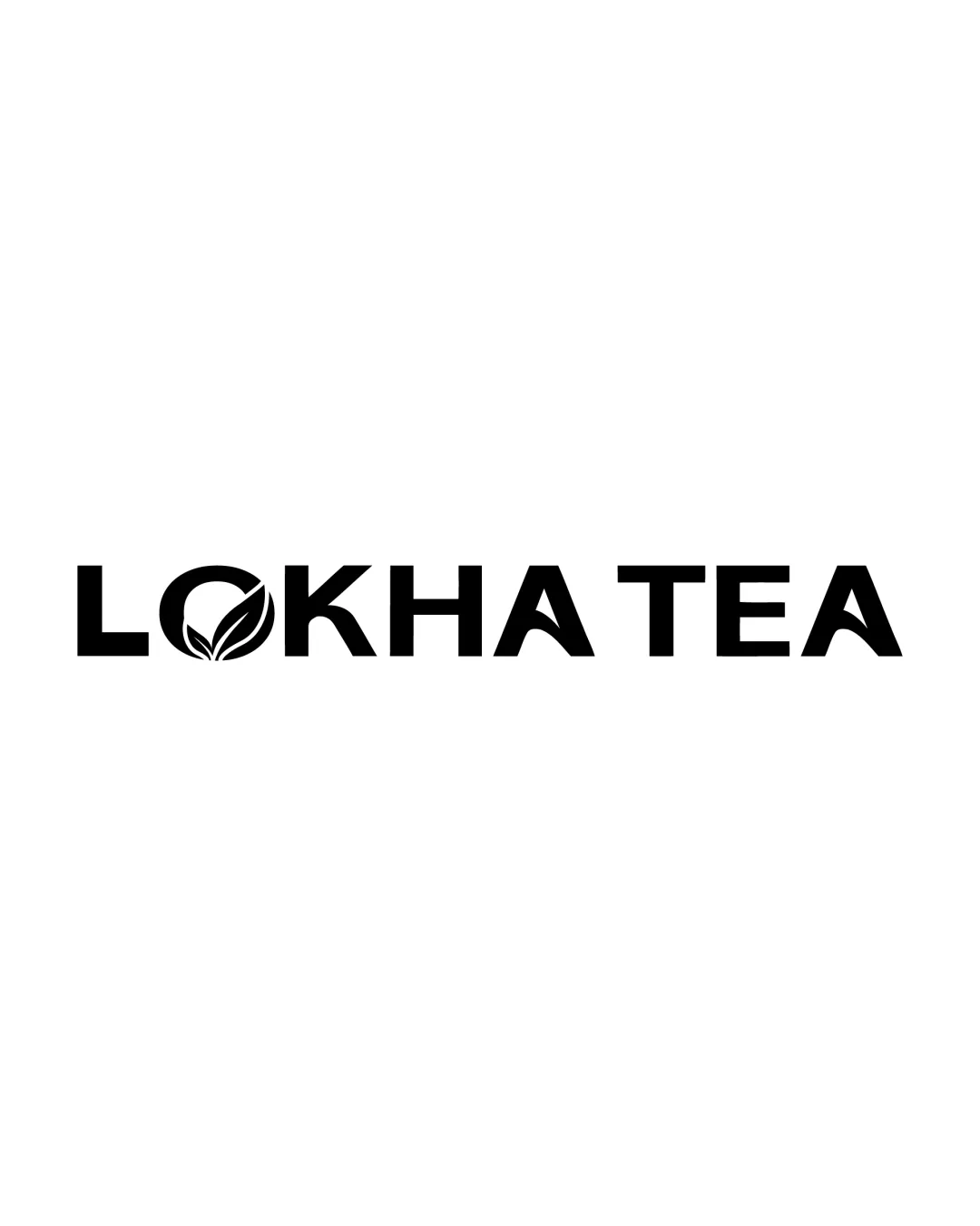
Try it Now!Logo review of LOKHA TEA
 Logo analysis by AI
Logo type:
Style:
Detected symbol:
Negative space:
Detected text:
Business industry:
Review requested by Slidefactory
**If AI can recognize or misinterpret it, so can people.
Structured logo review
Legibility
![]() All text is highly readable with a clear sans-serif font.
All text is highly readable with a clear sans-serif font.![]() The integration of the leaf in the O does not impede legibility.
The integration of the leaf in the O does not impede legibility.
Scalability versatility
![]() Bold lines ensure clarity at small sizes.
Bold lines ensure clarity at small sizes.![]() Simple color scheme enhances usability across various surfaces.
Simple color scheme enhances usability across various surfaces.
![]() Small details in the leaf motif could become less distinct in very tiny applications such as a favicon or embroidery.
Small details in the leaf motif could become less distinct in very tiny applications such as a favicon or embroidery.
200x250 px
100×125 px
50×62 px
Balance alignment
![]() Overall composition is visually balanced.
Overall composition is visually balanced.![]() Even spacing between characters retains structure and impact.
Even spacing between characters retains structure and impact.
![]() Leaf motif inside O creates a slightly heavier left side weight.
Leaf motif inside O creates a slightly heavier left side weight.

Originality
![]() Leaf integration in the O adds some visual interest.
Leaf integration in the O adds some visual interest.![]() Relevant motif for a tea brand.
Relevant motif for a tea brand.
![]() Leaf-in-letter concepts are common in the beverage and organic sectors.
Leaf-in-letter concepts are common in the beverage and organic sectors.![]() Overall structure feels fairly typical for the industry.
Overall structure feels fairly typical for the industry.
Aesthetic look
![]() Clean lines and minimalistic design enhance modern appeal.
Clean lines and minimalistic design enhance modern appeal.![]() Icon and text blend smoothly.
Icon and text blend smoothly.
![]() Visual approach lacks a distinctive twist beyond the leaf.
Visual approach lacks a distinctive twist beyond the leaf.
Dual meaning and misinterpretations
![]() No inappropriate or unintentional meanings detected.
No inappropriate or unintentional meanings detected.![]() Composition stays industry-relevant.
Composition stays industry-relevant.
Color harmony
![]() Monochrome palette is timeless, professional, and flexible.
Monochrome palette is timeless, professional, and flexible.![]() Strong contrast ensures outstanding visibility.
Strong contrast ensures outstanding visibility.
Black
#000000
White
#FFFFFF