View review
Logo score
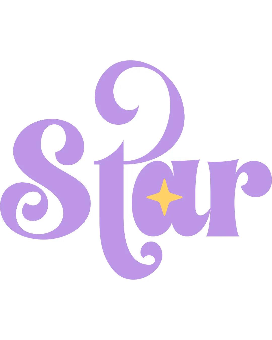
Logo review ofStar
Review the detailed scores below to see what is working and what should be refined first.
Legibility
Originality
Misread
Balance
Scale
Detailed review
Logo performance breakdown
Legibility
![]() Bold text enhances visibility at a glance.
Bold text enhances visibility at a glance.![]() Distinctive letterforms contribute to memorable appearance.
Distinctive letterforms contribute to memorable appearance.
![]() Swirly and decorative letter shapes slightly hinder instant readability.
Swirly and decorative letter shapes slightly hinder instant readability.![]() The 'S' and 't' can visually blend for fast readers.
The 'S' and 't' can visually blend for fast readers.![]() Retro curves and closed counters reduce clarity at small sizes.
Retro curves and closed counters reduce clarity at small sizes.
Originality
![]() Creative integration of the star within the 'a' adds conceptual depth.
Creative integration of the star within the 'a' adds conceptual depth.![]() Retro display typography is customized and memorable.
Retro display typography is customized and memorable.
![]() Overall retro wordmark style has been seen before in themed entertainment and event brands.
Overall retro wordmark style has been seen before in themed entertainment and event brands.
Color harmony
![]() The pastel purple and yellow harmonize well and evoke a dreamy, friendly mood.
The pastel purple and yellow harmonize well and evoke a dreamy, friendly mood.![]() Color contrast between background and foreground is sufficient.
Color contrast between background and foreground is sufficient.
Lavender
#B39AE8
Pastel Yellow
#FFE066
White
#FFFFFF
Balance alignment
![]() Visual weight is distributed evenly across the word.
Visual weight is distributed evenly across the word.![]() All characters maintain a harmonious retro flow.
All characters maintain a harmonious retro flow.
![]() The enlarged swirl of the 't' stem introduces minor imbalance compared to the rest of the logo.
The enlarged swirl of the 't' stem introduces minor imbalance compared to the rest of the logo.

Scalability
![]() Would stand out on large-scale formats like event banners or posters.
Would stand out on large-scale formats like event banners or posters.![]() Iconic enough for digital marketing or themed products.
Iconic enough for digital marketing or themed products.
![]() Chunky, ornate letterforms and star detail in the 'a' may lose clarity on business cards or small merchandise.
Chunky, ornate letterforms and star detail in the 'a' may lose clarity on business cards or small merchandise.![]() Intricate curves could suffer in embroidery or favicon mockups.
Intricate curves could suffer in embroidery or favicon mockups.![]() Limited adaptability for very simple branding needs.
Limited adaptability for very simple branding needs.
200x250 px
100×125 px
50×62 px
Misinterpretations
![]() No inappropriate or ambiguous elements detected.
No inappropriate or ambiguous elements detected.![]() The star is contextually relevant and visually clear.
The star is contextually relevant and visually clear.
Try your own review
Review my logo
Wondering how your logo performs?
Get a clear logo score, key risks, and priority fix ideas before your client or audience sees it.
Keep exploring