View review
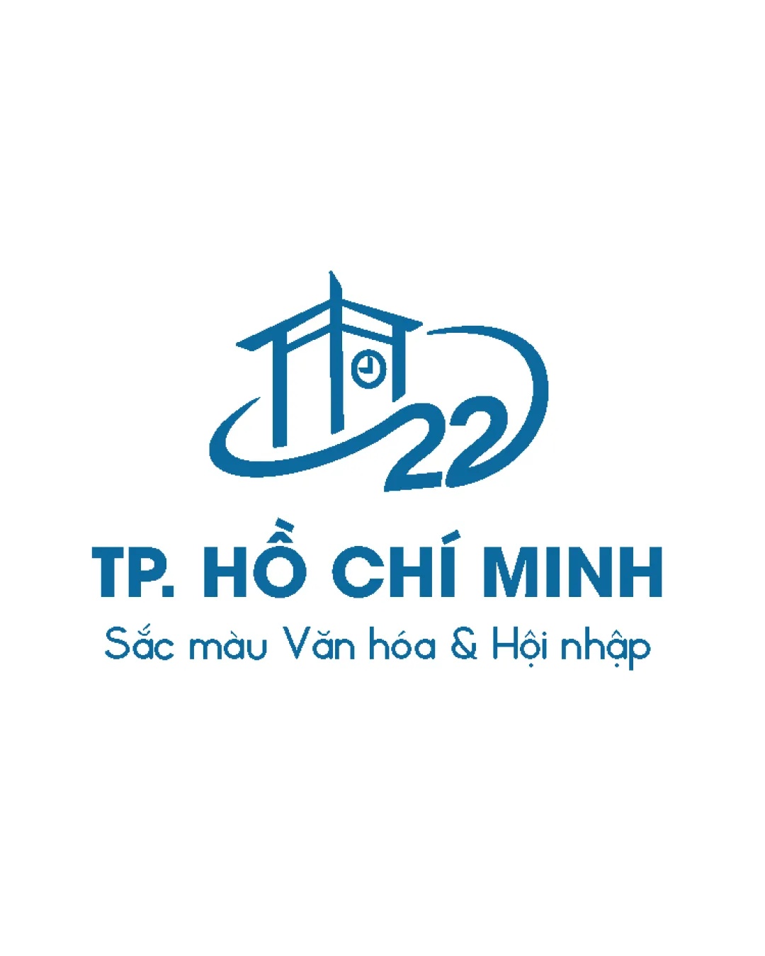
Tp. Hồ Chí Minh, Sắc Màu Văn Hóa & Hội N..
Review the detailed scores below to see what is working and what should be refined first.
Logo performance breakdown
Legibility
Primary text 'TP. HỒ CHÍ MINH' is bold, clear, and highly readable.
Subtext is legible with good letter spacing and simple sans-serif font.
Number '22' in the symbol could be misread at small sizes due to its stylized form.
Subtext may lose clarity if significantly reduced in scale.

Originality
Unique integration of a local architectural landmark and year into the symbol adds strong contextual relevance.
Custom structure and stylized numerals are distinctive.
Architectural/clock motifs are somewhat common for municipal logos, though execution here has freshness due to the swoosh and numeral integration.
Color harmony
Monochrome blue palette is harmonious, professional, and consistent with government/culture sector branding.
Excellent color contrast with white background enhances visibility.
Cerulean Blue
#1682B7
White
#FFFFFF
Balance alignment
Central alignment of logomark and wordmark creates a stable, unified composition.
Proportions between the illustrated symbol and the bold wordmark are mostly harmonious.
Slight mismatch in visual weight between the bold main text and delicate detailing in the symbol could be further tuned.
Scalability
Main mark and typography are fairly simple, allowing for some application versatility.
Works well in print, digital, and large-scale formats such as billboards and event backdrops.
Architectural symbol and number '22' have thin details that may disappear on smaller items like pins or business cards.
Subtext is too small for small-scale applications such as favicons or embroidery.
200x250 px
100×125 px
50×62 px
Misinterpretations
Symbolism is clear and contextually appropriate, with no inappropriate dual meanings detected.
Symbol & text fit
Symbol and primary wordmark share the same color and overall modern style, providing cohesion.
Combined elements are conceptually related to the city and its cultural message.
Minor imbalance in thickness: architectural mark is lighter than the bold wordmark, which can be adjusted for better synergy.
Wondering how your logo performs?
Get a clear logo score, key risks, and priority fix ideas before your client or audience sees it.