Wondering how your logo performs? 🧐
Get professional logo reviews in seconds and catch design issues in time.
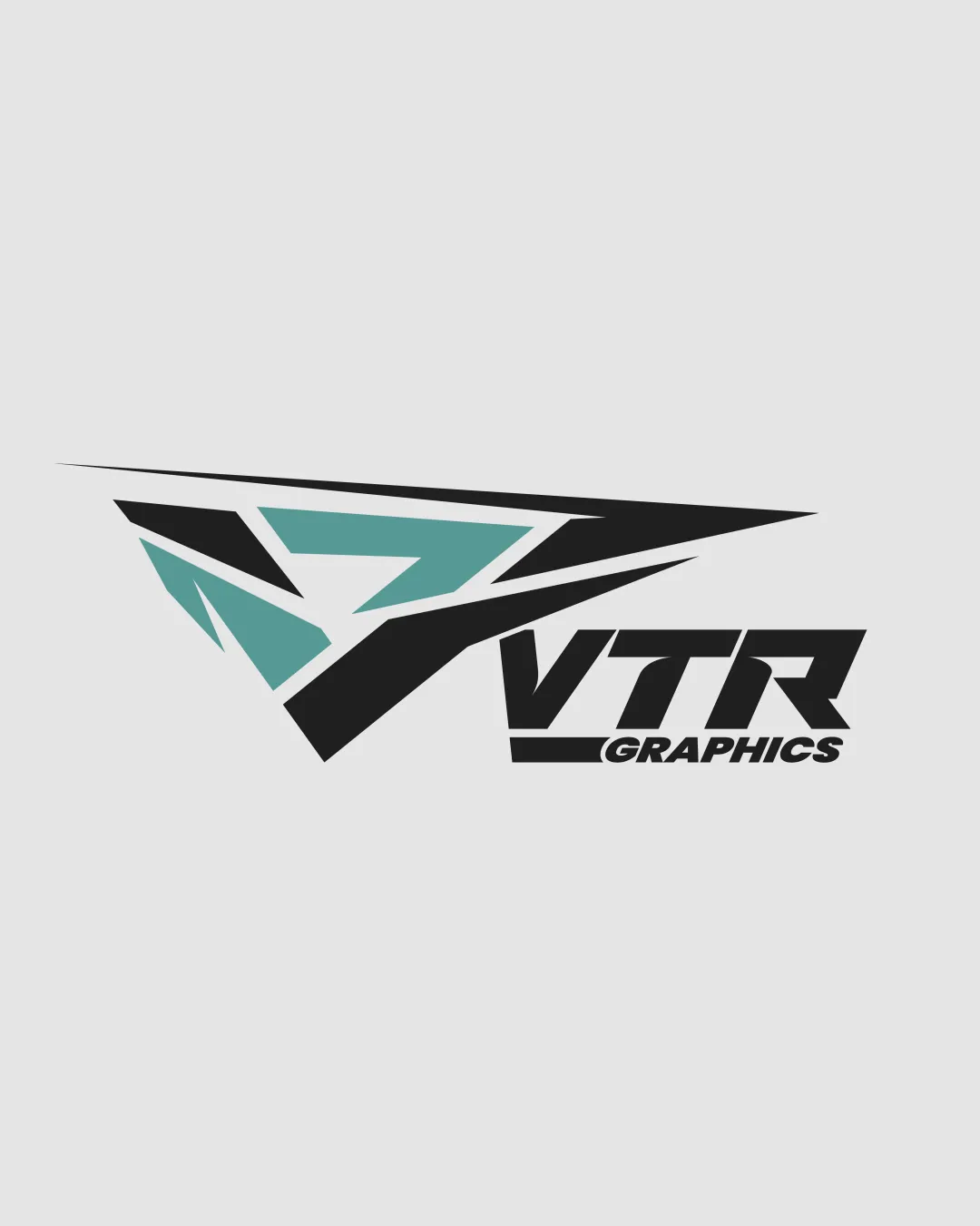
Try it Now!Logo review of VTR GRAPHICS
 Logo analysis by AI
Logo type:
Style:
Detected symbol:
Negative space:
Detected text:
Business industry:
Review requested by JanPavlic
**If AI can recognize or misinterpret it, so can people.
Structured logo review
Legibility
![]() The main text 'VTR' is bold, highly readable, and styled in a way that matches the brand's energetic feel.
The main text 'VTR' is bold, highly readable, and styled in a way that matches the brand's energetic feel.![]() Supporting text 'GRAPHICS' is clear and separated by a bar for hierarchy.
Supporting text 'GRAPHICS' is clear and separated by a bar for hierarchy.
![]() The aggressive angular cut of the 'V' slightly compromises instant recognition, especially at smaller sizes.
The aggressive angular cut of the 'V' slightly compromises instant recognition, especially at smaller sizes.![]() The spacing between 'VTR' and the underline could be improved for enhanced clarity.
The spacing between 'VTR' and the underline could be improved for enhanced clarity.
Scalability versatility
![]() Logo mark and wordmark together will work well for vehicle decals, jackets, and digital media.
Logo mark and wordmark together will work well for vehicle decals, jackets, and digital media.![]() Bold forms translate well to large signage and merchandising.
Bold forms translate well to large signage and merchandising.
![]() Fine lines and fragmented angles of the symbol may get lost or appear cluttered in small formats such as business cards or favicons.
Fine lines and fragmented angles of the symbol may get lost or appear cluttered in small formats such as business cards or favicons.![]() Small text 'GRAPHICS' under the bold underline loses readability at reduced sizes.
Small text 'GRAPHICS' under the bold underline loses readability at reduced sizes.
200x250 px
100×125 px
50×62 px
Balance alignment
![]() The symbol and wordmark are deliberately angled for a feeling of speed and dynamism.
The symbol and wordmark are deliberately angled for a feeling of speed and dynamism.
![]() Overall alignment feels slightly off-balance due to the large, right-leading angular symbol overpowering the text.
Overall alignment feels slightly off-balance due to the large, right-leading angular symbol overpowering the text.![]() The underline behind 'GRAPHICS' is not visually balanced with the logo mark.
The underline behind 'GRAPHICS' is not visually balanced with the logo mark.

Originality
![]() Custom geometric form is energetic and somewhat distinctive.
Custom geometric form is energetic and somewhat distinctive.![]() Use of negative space arrow adds a degree of conceptual cleverness.
Use of negative space arrow adds a degree of conceptual cleverness.
![]() Overall visual is reminiscent of generic sports/automotive/graphics industry marks.
Overall visual is reminiscent of generic sports/automotive/graphics industry marks.![]() Lacks a truly unique element that sets it apart from similar competitor logos.
Lacks a truly unique element that sets it apart from similar competitor logos.
Logomark wordmark fit
![]() Both elements share an angular, aggressive style for consistency.
Both elements share an angular, aggressive style for consistency.
![]() Proportion between symbol and text leans heavily towards the symbol, resulting in imbalance.
Proportion between symbol and text leans heavily towards the symbol, resulting in imbalance.![]() Visual connection feels forced rather than integrated.
Visual connection feels forced rather than integrated.
Aesthetic look
![]() Color blocking and geometric composition convey speed, energy, and creativity relevant to the industry.
Color blocking and geometric composition convey speed, energy, and creativity relevant to the industry.
![]() Busy, overly sharp geometry detracts from simplicity and may hinder versatility.
Busy, overly sharp geometry detracts from simplicity and may hinder versatility.![]() Style may quickly feel dated with evolving design trends.
Style may quickly feel dated with evolving design trends.
Dual meaning and misinterpretations
![]() No inappropriate or suggestive shapes detected.
No inappropriate or suggestive shapes detected.![]() Abstract geometry successfully avoids unintended negative connotations.
Abstract geometry successfully avoids unintended negative connotations.
Color harmony
![]() Limited color palette of black and teal offers good contrast and complements the modern feel.
Limited color palette of black and teal offers good contrast and complements the modern feel.![]() Colors are industry-appropriate and visually crisp.
Colors are industry-appropriate and visually crisp.
![]() Contrast between black and teal within the symbol could cause confusion in black-and-white reproductions.
Contrast between black and teal within the symbol could cause confusion in black-and-white reproductions.![]() Three color areas (symbol, text, underline) could be unified for stronger cohesion.
Three color areas (symbol, text, underline) could be unified for stronger cohesion.
Black
#363636
Green Sheen
#66A7A3
Gray (background)
#E5E5E5


