 View review
Logo score
Logo review of
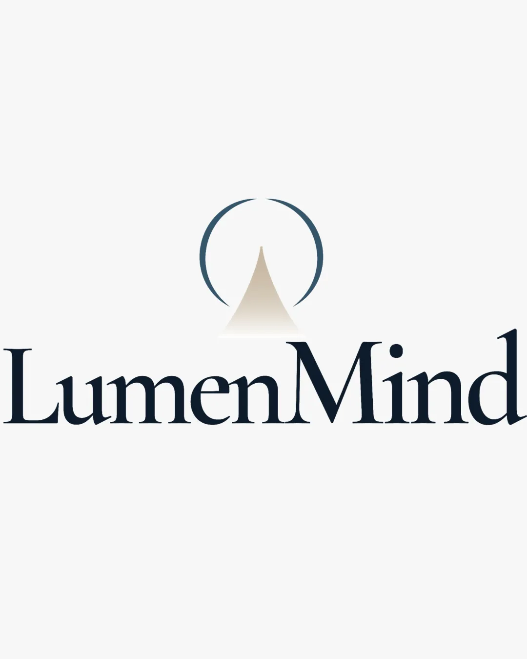
Lumenmind
Distinctive, modern, and conceptually coherent; minor spacing refinements will elevate the result to exceptional.
Objective AI feedback. Your creative decision.
Legibility
Originality
Misread
Balance
Scale
Action plan
What to fix first
The most important fixes to handle before polishing the full presentation.
1
Slightly adjust spacing between mark and wordmark, and consider tightening glyph kerning for even balance.
Medium prioritySmall refinements to spacing will create a more professional suite.
Impact: Improves Visual Harmony And Polish At All Sizes. · Effort: Low
Detailed review
Logo performance breakdown
Legibility
 Serif wordmark is clear and very readable.
 Minor tightness between some wordmark glyphs.
Originality
Abstract mark is distinctive and reinforces the 'lumen' (light) theme.
Partial-circle motif is somewhat familiar in wellness branding.
Color harmony
Charcoal and muted beige give a calm, modern feel. Contrast is clear for digital and print.
Charcoal
#222834
Beige
#E3DFD8
Your palette is close. Refine the color roles and combinations before updating the logo.
Build brand colorsBalance alignment
Mark is centered, and the wordmark's weight is visually balanced.
Minor visual tension from the intersection of mark and wordmark spacing.

Scalability
Symbol and wordmark are bold enough for small-scale use.
Very thin portions of the abstract circle may fade below 1cm size.
200x250 px
100×125 px
50×62 px
Misinterpretations
No obvious alternative or risky readings.
Logo structure & brief match
Mark conceptually and visually fits brand name.
Shared color and style unify elements.
Brand Name Fit: Abstract mark and wordmark both reinforce the light/enlightenment theme suggested by 'LumenMind.'
Industry Fit: Color, symbol, and typography choices suit wellness, psychology, or coaching niches.
Try your own review
Review my logo
Wondering how your logo performs?
Get a clear logo score, key risks, and priority fix ideas before your client or audience sees it.
Keep exploring