 View review
Logo score
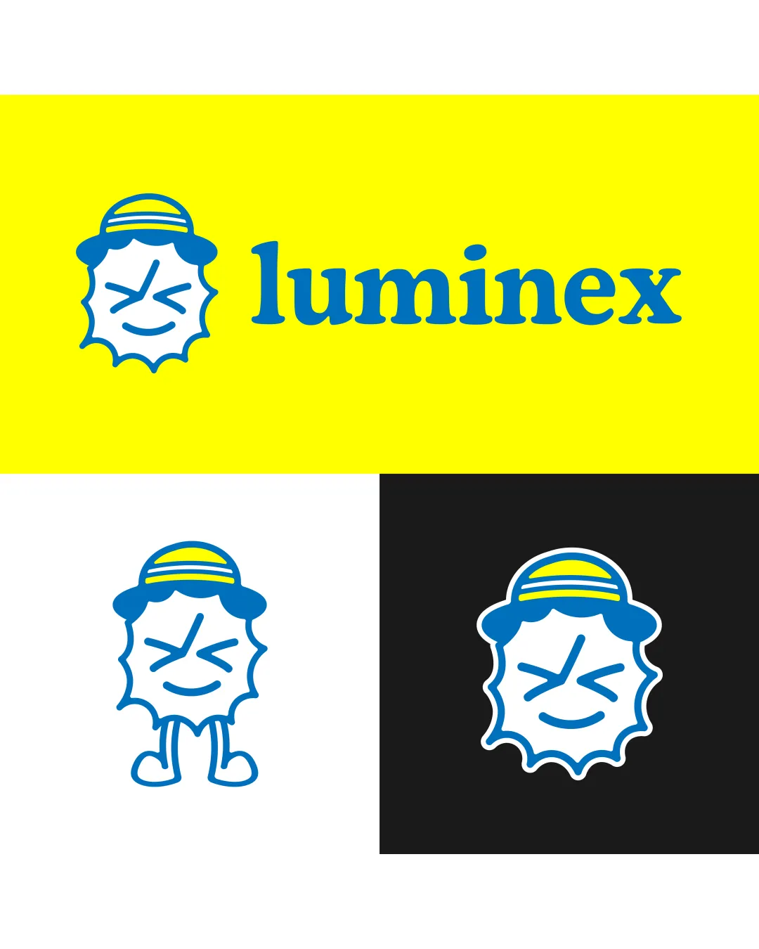
Logo review ofLuminex
Review the detailed scores below to see what is working and what should be refined first.
Legibility
Originality
Misread
Balance
Scale
Detailed review
Logo performance breakdown
Legibility
![]() Wordmark is clear and readable.
Wordmark is clear and readable.![]() Typeface is bold with good spacing and strong presence.
Typeface is bold with good spacing and strong presence.
![]() Yellow background with blue text is high contrast, but may strain the eyes in some applications.
Yellow background with blue text is high contrast, but may strain the eyes in some applications.![]() Lowercase 'l' may be misread as an uppercase 'I' at small sizes.
Lowercase 'l' may be misread as an uppercase 'I' at small sizes.
Originality
![]() Unique character illustration adds personality.
Unique character illustration adds personality.![]() Playful, friendly touch to the sun motif.
Playful, friendly touch to the sun motif.
![]() Sun-with-face as a concept is common in children’s brands.
Sun-with-face as a concept is common in children’s brands.![]() No negative space utilization or clever visual twist.
No negative space utilization or clever visual twist.
Color harmony
![]() Limited palette keeps the look unified and memorable.
Limited palette keeps the look unified and memorable.![]() Bright colors are suitable for a children-oriented brand.
Bright colors are suitable for a children-oriented brand.
![]() Yellow and blue may present some accessibility issues for color-blind users if used together with no contrast.
Yellow and blue may present some accessibility issues for color-blind users if used together with no contrast.![]() Yellow background can strain the viewer’s eyes over time.
Yellow background can strain the viewer’s eyes over time.
Yellow
#FFE800
Blue
#0083C6
White
#FFFFFF
Black
#272727
Your palette is close. Explore sharper color combinations with Colorfly.design before updating the logo.
Explore palettesBalance alignment
![]() Good horizontal alignment between logomark and wordmark.
Good horizontal alignment between logomark and wordmark.![]() Visual weight feels mostly equal when viewed together.
Visual weight feels mostly equal when viewed together.
![]() Sun character on its own feels a bit off-center due to facial expression and hat tilt.
Sun character on its own feels a bit off-center due to facial expression and hat tilt.![]() Legs illustration in alternate variation appears unbalanced.
Legs illustration in alternate variation appears unbalanced.

Scalability
![]() Logo works well on large banners and signage.
Logo works well on large banners and signage.![]() Simple bold lines generally maintain form when reduced.
Simple bold lines generally maintain form when reduced.
![]() Face details and hat stripes risk losing clarity at very small scales (e.g., favicon, embroidery).
Face details and hat stripes risk losing clarity at very small scales (e.g., favicon, embroidery).![]() The playful illustration may not transfer well to very formal or monochrome contexts.
The playful illustration may not transfer well to very formal or monochrome contexts.
200x250 px
100×125 px
50×62 px
Misinterpretations
![]() No inappropriate or confusing secondary interpretations detected.
No inappropriate or confusing secondary interpretations detected.
Symbol & text fit
![]() Theme and colors are consistent between mark and text.
Theme and colors are consistent between mark and text.
![]() Illustrative style feels looser than the structured serif wordmark, leading to a slight mismatch in aesthetics.
Illustrative style feels looser than the structured serif wordmark, leading to a slight mismatch in aesthetics.
![]() Wordmark has a formal feel, clashing subtly with the comic style of the mark.
Wordmark has a formal feel, clashing subtly with the comic style of the mark.
Try your own review
Review my logo
Wondering how your logo performs?
Get a clear logo score, key risks, and priority fix ideas before your client or audience sees it.
Keep exploring


