Wondering how your logo performs? 🧐
Get professional logo reviews in seconds and catch design issues in time.
Try it Now!Logo review of lunaris Café & Bakery
 Logo analysis by AI
Logo type:
Style:
Detected symbol:
Detected text:
Business industry:
Review requested by Inaqui
**If AI can recognize or misinterpret it, so can people.
Structured logo review
Legibility
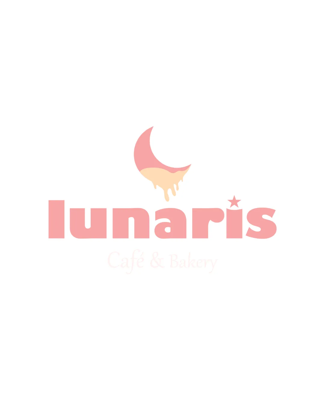
Main word 'lunaris' is bold and easy to read.
Subtext 'Café & Bakery' is extremely faint, nearly invisible against a white background.
Contrast between background and subtext is exceptionally poor, making it unreadable in most practical applications.
Scalability versatility
Bold sans serif type and straightforward crescent symbol scale reasonably well.
Should look acceptable on larger signs and packaging.
Thin dripping detail on the crescent may be lost at small sizes or on embroidery.
The pale subtext does not scale well in small formats and loses clarity.
Gradients and subtle color transitions may not be print-friendly.

200x250 px

100×125 px

50×62 px
Balance alignment
Good centering and visual harmony between the logomark and the wordmark.
The star on the 'i' is playfully integrated, supporting theme.
The dripping effect slightly unbalances the otherwise clean crescent if not carefully centered.


Originality
Dripping crescent moon effectively combines lunar and bakery concepts in a creative manner.
The star on the 'i' is a subtle but nice thematic touch.
Crescent moon tropes are common in 'lunar'-related branding, though the dripping twist adds uniqueness.
Logomark wordmark fit
Crescent logomark and rounded, playful typeface match and reinforce each other’s feel.
Color palette is consistently applied to both symbol and text.
Aesthetic look
Soft colors and playful shapes create an inviting, appetizing look matched to a bakery or café.
Overall aesthetic feels warm and modern, with a gentle, appealing presence.
Faint subtext detracts from the otherwise polished design.
Dual meaning and misinterpretations
No inappropriate or confusing imagery detected.
Dual meaning successfully blends moon and bakery themes.
Color harmony
Delicate pastel palette suits the industry and target audience.
Two-tone effect on the moon adds subtle interest without overwhelming.
Very light peach/beige color risks weak contrast, especially for subtext or in print.
Light Pink
#F6B7A5
Pale Peach
#FDD9B0
White
#FFFFFF

