LUXURY OF CHOICE logo review
4.8 / 5
Logo score
Logo review of

Luxury Of Choice

Review the detailed scores below to see what is working and what should be refined first.

Objective AI feedback. Your creative decision.

Combination Mark (monogram + Wordmark) Modern, Minimal, Geometric Luxury
5/5
Legibility
4/5
Originality
5/5
Misread
5/5
Balance
4/5
Scale
Detailed review

Logo performance breakdown

5/5

Legibility

Checkmark icon Typography is crisp, highly readable, and well-sized.
Checkmark icon Good contrast between text and background, ensuring clarity.
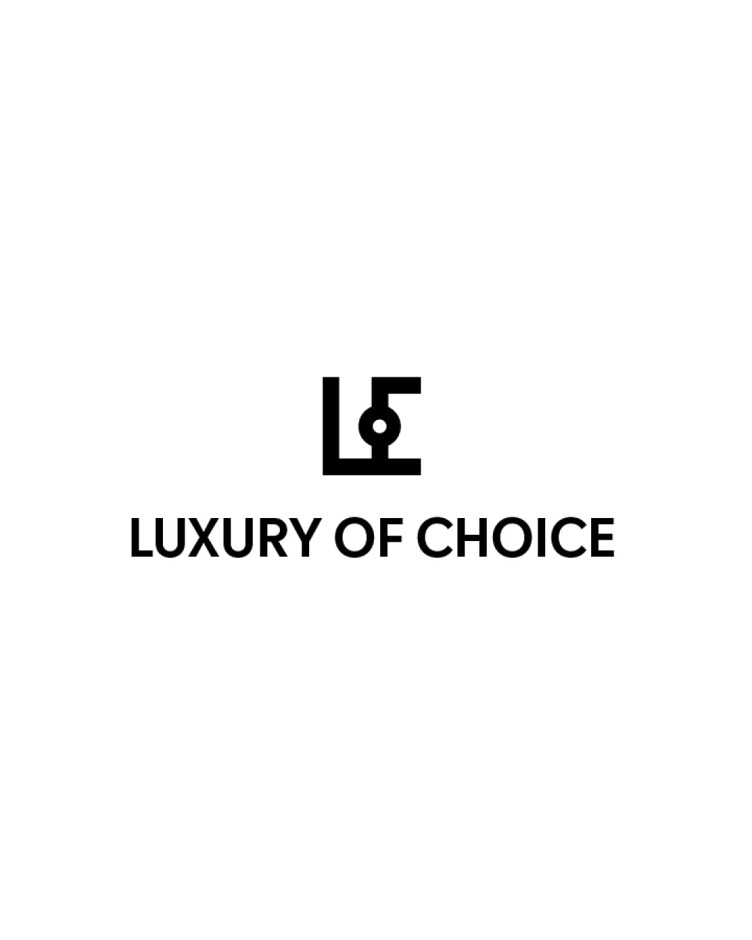
4/5

Originality

Checkmark icon Monogram cleverly combines 'L' and 'C' in a minimal, abstract form.
Checkmark icon Central dot adds a unique, memorable element.

Warning icon While effective, geometric monograms are fairly common in the luxury sector, so it risks some similarity with competitors.

5/5

Color harmony

Checkmark icon Black and white palette is timeless, elegant, and versatile.
Checkmark icon Excellent contrast ensures high visibility across mediums.

Black
#000000

White
#FFFFFF

5/5

Balance alignment

Checkmark icon Monogram is centered perfectly above the wordmark, creating a strong visual hierarchy.
Checkmark icon Spacing between logo elements is clean and balanced.

logo 200x250 pixels scalability test alignment grid overlay
4/5

Scalability

Checkmark icon Simple bold shapes in the monogram are versatile and scale well for digital and print use.
Checkmark icon Logo retains clarity on business cards, websites, and large format signage.

Warning icon Central dot detail in the monogram may lose definition at very small sizes, especially in embroidery or favicons.

logo 200x250 pixels scalability test

200x250 px

logo 100x125 pixels scalability test

100×125 px

logo 50x62 pixels scalability test

50×62 px

5/5

Misinterpretations

Checkmark icon Abstract treatment of letters avoids unintended shapes or inappropriate associations.

5 / 5

Symbol & text fit

Checkmark icon Monogram style matches the modern sans-serif wordmark, resulting in aesthetic unity.
Checkmark icon Proportions between logomark and wordmark are well-judged—neither overwhelms the other.

Try your own review

Wondering how your logo performs?

Get a clear logo score, key risks, and priority fix ideas before your client or audience sees it.

Review my logo