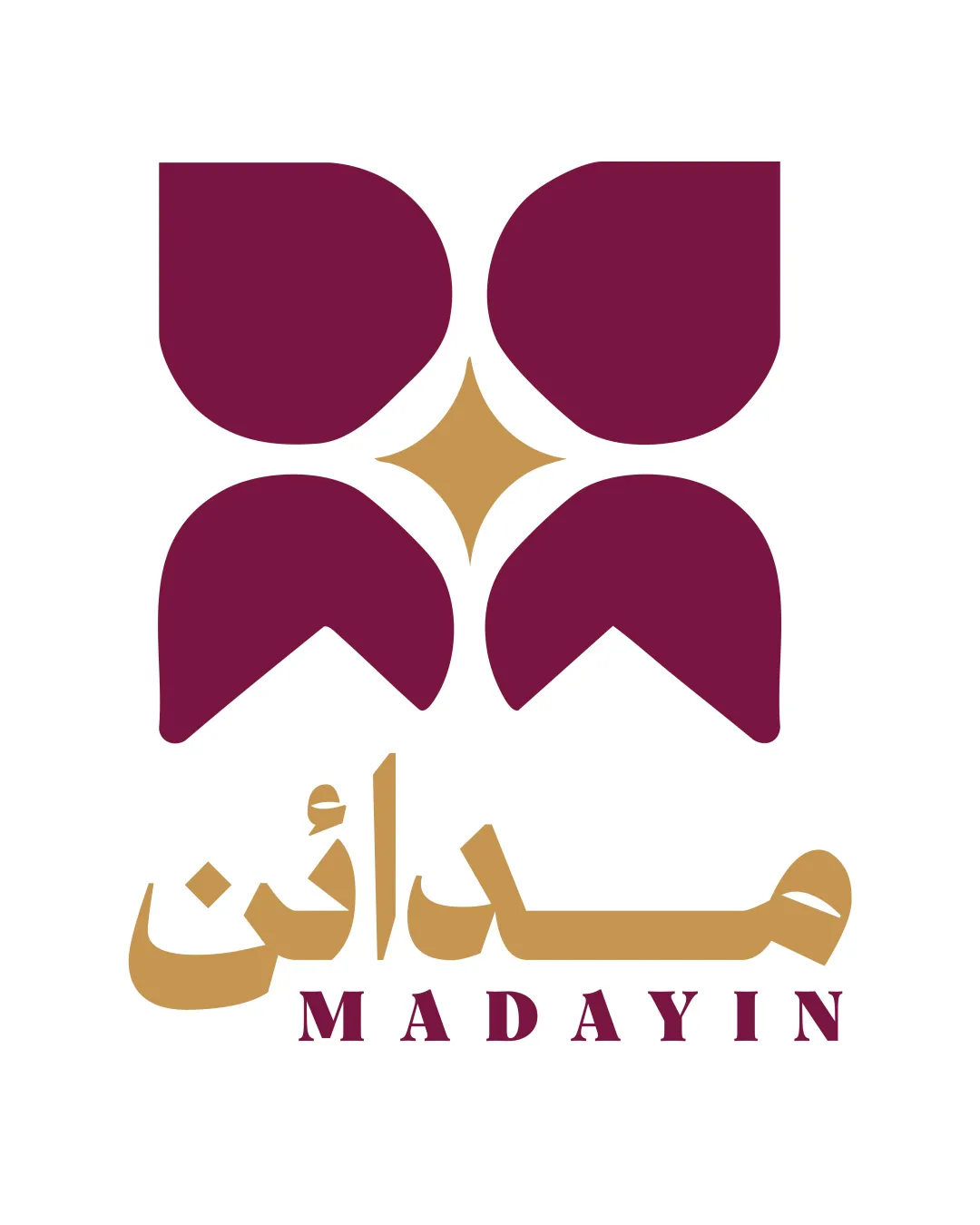
MADAYIN logo review
4.3 / 5
Logo score
Logo review of

Madayin

A strong, stylish, and culturally resonant combination mark with broad professional application. Minor execution tweaks will optimize versatility.

Combination Mark Modern Geometric Arabic-inspired Architecture
4.5/5
Legibility
4/5
Originality
5/5
Misread
4.5/5
Balance
4/5
Scale
Action plan

What to fix first

The most important fixes to handle before polishing the full presentation.

1

Adjust Arabic wordmark stroke thickness for increased small-size clarity

Medium priority

Thicker script strokes may reduce wordmark sharpness at small scale.

Impact: Enhances Micro-legibility Across Applications · Effort: Medium

Detailed review

Logo performance breakdown

4.5/5

Legibility

Checkmark icon English wordmark is clear and highly readable
Checkmark icon Arabic lettering is confidently styled and sufficiently clear

4/5

Originality

Checkmark icon Distinct Middle Eastern visual influence with a modern edge
Checkmark icon Combination of dual scripts and geometric form feels unique

Warning icon Patterned geometric motif concept is not entirely unfamiliar in region-inspired branding

4.5/5

Color harmony

Checkmark icon Gold and maroon evoke luxury and tradition
Checkmark icon Palette is harmonious, clear contrast for legibility

Maroon
#781948

Gold
#C9A14B

Your palette is close. Refine the color roles and combinations before updating the logo.

Build brand colors
4.5/5

Balance alignment

Checkmark icon Excellent vertical stacking and alignment of elements
Checkmark icon Optical balance between mark and type

logo 200x250 pixels scalability test alignment grid overlay
4/5

Scalability

Checkmark icon Geometric mark is bold and simple enough for good scaling
Checkmark icon Minimal detail ensures reproduction at small sizes

Warning icon Thicker strokes in Arabic wordmark may blend at very small sizes

logo 200x250 pixels scalability test

200x250 px

logo 100x125 pixels scalability test

100×125 px

logo 50x62 pixels scalability test

50×62 px

5/5

Misinterpretations

Checkmark icon No negative or inappropriate alternate readings

4.5 / 5

Logo structure & brief match

Checkmark icon Strong conceptual relationship between geometric form and bilingual wordmarks
Checkmark icon Color synchronization supports unity

Checkmark icon Cultural Relevance: Strongly references Middle Eastern heritage and architecture.
Checkmark icon Bilingual Communication: Successfully integrates both Arabic and English wordmarks.

Try your own review

Wondering how your logo performs?

Get a clear logo score, key risks, and priority fix ideas before your client or audience sees it.

Review my logo