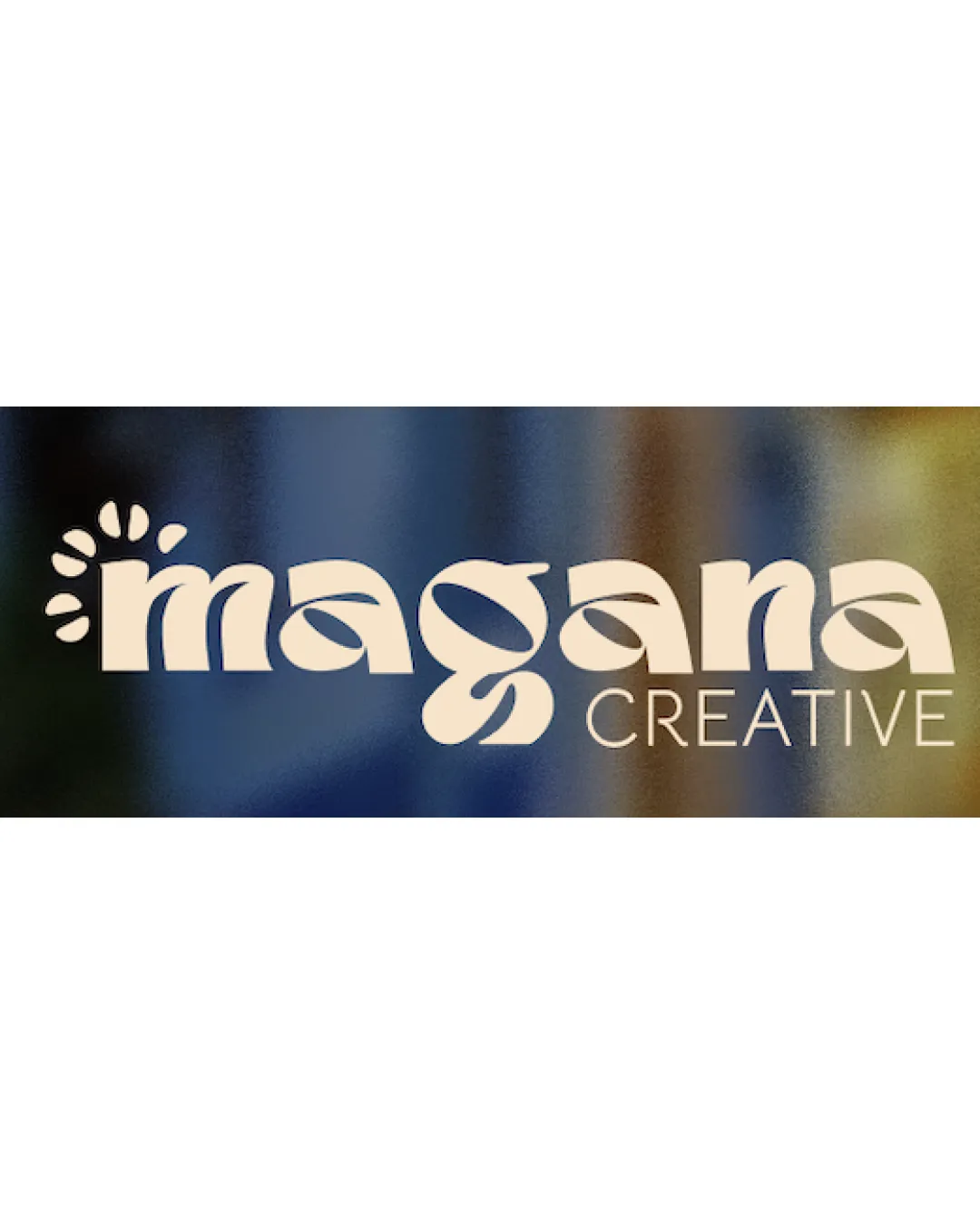
magana CREATIVE logo logo review
3.9/5
Logo score Wordmark with symbol category

magana CREATIVE logo

creative774709 Essential logo review

Distinct and playful, the logo successfully channels a youthful and creative vibe, with minor balance issues in the letterforms warranting adjustment for optimal professionalism.

This logo lockup shows solid execution, supported by distinctive construction and text readability; improving clarity at smaller sizes is the clearest next step.

Wordmark With Symbol Retro/geometric, Custom Type Creative Services, Design
4.4/5
Legibility
4/5
Originality
3.7/5
Balance
3/5
Scale
4/5
Color
4/5
Style consistency
Your next steps

What to fix first

Focus on the changes that matter. Keep what makes the logo work.

1

Main wordmark 'magana', especially the 'g'

Refine the 'g' shape/weight to improve typographic balance with the rest of the wordmark.

High priority Visible issue Medium effort

The decorative 'g' descender is significantly larger and bolder than the other letters, causing a slight imbalance and drawing disproportionate attention to the lower part of the mark.

See the category review
Detailed review

Logo performance breakdown

4/5

Brief & logo match

The custom retro-influenced wordmark and burst symbol express creativity and femininity well for a freelance designer, though slight typographic tweaks would perfect the balance and professional impact.

5/5

Misinterpretations

  • No visible risks of misreading or unintended associations.
4.4/5

Legibility

Wordmark 4/5 · Layout 5/5

  • 'magana' and 'CREATIVE' are both readable despite stylization.
4/5

Originality

Symbol 4/5 · Wordmark 4/5

  • Custom playful letterforms and the symbolic burst create distinctiveness.
4/5

Color harmony

Symbol 4/5 · Wordmark 4/5

  • Warm cream and muted blue/gold background feel cohesive and welcoming.
  • The pale cream text works on the dark/gradient background but may lack contrast or warmth on white or lighter backgrounds, which impacts versatility.

    Optional refinement Overall palette (cream on blue/gold gradient)
Beige#F4E1C4
Navy blue background#232846
Brown gradient#927746

Estimated colors. Use the original design file for exact values.

Create a full color palette using these colors

Create new palette
4/5

Style consistency

  • Burst motif ties stylistically to custom letters, especially the rounded and organic shapes.
3.7/5

Balance alignment

Symbol 4/5 · Wordmark 3/5 · Layout 4/5

Available in Advanced logo reviews
3/5

Scalability

Symbol 3/5 · Wordmark 3/5 · Layout 3/5

Available in Advanced logo reviews
Try your own review

Wondering how your logo performs?

Get a clear logo score, key risks, and priority fix ideas before your client or audience sees it.

Review my logo