Wondering how your logo performs? 🧐
Get professional logo reviews in seconds and catch design issues in time.
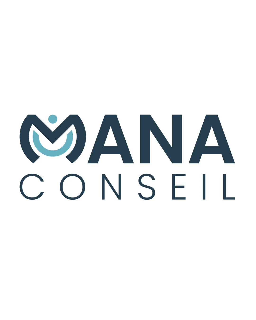
Try it Now!Logo review of MANA CONSEIL
 Logo analysis by AI
Logo type:
Style:
Detected symbol:
Negative space:
Detected text:
Business industry:
Review requested by Nenes_ss
**If AI can recognize or misinterpret it, so can people.
Structured logo review
Legibility
![]() Text is extremely clear with strong contrast against the background.
Text is extremely clear with strong contrast against the background.![]() Choice of typeface for both primary and secondary text is easy to read.
Choice of typeface for both primary and secondary text is easy to read.
Scalability versatility
![]() Clean forms allow for good scaling across print and digital.
Clean forms allow for good scaling across print and digital.![]() Minimal details of the symbol will render well on larger or smaller surfaces.
Minimal details of the symbol will render well on larger or smaller surfaces.
![]() Thin lines in the secondary 'CONSEIL' text may become less readable at very small sizes, such as on favicons or pen prints.
Thin lines in the secondary 'CONSEIL' text may become less readable at very small sizes, such as on favicons or pen prints.
200x250 px
100×125 px
50×62 px
Balance alignment
![]() Overall composition is meticulously centered.
Overall composition is meticulously centered.![]() Good proportional relationship between the symbol and wordmark.
Good proportional relationship between the symbol and wordmark.

Originality
![]() The 'M' monogram integrated with a supporting shape and dot hints at team or partnership uniquely.
The 'M' monogram integrated with a supporting shape and dot hints at team or partnership uniquely.![]() A slight creative interpretation for the consulting field.
A slight creative interpretation for the consulting field.
![]() Abstract-person-with-arms-raised motif has been used in similar forms in consulting and health industries, slightly reducing uniqueness.
Abstract-person-with-arms-raised motif has been used in similar forms in consulting and health industries, slightly reducing uniqueness.
Logomark wordmark fit
![]() Font weight and aesthetic of wordmark matches the geometric style of the symbol.
Font weight and aesthetic of wordmark matches the geometric style of the symbol.![]() The integration between symbol and wordmark is seamless and unified.
The integration between symbol and wordmark is seamless and unified.
Aesthetic look
![]() Modern, uncluttered appearance.
Modern, uncluttered appearance.![]() Color choice is professional and harmonious.
Color choice is professional and harmonious.
Dual meaning and misinterpretations
![]() No inappropriate or misleading elements.
No inappropriate or misleading elements.![]() Symbolism fits with consulting and partnership themes.
Symbolism fits with consulting and partnership themes.
Color harmony
![]() Restrained color palette exudes professionalism.
Restrained color palette exudes professionalism.![]() Excellent contrast and modern vibe.
Excellent contrast and modern vibe.
Midnight Blue
#304B5F
Cool Blue
#7EC6CF
White
#FFFFFF


