Wondering how your logo performs? 🧐
Get professional logo reviews in seconds and catch design issues in time.
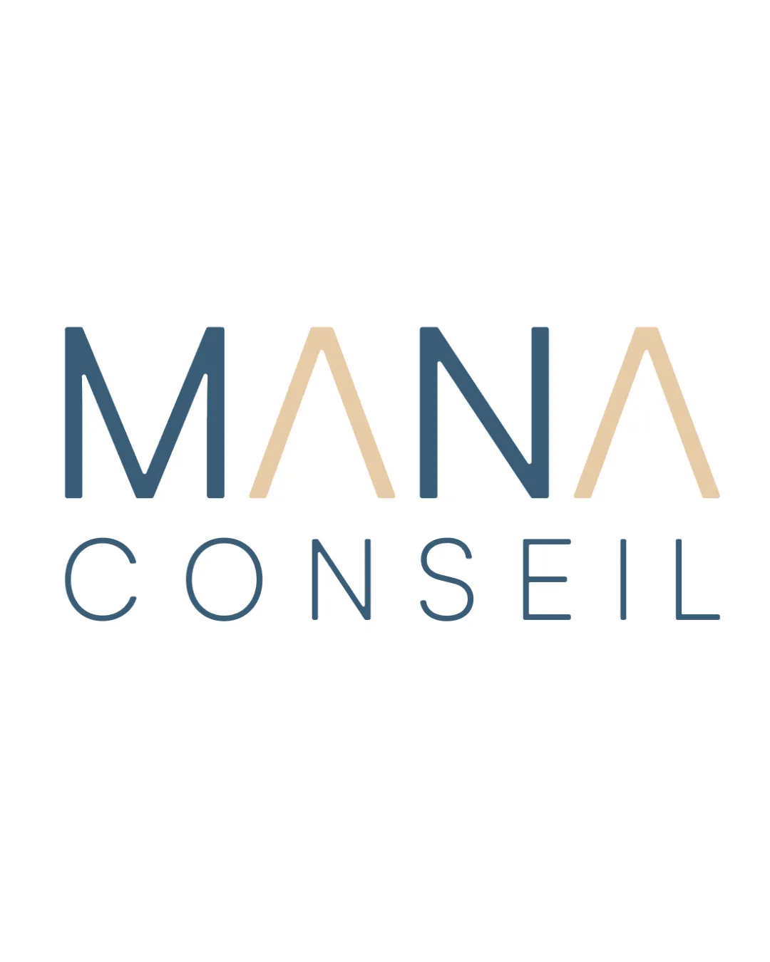
Try it Now!Logo review of MANA CONSEIL
 Logo analysis by AI
Logo type:
Style:
Detected text:
Business industry:
Review requested by Nenes_ss
**If AI can recognize or misinterpret it, so can people.
Structured logo review
Legibility
![]() Both words are immediately easy to read due to clear, well-spaced, modern sans-serif typography.
Both words are immediately easy to read due to clear, well-spaced, modern sans-serif typography.![]() Contrast between the colors and the white background ensures excellent readability.
Contrast between the colors and the white background ensures excellent readability.
Scalability versatility
![]() Clean lines and negative space make the logo easily adaptable to most formats such as business cards, digital headers, and letterheads.
Clean lines and negative space make the logo easily adaptable to most formats such as business cards, digital headers, and letterheads.![]() Minimal detail ensures clarity at small sizes.
Minimal detail ensures clarity at small sizes.
![]() The thin line-weight may become too faint in embroidery or at extremely small sizes.
The thin line-weight may become too faint in embroidery or at extremely small sizes.![]() The color distinction between the blue and beige may be lost in grayscale mockups or on color-restricted media.
The color distinction between the blue and beige may be lost in grayscale mockups or on color-restricted media.
200x250 px
100×125 px
50×62 px
Balance alignment
![]() Strong horizontal alignment and visual balance between the two words.
Strong horizontal alignment and visual balance between the two words.![]() Consistent spacing and vertical alignment create a harmonious composition.
Consistent spacing and vertical alignment create a harmonious composition.

Originality
![]() Alternating colors in 'MANA' create distinction and hint at a sophisticated brand personality.
Alternating colors in 'MANA' create distinction and hint at a sophisticated brand personality.![]() The use of a minimalist geometric 'A' sets it slightly apart from more generic consulting wordmarks.
The use of a minimalist geometric 'A' sets it slightly apart from more generic consulting wordmarks.
![]() The overall structure remains close to typical wordmarks in consulting, so it's stylish but not groundbreaking.
The overall structure remains close to typical wordmarks in consulting, so it's stylish but not groundbreaking.
Aesthetic look
![]() Clean, modern, and professional aesthetic.
Clean, modern, and professional aesthetic.![]() Muted color palette elevates the look and feels premium.
Muted color palette elevates the look and feels premium.
Dual meaning and misinterpretations
![]() No negative, inappropriate, or ambiguous associations present.
No negative, inappropriate, or ambiguous associations present.
Color harmony
![]() Limited color palette with harmonious tones aids professionalism.
Limited color palette with harmonious tones aids professionalism.![]() Good contrast helps with legibility and branding consistency.
Good contrast helps with legibility and branding consistency.
Steel Blue
#47667A
Champagne
#E7D1B0
White
#FFFFFF


