Wondering how your logo performs? 🧐
Get professional logo reviews in seconds and catch design issues in time.
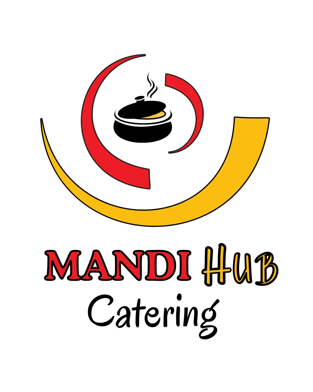
Try it Now!Logo review of MANDI Hub Catering
 Logo analysis by AI
Recognized style:
Logo type:
Detected symbol:
Detected text:
Business industry:
Review requested by Rabah
**If AI can recognize or misinterpret it, so can people.
Structured logo review
Legibility
![]() Text is clear and easy to read.
Text is clear and easy to read.
Scalability versatility
![]() Bold design likely versatile across applications.
Bold design likely versatile across applications.
![]() Fine details in the pot might be lost at small sizes.
Fine details in the pot might be lost at small sizes.
200x250 px
100×125 px
50×62 px
Balance alignment
![]() Visually balanced with central alignment.
Visually balanced with central alignment.

Originality
![]() Unique representation with cooking pot and arcs.
Unique representation with cooking pot and arcs.
![]() Arcs are somewhat generic.
Arcs are somewhat generic.
Logomark wordmark fit
![]() Text and symbol match well stylistically.
Text and symbol match well stylistically.
Aesthetic look
![]() The logo looks professional and visually appealing.
The logo looks professional and visually appealing.
Cultural sensitivity dual meaning
![]() No cultural sensitivity issues detected.
No cultural sensitivity issues detected.
Color harmony
![]() Effective use of red, yellow, and black for contrast.
Effective use of red, yellow, and black for contrast.
![]() Color scheme may be bold for some applications.
Color scheme may be bold for some applications.