1
Category Fit
Good fitLogo's form and palette strongly suit ceramics/home decor.
Aligns well with expected visual cues.
A confident, industry-fitting logo—address thin letterforms for production reliability.
The most important fixes to handle before polishing the full presentation.
Current thin strokes risk legibility at practical sizes for packaging or web avatars.
Impact: High · Effort: Medium
Closing the gap will help visual cohesion and unity.
Impact: Medium · Effort: Low
A more distinct shape could further separate the brand from similar ceramics or wellness marks.
Impact: Medium · Effort: Medium
![]() 'MANGOLD' is generally readable and distinctive.
'MANGOLD' is generally readable and distinctive.![]() 'CERAMICS' is clear and well-spaced.
'CERAMICS' is clear and well-spaced.
![]() Tall, narrow letterforms in 'MANGOLD' reduce readability at small sizes.
Tall, narrow letterforms in 'MANGOLD' reduce readability at small sizes.
![]() Custom abstract mark adds uniqueness.
Custom abstract mark adds uniqueness.![]() Distinctive wordmark with high character.
Distinctive wordmark with high character.
![]() Abstract wavy mark is slightly generic and could relate to common motifs in ceramics or wellness brands.
Abstract wavy mark is slightly generic and could relate to common motifs in ceramics or wellness brands.
![]() Earthy, harmonious palette appropriate for ceramics.
Earthy, harmonious palette appropriate for ceramics.![]() Sufficient contrast between foreground and background.
Sufficient contrast between foreground and background.
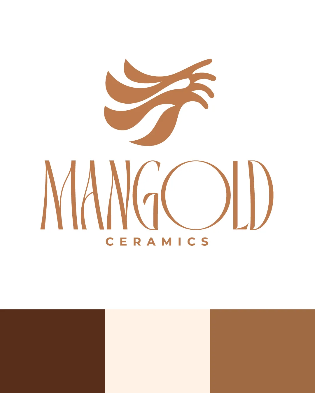
Tobacco
#6B3F28
Soapstone
#FDEDDF
Burlap
#B48456
![]() Cohesive vertical composition with centered elements.
Cohesive vertical composition with centered elements.![]() Mark size is visually balanced to the wordmark.
Mark size is visually balanced to the wordmark.
![]() Mark could feel slightly disconnected above the wordmark due to a significant gap.
Mark could feel slightly disconnected above the wordmark due to a significant gap.

![]() Mark uses clean, bold shapes that hold up when scaled.
Mark uses clean, bold shapes that hold up when scaled.![]() Color scheme works in one color.
Color scheme works in one color.
![]() Serif details and thin lines in the wordmark may lose clarity at very small sizes.
Serif details and thin lines in the wordmark may lose clarity at very small sizes.
200x250 px
100×125 px
50×62 px
![]() No inappropriate or confusing visual misreads detected.
No inappropriate or confusing visual misreads detected.
![]() Abstract mark and wordmark both utilize organic curves, ensuring good stylistic fit.
Abstract mark and wordmark both utilize organic curves, ensuring good stylistic fit.
![]() Industry Fit: Earthy and organic mark fits well with ceramics and home decor positioning.
Industry Fit: Earthy and organic mark fits well with ceramics and home decor positioning.
![]() Visual Tone: Elegant yet grounded—supports a premium but approachable craft brand.
Visual Tone: Elegant yet grounded—supports a premium but approachable craft brand.
Well-positioned with minor differentiation risk.
The logo fits the high-end ceramics space with an organic, crafted feel but should strengthen uniqueness in the symbol for stand-out appeal.
Logo's form and palette strongly suit ceramics/home decor.
Aligns well with expected visual cues.
Abstract shape is a bit generic for the space.
Could overlap with motifs used by other artisan or wellness brands.
Communicates quality and hand-crafted authenticity.
Appropriate premium feel.
Where the logo is ready to use, where it needs adjustment, and where it may break in real applications.
High-contrast palette and horizontal lockup suitable for digital headers.
Abstract mark alone can function, but ensure recognizability at tiny sizes.
Thin wordmark strokes may need bolding for embroidery clarity.
Wordmark requires simplification or alternate lockup for clarity at small scale.
High-contrast and scalable; ensure thick enough lines for production.
A practical checklist of the logo versions to prepare before sending the final files to a client or team.
Main brand asset; clearly shown in image.
Needed for square/small spaces and icons.
Essential for production and versatility.
May improve fit on some packaging or digital placements.
Useful for typography-focused applications.
An abstract, flowing symbol sits above a sophisticated serif wordmark spelling 'MANGOLD' with 'CERAMICS' beneath in uppercase sans-serif. Earthy brown tones create a natural, crafted feel.
Custom serif lettering uses elegant, elongated forms echoing artisan craftsmanship, paired with a simple sans-serif for 'CERAMICS.'
Abstract, wavy lines forming a unique leaf, flame, or flowing motif convey motion and organic materials.
Warm browns and beige evoke clay and natural materials, reinforcing the handmade, authentic brand story.
This logo pairs a refined, organic wordmark with an abstract mark that evokes handmade craft and natural materials—ideal for a high-end ceramics studio.
Organic type and earthy palette convey warmth and authenticity.
Abstract mark complements the artistic nature of ceramic work.
Get a clear logo score, key risks, and priority fix ideas before your client or audience sees it.