View review
Logo score
Logo review of
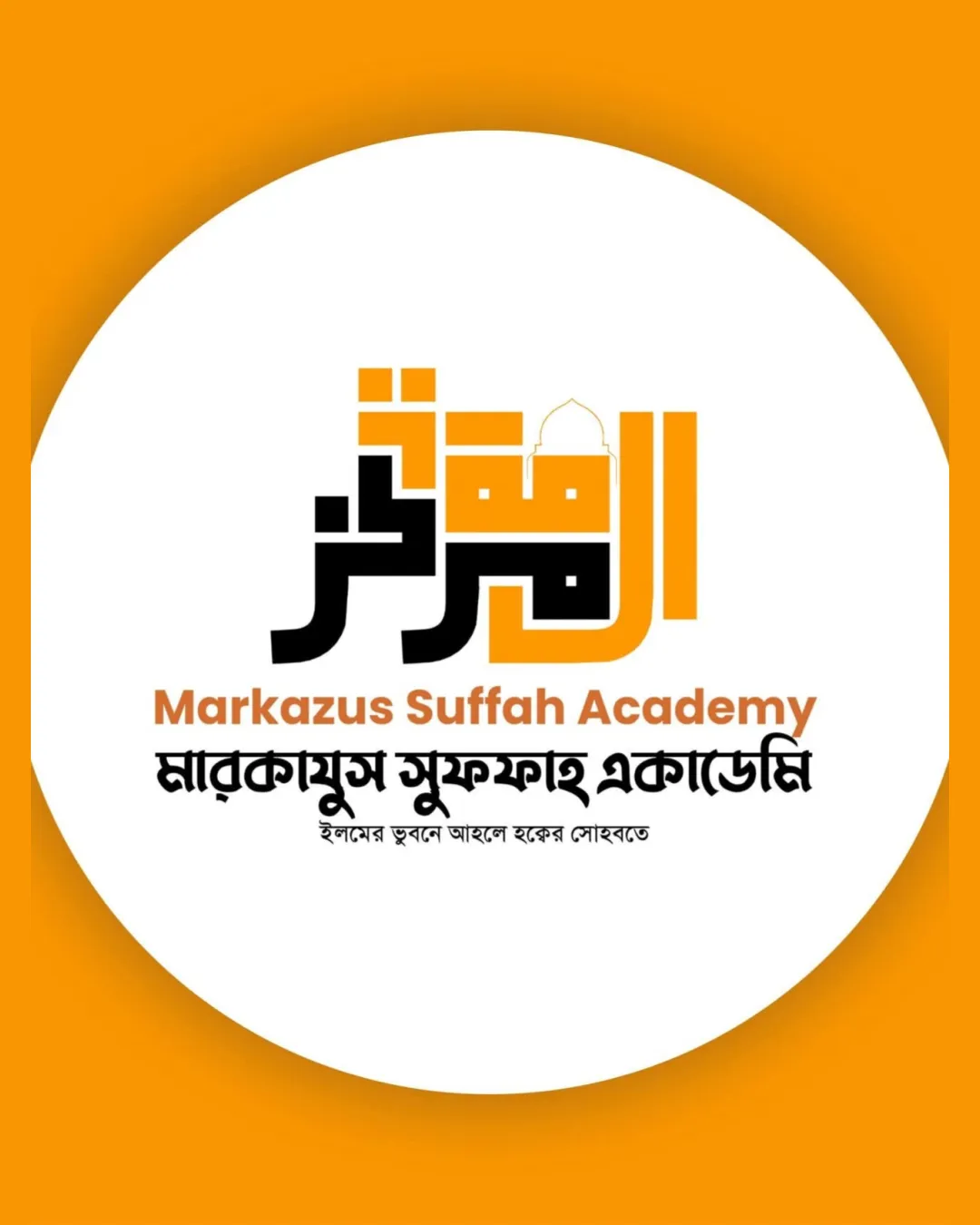
Markazus Suffah Academy, মারকাযুস ..
Review the detailed scores below to see what is working and what should be refined first.
Objective AI feedback. Your creative decision.
Legibility
Originality
Misread
Balance
Scale
Detailed review
Logo performance breakdown
Legibility
 English and Bengali text is clear and easy to read Color contrast enhances readability
 Arabic section (kufic calligraphy) may be difficult for those unfamiliar with the script Subheadline in Bengali has smaller font size, lower legibility at smaller scales
Originality
Creative fuse of kufic calligraphy with mosque outline Cultural integration of multiple scripts is visually unique
Use of mosque silhouette is somewhat common in Islamic educational branding
Color harmony
Limited and harmonious palette; orange and black complement each other well Good contrast for visibility
Orange
#F7A51A
Black
#000000
White
#FFFFFF
Balance alignment
Vertical stacking creates a solid foundational structure Main elements are visually centered
Subheadline text alignment and varying font sizes create mild imbalance underneath main logo Slight tension between the Kufic block's weight and the lighter Bengali calligraphy

Scalability
Bold lines in main logomark likely to scale well for large applications like signage Strong contrast translates well to print and digital
Fine detail in mosque dome and small Bengali subtext may not scale down well for very small uses (favicons, embroidery) Logo suite is not provided; single color/adaptable variations not demonstrated
200x250 px
100×125 px
50×62 px
Misinterpretations
No inappropriate or confusing symbolism present
Symbol & text fit
Logomark style (kufic/mosque) relates directly to wordmark (educational/Islamic theme)
Visual weight and complexity of logomark slightly overpowers wordmark
Try your own review
Review my logo
Wondering how your logo performs?
Get a clear logo score, key risks, and priority fix ideas before your client or audience sees it.
Keep exploring