Wondering how your logo performs? 🧐
Get professional logo reviews in seconds and catch design issues in time.
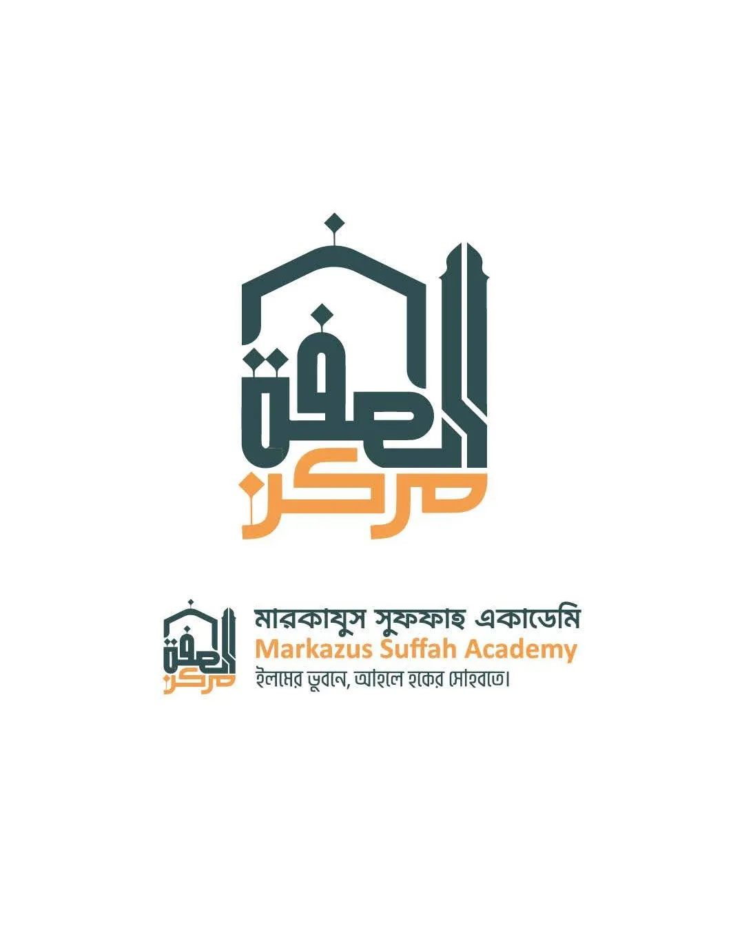
Try it Now!Logo review of Markazus Suffah Academy, multiple languages: Arabi..
 Logo analysis by AI
Logo type:
Style:
Detected symbol:
Negative space:
Detected text:
Business industry:
Review requested by Fp6
**If AI can recognize or misinterpret it, so can people.
Structured logo review
Legibility
 English and Bengali text are reasonably clear and readable Distinct color separation improves multi-language presentation
 Arabic calligraphy is stylized and may not be quickly readable to all viewers Logomark at small size (icon) loses type clarity, especially in lower text
Scalability versatility
Icon version allows for small-scale use, such as social media avatars Combination mark is adaptable for signage, stationery, and official documents
Intricate details and small text lines may render poorly on embroidery or as a favicon Arabic calligraphy and tagline likely to become illegible when downsized
200x250 px
100×125 px
50×62 px
Balance alignment
Well-balanced composition between mosque illustration, logotype, and supporting text Consistent alignment; geometric styling ties elements together seamlessly

Originality
Creative use of mosque silhouette and modern calligraphy for visual identity Distinctive blend of geometric Islamic artistry and educational branding
Mosque motifs are common in this sector; partial risk of generic impression if not paired with strong brand materials
Logomark wordmark fit
Logomark and wordmark are visually and thematically integrated Color and geometric treatment create a cohesive appearance
Aesthetic look
Modern and professional visual impression Color contrast enhances readability and draws attention
Slightly busy lower section; multilingual lines make it visually dense
Dual meaning and misinterpretations
No inappropriate or misleading shapes; visual language is on-brand for an Islamic academic institution
Color harmony
Well-balanced, harmonious two-tone treatment Consistent palette maintains brand clarity
Nile Blue
#355450
Reno Sand
#E6A13F
White
#FFFFFF