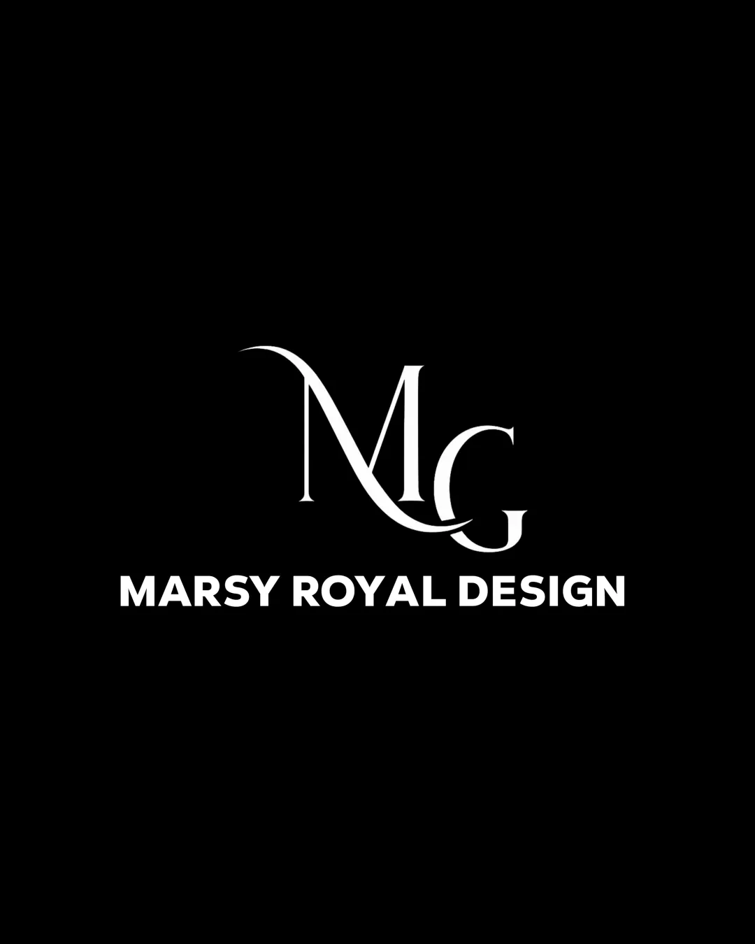
MARSY ROYAL DESIGN logo review
3.5 / 5
Logo score
Logo review of

Marsy Royal Design

A functional, stylish logo suited to a premium design brand, though slightly generic in concept and in need of minor technical refinements for consistent application.

Objective AI feedback. Your creative decision.

Combination Mark Modern Classic With Luxury Cues Design Services
4/5
Legibility
3.5/5
Originality
4.5/5
Misread
4/5
Balance
3/5
Scale
Action plan

What to fix first

The most important fixes to handle before polishing the full presentation.

1

Thicken or simplify the thinnest flourishes in the monogram for clarity at small sizes.

High priority

Thin lines are vulnerable to loss of detail.

Impact: Improves Scalability And Consistency Across Applications. · Effort: Medium

2

Slightly adjust monogram centering relative to the wordmark for increased optical harmony.

Medium priority

Small vertical/horizontal adjustment could resolve minor imbalance.

Impact: Enhances Visual Balance And Professionalism. · Effort: Low

Detailed review

Logo performance breakdown

4/5

Legibility

Checkmark icon Wordmark is bold and highly readable
Checkmark icon Monogram letters are mostly clear

Warning icon Flourishes on the 'M' and 'G' introduce slight ambiguity at small sizes

3.5/5

Originality

Checkmark icon Custom flourishes in the monogram add some distinctiveness

Warning icon MG lettermark is a common approach; luxury cues are conventional

4/5

Balance alignment

Checkmark icon Good vertical alignment between monogram and wordmark
Checkmark icon Balanced negative space

Warning icon Monogram could be optically more centered above the wordmark

logo 200x250 pixels scalability test alignment grid overlay
3/5

Scalability

Checkmark icon Simple color scheme aids versatility
Checkmark icon Wordmark remains strong at small sizes

Warning icon Thin flourishes on monogram may lose clarity at small scales

logo 200x250 pixels scalability test

200x250 px

logo 100x125 pixels scalability test

100×125 px

logo 50x62 pixels scalability test

50×62 px

4.5/5

Misinterpretations

Checkmark icon No plausible misinterpretations

4 / 5

Logo structure & brief match

Checkmark icon Serif monogram contrasts but complements the sans-serif wordmark

Warning icon Slight stylistic disconnect between classic monogram and contemporary wordmark

Checkmark icon Target Audience: Sophisticated and bold styling suits a design-related or luxury clientele.

Checkmark icon Industry Relevance: Monogram approach is fitting for premium design, fashion, or personal branding.

Try your own review

Wondering how your logo performs?

Get a clear logo score, key risks, and priority fix ideas before your client or audience sees it.

Review my logo