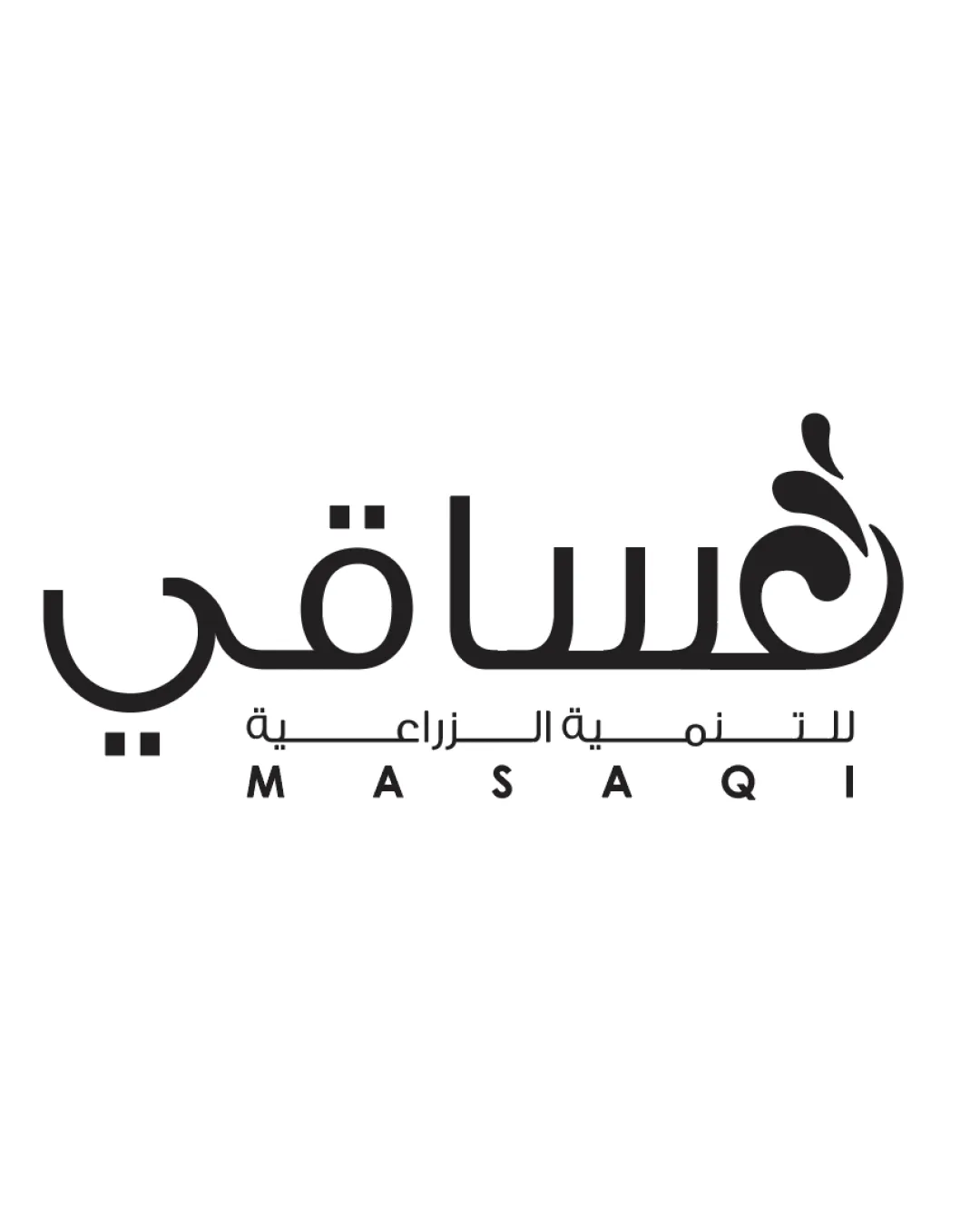
للتنمية الزراعية MASAQI logo review
4/5
Logo score
Logo review of

للتنمية الزراعية Masaqi

A well-crafted, relevant logo for an agriculture brand with strong bilingual execution; slight tuning of alignment and small-size details recommended.

Combination Mark Modern Arabic Wordmark With Agricultural Motif Agriculture
4/5
Legibility
4/5
Originality
5/5
Misread
4/5
Balance
3/5
Scale
Your next steps

What to fix first

Focus on the changes that matter. Keep what makes the logo work.

1

leaf/sprout motif at the end of main Arabic lettering

Test the logo at small sizes to verify the motif remains clear and distinct.

Worth testing High priority Low effort
Area to inspectApproximate location

The fine lines and enclosed spaces of the sprout/leaf motif could lose clarity at small sizes or in low-resolution output.

How to check

Print and review the logo at business card and product label sizes for motif legibility.

See the category review
2

alignment of English and Arabic taglines below main wordmark

Fine-tune vertical spacing and alignment between text lines to ensure a well-balanced composition.

Optional refinement Medium priority Low effort

The English and Arabic text are reasonably aligned, but minor tweaks could further optimize visual harmony between the two languages and with the main mark.

How to check

Visually inspect for even optical margin and baseline alignment between elements.

See the category review
Detailed review

Logo performance breakdown

5/5

Brief & logo match

Based on your brief
Compared with

"Masaqi is an agricultural development company. The industry is agriculture and farming. Our target audience includes farmers, agricultural investors, and agribusinesses. The brand personality is natural, sustainable, professional, and trustworthy. The logo will be used on our website, business cards, official documents, and agricultural products."

The logo effectively combines natural symbolism, bilingual accessibility, and a professional tone, matching the core brief requirements.

  • Agricultural Symbolism

    Sprout/leaf motif directly references growth and nature, linking well to the sector and the intended sustainable personality.

  • Bilingual Audience And Professionalism

    The use of both Arabic and English ensures accessibility and credibility for local and international stakeholders.

4/5

Legibility

  • Arabic and English text are clear and readable.
  • Distinctive motif does not impede legibility.
4/5

Originality

  • Unique integration of agricultural symbolism into Arabic script.
  • Distinctive for its target region.
4/5

Balance alignment

  • Strong central alignment of major elements.
  • Motif balanced to not overpower wordmark.
  • The English and Arabic text are reasonably aligned, but minor tweaks could further optimize visual harmony between the two languages and with the main mark.

    Optional refinement alignment of English and Arabic taglines below main wordmark

    Try: Fine-tune vertical spacing and alignment between text lines to ensure a well-balanced composition.

    Check: Visually inspect for even optical margin and baseline alignment between elements.

Uploaded logoAlignment guide overlay

Inspect spacing with the guide. Optical balance may differ from geometric centering.

3/5

Scalability

  • Simple lines aid scale flexibility.
  • Monochrome format is versatile.
  • The fine lines and enclosed spaces of the sprout/leaf motif could lose clarity at small sizes or in low-resolution output.

    Worth testing leaf/sprout motif at the end of main Arabic lettering

    Try: Test the logo at small sizes to verify the motif remains clear and distinct.

    Check: Print and review the logo at business card and product label sizes for motif legibility.
    Area to inspectApproximate location
Uploaded logo at 200 pixels wide
200 × 250 px
Uploaded logo at 100 pixels wide
100 × 125 px
Uploaded logo at 50 pixels wide
50 × 63 px

Compare the detail at different sizes. Labels show the full image dimensions.

5/5

Misinterpretations

  • No visible risk of unintended meanings or awkward visuals.

Black & white

Does the shape still work without color?

These tests are available only for logos uploaded in vector (SVG) format.

Background contrast

Find the surfaces where your logo stays clear.

These tests are available only for logos uploaded in vector (SVG) format.

Blur & silhouette

A 3px blur softens fine details so you can check whether the overall shape stays recognizable. If key gaps close or elements merge, the logo may rely too heavily on detail.

These tests are available only for logos uploaded in vector (SVG) format.

Try your own review

Wondering how your logo performs?

Get a clear logo score, key risks, and priority fix ideas before your client or audience sees it.

Review my logo