View review
Logo score
Logo review of
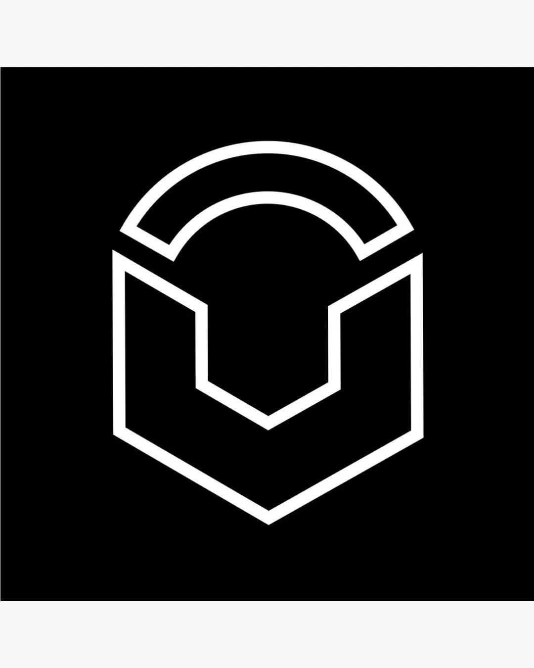
Geometric Letter 'u' With An Enclosing Arc
A clean, modern monogram logo with strong balance and scalability, though minor line-weight adjustment is recommended for reliable performance in practical use.
Objective AI feedback. Your creative decision.
Originality
Misread
Balance
Scale
Action plan
What to fix first
The most important fixes to handle before polishing the full presentation.
1
Increase line weight slightly for improved presence in small or low-contrast settings
High priorityThin lines risk disappearing at reduced sizes or on complex surfaces.
Impact: Ensures Legibility And Recognition At Various Scales And Backgrounds · Effort: Low
Detailed review
Logo performance breakdown
Originality
 Modern, clean monogram design
 Geometric letterforms are a common trend and not highly distinctive
Balance alignment
Symmetrically balanced Visually harmonious composition

Scalability
Simple lines scale well Form remains recognizable at small sizes
Very thin lines may lose presence at the smallest sizes or against busy backgrounds
200x250 px
100×125 px
50×62 px
Misinterpretations
No evident dual meaning or problematic shapes
Try your own review
Review my logo
Wondering how your logo performs?
Get a clear logo score, key risks, and priority fix ideas before your client or audience sees it.
Keep exploring