 View review
Logo score
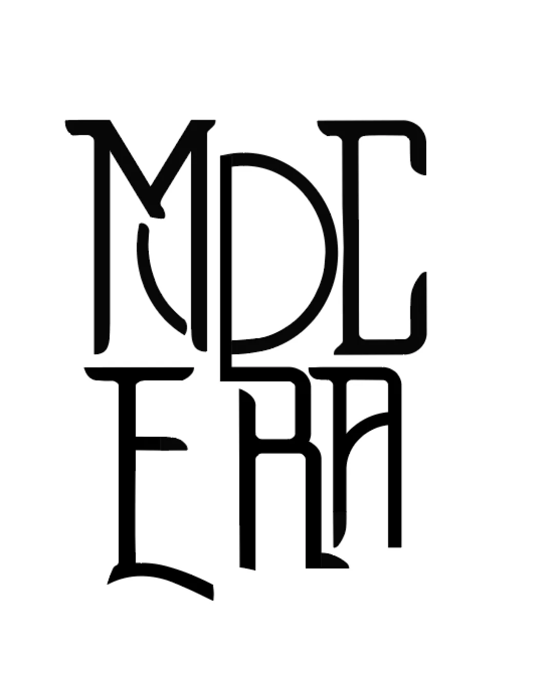
Logo review ofMd Era
Review the detailed scores below to see what is working and what should be refined first.
Legibility
Originality
Misread
Balance
Scale
Detailed review
Logo performance breakdown
Legibility
![]() Distinct separation of characters through linework
Distinct separation of characters through linework![]() Some individual letter shapes remain recognizable
Some individual letter shapes remain recognizable
![]() Complex overlapping of letters creates confusion when reading
Complex overlapping of letters creates confusion when reading![]() Some letters, especially the D/E and R/A transitions, merge excessively
Some letters, especially the D/E and R/A transitions, merge excessively![]() Reading order is ambiguous—hard to determine if it's meant as 'MD ERA' or something else
Reading order is ambiguous—hard to determine if it's meant as 'MD ERA' or something else
Originality
![]() Unique letter joining and custom typography
Unique letter joining and custom typography![]() Vintage/art deco interlace is clever and memorable
Vintage/art deco interlace is clever and memorable
![]() Risk of appearing as a pastiche of art deco trends without adding modern flair
Risk of appearing as a pastiche of art deco trends without adding modern flair
Color harmony
![]() The black and white contrast is timeless, bold, and adaptable
The black and white contrast is timeless, bold, and adaptable![]() Simple palette aids versatility
Simple palette aids versatility
Black
#000000
White
#FFFFFF
Balance alignment
![]() Stacked layout strives for vertical and horizontal symmetry
Stacked layout strives for vertical and horizontal symmetry
![]() Letter alignment is inconsistent—some strokes protrude awkwardly
Letter alignment is inconsistent—some strokes protrude awkwardly![]() Weight distribution feels lopsided between upper and lower text blocks
Weight distribution feels lopsided between upper and lower text blocks![]() Legs and arms of some letters extend in ways that unbalance the logo visually
Legs and arms of some letters extend in ways that unbalance the logo visually

Scalability
![]() Bold strokes theoretically maintain weight when scaled
Bold strokes theoretically maintain weight when scaled
![]() Fine spacing and complexity risk losing detail at small scales (e.g., business cards or favicons)
Fine spacing and complexity risk losing detail at small scales (e.g., business cards or favicons)![]() Ornate overlapping makes it unsuitable for embroidery or small promotional items
Ornate overlapping makes it unsuitable for embroidery or small promotional items
200x250 px
100×125 px
50×62 px
Misinterpretations
![]() No inappropriate or confusing secondary meanings detected
No inappropriate or confusing secondary meanings detected
Try your own review
Review my logo
Wondering how your logo performs?
Get a clear logo score, key risks, and priority fix ideas before your client or audience sees it.
Keep exploring


