MEDUSA 3D printing logo review
3.9/5
Logo score
Logo review of

Medusa 3d Printing

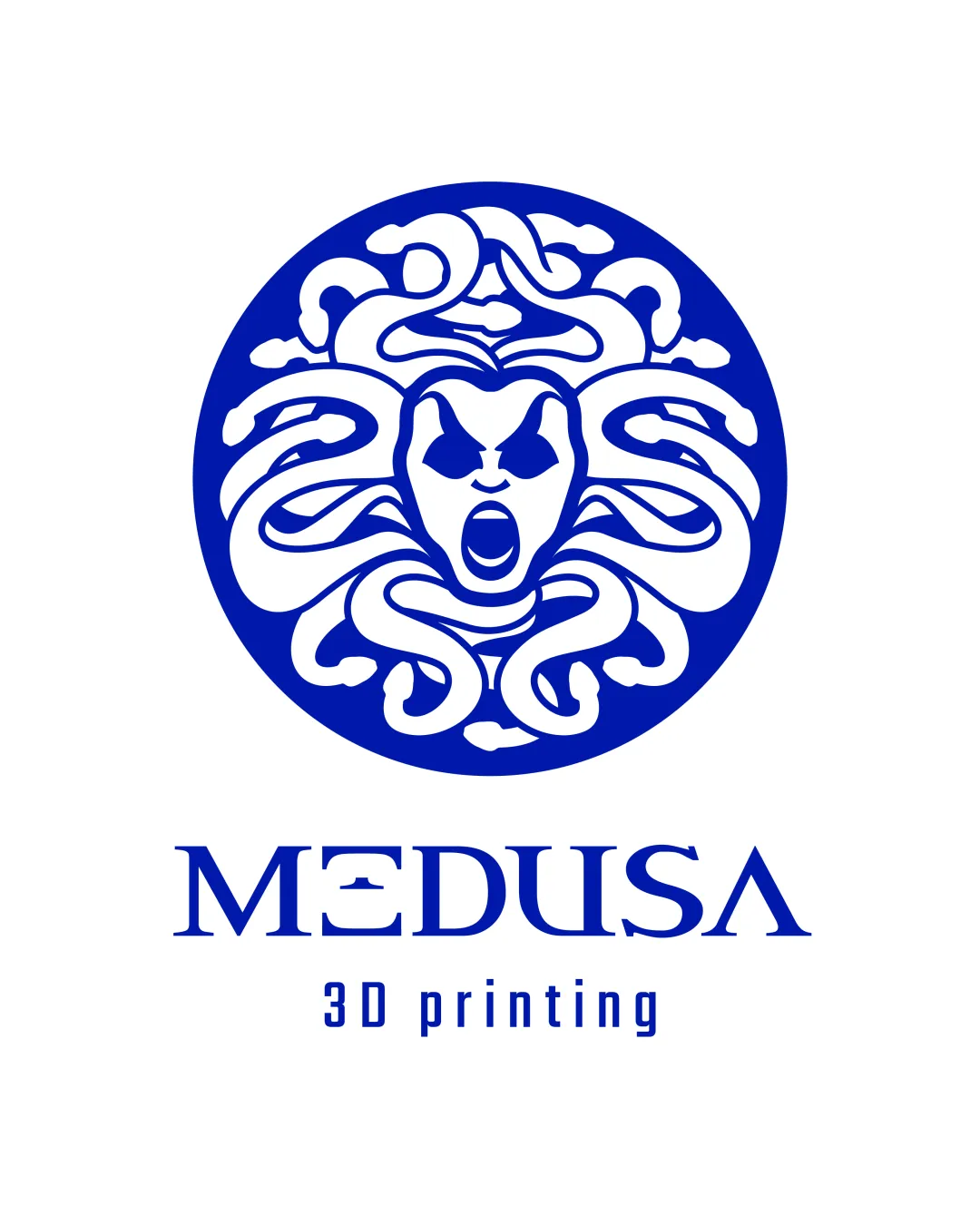
The logo is bold and marketable but needs simplification for versatility and minor typing tweaks for maximum clarity.

Combination Mark Bold Graphic Mythological 3D Printing
4/5
Legibility
4/5
Originality
4/5
Misread
4/5
Balance
3/5
Scale
Your next steps

What to fix first

Focus on the changes that matter. Keep what makes the logo work.

1

Simplify head and snake details for stronger legibility and impact across all sizes, especially in monochrome or small applications.

High priority Medium effort

Current intricacies may not reproduce well at all scales.

Improves scalability and makes the logo more versatile for print and digital uses.

2

Refine 'MEDUSA' custom glyphs ('E' and 'A') to balance uniqueness with clearer legibility, especially at small/fast reading.

Medium priority Low effort

Some custom styled letters reduce word clarity.

Improves quick recognition and avoids misreading brand name in applications like business cards.

Detailed review

Logo performance breakdown

Not scored

Brief & logo match

From the original review
  • Industry Fit

    The Medusa myth aligns with a 3D printing company's positioning as powerful, creative, and transformative.

4/5

Legibility

  • Word 'MEDUSA' is readable and distinctive
  • '3D printing' is clear at moderate sizes
  • Custom glyphs in 'MEDUSA' (especially E and A) might reduce clarity at small or quick glances
4/5

Originality

  • Rare use of Medusa myth and custom type treatment
  • Mythological head-in-circle motifs are somewhat familiar; could push uniqueness further
5/5

Color harmony

  • Bold blue and white are high contrast and professional; easy to reproduce
Blue#0033AA
White#FFFFFF

Estimated colors. Use the original design file for exact values.

Create a full color palette using these colors

Create new palette
4/5

Balance alignment

  • Strong vertical centering; circular symbol aligns well above text
  • '3D printing' baseline does not perfectly echo the main logo's proportional weight
Uploaded logoAlignment guide overlay

Inspect spacing with the guide. Optical balance may differ from geometric centering.

3/5

Scalability

  • Bold medallion graphic remains distinguishable at small-medium sizes
  • Intricate head and snake details may blur or fill in at very small sizes; may lose detail in monochrome
Uploaded logo at 200 pixels wide
200 × 250 px
Uploaded logo at 100 pixels wide
100 × 125 px
Uploaded logo at 50 pixels wide
50 × 63 px

Compare the detail at different sizes. Labels show the full image dimensions.

4/5

Misinterpretations

  • Strong, clear mythological theme with dramatic flair
  • Intense facial expression could be polarizing or loosely misinterpreted as aggressive, but not inappropriate
5/5

Symbol & text fit

  • The mythology theme ties the logomark and wordmark well; both share similar visual energy

Black & white

Does the shape still work without color?

These tests are available only for logos uploaded in vector (SVG) format.

Background contrast

Find the surfaces where your logo stays clear.

These tests are available only for logos uploaded in vector (SVG) format.

Blur & silhouette

A 3px blur softens fine details so you can check whether the overall shape stays recognizable. If key gaps close or elements merge, the logo may rely too heavily on detail.

These tests are available only for logos uploaded in vector (SVG) format.

Try your own review

Wondering how your logo performs?

Get a clear logo score, key risks, and priority fix ideas before your client or audience sees it.

Review my logo