 View review
Logo score
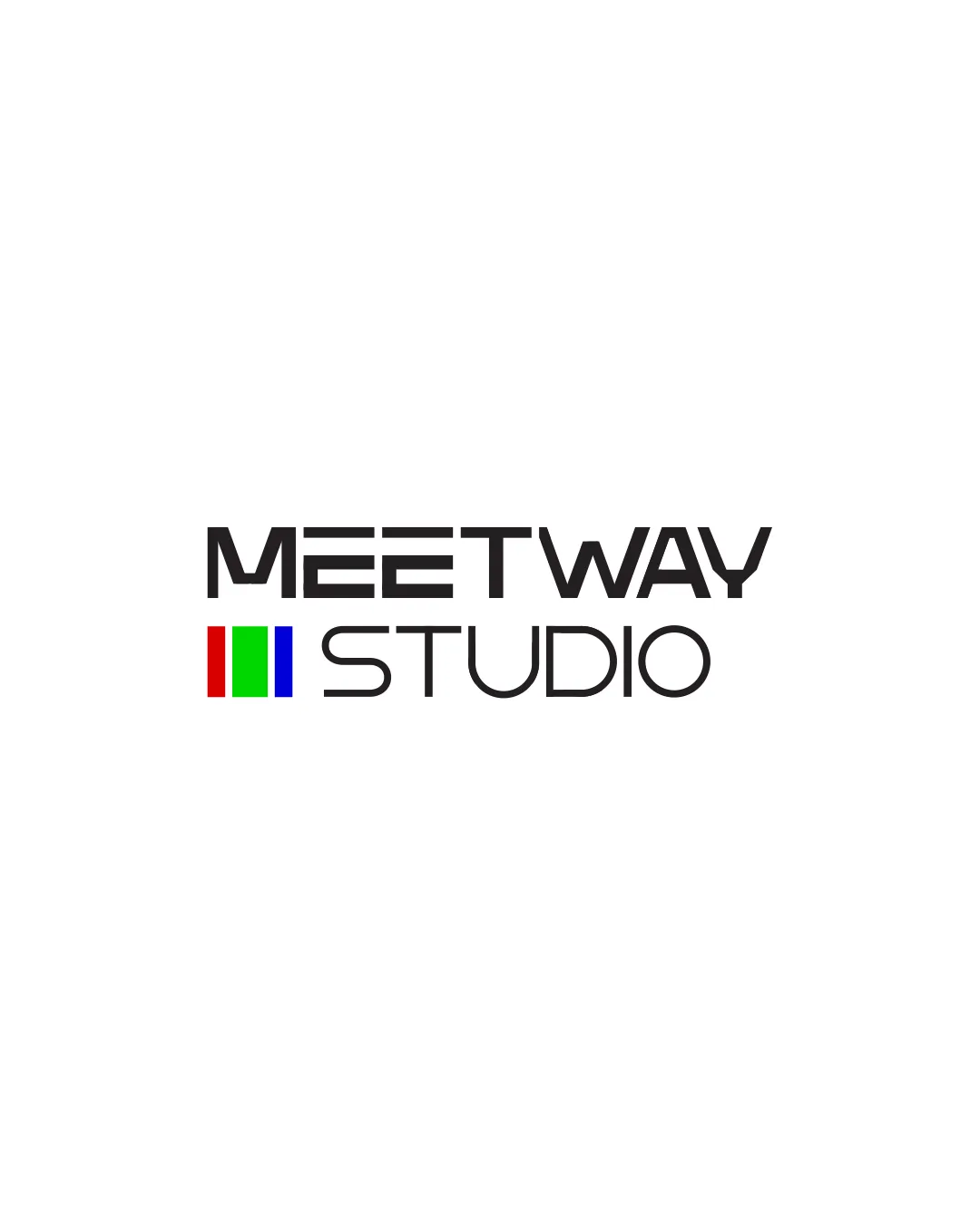
Logo review ofMeetway Studio
Review the detailed scores below to see what is working and what should be refined first.
Legibility
Originality
Balance
Scale
Detailed review
Logo performance breakdown
Legibility
![]() Text is clear and easy to read.
Text is clear and easy to read.
Originality
![]() Unique text style.
Unique text style.
![]() Colored bars are somewhat generic.
Colored bars are somewhat generic.
Color harmony
![]() Primary colors used effectively.
Primary colors used effectively.
![]() Might be jarring in certain contexts.
Might be jarring in certain contexts.
Your palette is close. Explore sharper color combinations with Colorfly.design before updating the logo.
Explore palettesBalance alignment
![]() Overall well-balanced and aligned.
Overall well-balanced and aligned.
![]() The symbol slightly overshadows the word 'STUDIO'.
The symbol slightly overshadows the word 'STUDIO'.

Scalability
![]() Simple design is easily scalable.
Simple design is easily scalable.
![]() Colors may not display well in grayscale versions.
Colors may not display well in grayscale versions.
200x250 px
100×125 px
50×62 px
Symbol & text fit
![]() Text and symbol create a cohesive look.
Text and symbol create a cohesive look.
![]() The bars might look unrelated to the brand name.
The bars might look unrelated to the brand name.
Try your own review
Review my logo
Wondering how your logo performs?
Get a clear logo score, key risks, and priority fix ideas before your client or audience sees it.
Keep exploring


