1
Category Fit
Weak fitFails to communicate clean, trustworthy dental care values.
Symbol undermines brand trust.
High-risk visual misinterpretation detected. Resolve this before presenting the logo.
The most important fixes to handle before polishing the full presentation.
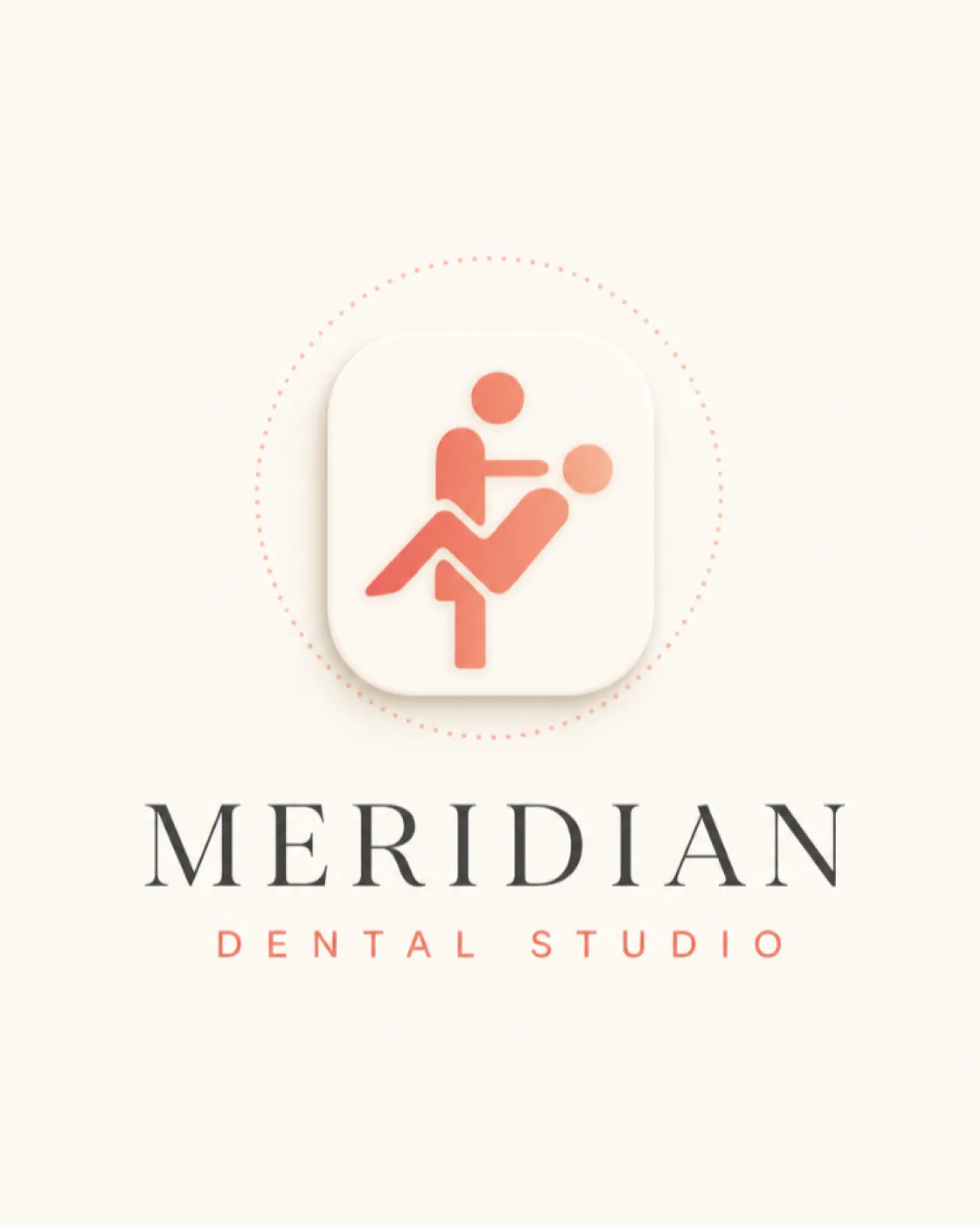
Mark strongly resembles sexual imagery due to the arrangement of geometric 'figures'; highly inappropriate for dental/medical field
Impact: High · Effort: Medium
Consistency in style will increase professionalism and industry fit.
Impact: High · Effort: Medium
![]() All text is clear and readable
All text is clear and readable
![]() Unusual abstract mark draws attention
Unusual abstract mark draws attention
![]() Mark's form can be misread inappropriately, lacking control over meaning
Mark's form can be misread inappropriately, lacking control over meaning
![]() Calming, dental-appropriate palette
Calming, dental-appropriate palette![]() Good contrast between mark and background
Good contrast between mark and background
![]() Palette does not resolve the mark’s inappropriate read
Palette does not resolve the mark’s inappropriate read
Champagne Pink
#FED7C3
Salmon
#FF7B6C
Your palette is close. Explore sharper color combinations with Colorfly.design before updating the logo.
Explore palettes![]() Wordmark is well centered under the mark
Wordmark is well centered under the mark![]() Proportions between mark and text are visually balanced
Proportions between mark and text are visually balanced
![]() Slight disconnect between geometric mark and elegant serif wordmark
Slight disconnect between geometric mark and elegant serif wordmark

![]() Simple forms scale well
Simple forms scale well![]() Contrast holds at different sizes
Contrast holds at different sizes
![]() Abstract mark's details may confuse at small scale
Abstract mark's details may confuse at small scale
200x250 px
100×125 px
50×62 px
![]() Mark strongly resembles sexual imagery due to the arrangement of geometric 'figures'; highly inappropriate for dental/medical field
Mark strongly resembles sexual imagery due to the arrangement of geometric 'figures'; highly inappropriate for dental/medical field
![]() Distinct color separation between mark and text
Distinct color separation between mark and text
![]() Symbol style and text style do not harmonize; severe meaning mismatch
Symbol style and text style do not harmonize; severe meaning mismatch
![]() Industry: The abstract symbol creates an unintended and highly inappropriate sexual interpretation that fundamentally conflicts with a professional dental studio context.
Industry: The abstract symbol creates an unintended and highly inappropriate sexual interpretation that fundamentally conflicts with a professional dental studio context.
Logo is unsuitable for dental/medical market.
Symbol’s sexual misreading makes it a high-risk outlier that signals unprofessionalism.
Fails to communicate clean, trustworthy dental care values.
Symbol undermines brand trust.
Stands out, but for negative reasons.
Differentiation is due to inappropriate, not positive, qualities.
Signals confusion or lack of professionalism.
Could damage reputation and patient trust.
Where the logo is ready to use, where it needs adjustment, and where it may break in real applications.
Current mark poses reputational risk.
Abstract mark is not appropriate for public display.
Visual problem persists in single color as well.
Small sizes amplify problematic misread.
Symbol will not be suitable for signage or clinic collateral.
A practical checklist of the logo versions to prepare before sending the final files to a client or team.
Needed for main brand assets, but must be redesigned.
Version present but currently inappropriate for use.
Ensures a fallback if symbol issues arise.
Essential for signage and print; only after mark is replaced.
Needed for web applications after redesign.
An abstract geometric mark is paired with an elegant, modern serif wordmark and a sans-serif subtitle. The mark appears within a rounded square with soft shadows.
'MERIDIAN' is set in a refined serif font, communicating professionalism, with 'DENTAL STUDIO' below in a calm sans-serif for contrast.
The logomark consists of geometric shapes arranged to resemble two human figures, but creates a strong unintended sexual interpretation.
Uses a gentle pinkish-orange (#FF7B6C-Salmon) for the mark and subtitle, and neutral off-white (#FED7C3-Champagne Pink) as background, aiming for a calming but fresh dental feel.
Modern, professional dental studios require visual marks that inspire trust and clarity—never confusion or discomfort.
Original aim may have been to create an abstract, human-centric dental symbol.
Elegant serif wordmark choice conveys quality and trust.
Get a clear logo score, key risks, and priority fix ideas before your client or audience sees it.