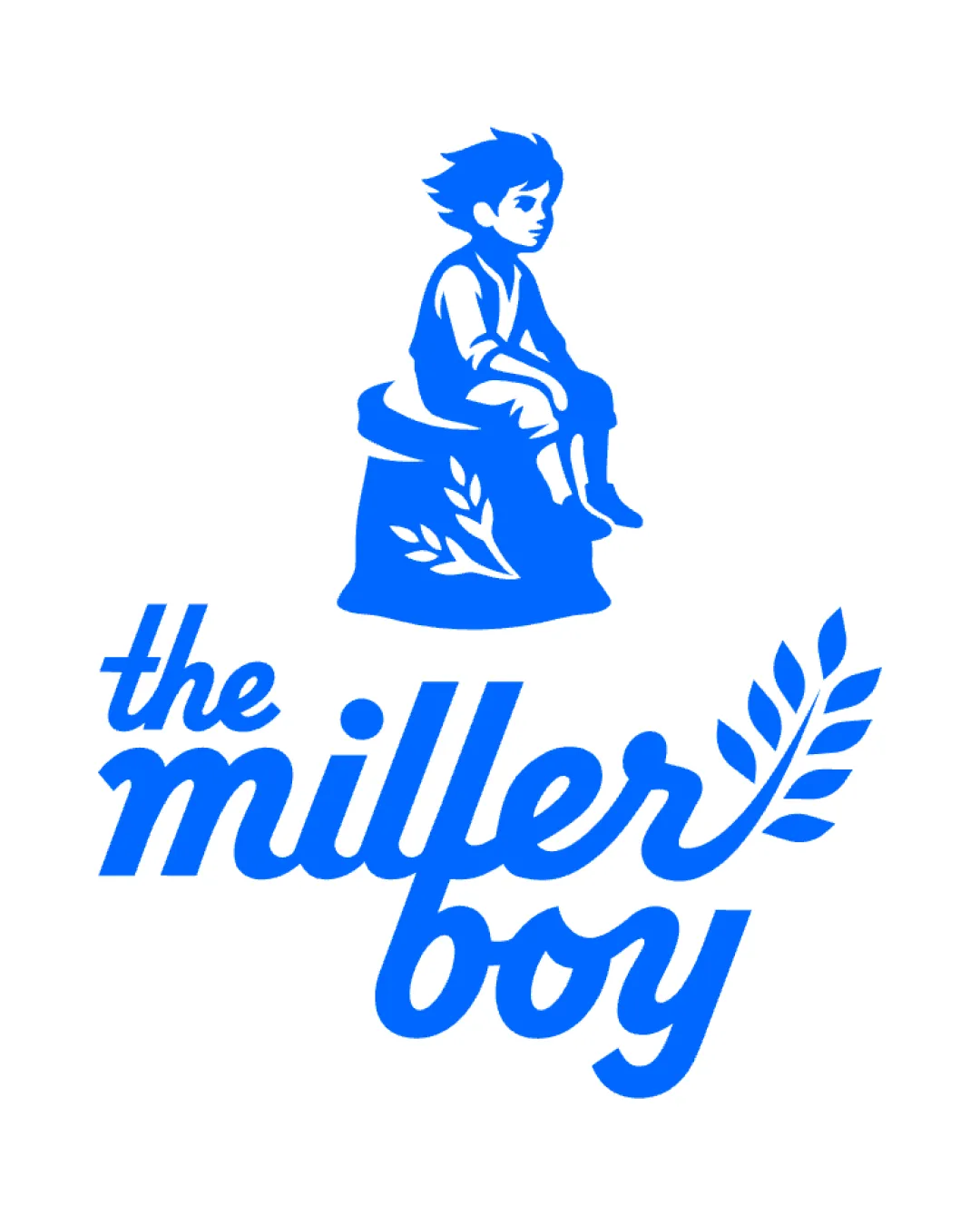
Outstanding mascotAwarded by mylogo.reviewAwarded on 13 October 2026This mascot beautifully captures the spirit of a family business, where everyone, from parents to kids, plays a part in its success. Such a meaningful concept. Well done!
the miller boy logo review
4.1/5
Logo score Combination mark category

the miller boy

graphstorm Advanced logo review

A charming, friendly logo that effectively expresses family bakery values, with minor scalability consideration for the mark.

This logo lockup shows strong execution, supported by visual balance and distinctive construction; improving clarity at smaller sizes is the clearest next step.

Combination Mark Illustrative, Script Bakery/food
4.4/5
Legibility
4/5
Originality
4/5
Balance
3.3/5
Scale
5/5
Style consistency
Your next steps

What to fix first

Focus on the changes that matter. Keep what makes the logo work.

1

Standalone mark (boy + sack/illustration)

Test reduced versions for legibility, especially the standalone mark.

High priority Worth testing Medium effort

Moderate illustration detail in the boy's face/hair and sack may partially merge or lose clarity at small sizes.

See the category review
Detailed review

Logo performance breakdown

5/5

Brief & logo match

The expressive illustration and script letterforms strongly reflect authenticity and friendliness, matching the family bakery context.

4.4/5

Legibility

Wordmark 4/5 · Layout 5/5

  • Script style is readable and friendly.
  • Character illustration does not obscure the brand name.
4/5

Originality

Symbol 4/5 · Wordmark 4/5

  • Distinctive illustration plus a customized wordmark for recognizable character.
4/5

Balance alignment

Symbol 4/5 · Wordmark 4/5 · Layout 4/5

  • Script and sprig elements create a cohesive flow.
  • Overall composition feels unified and inviting.
  • The sprig’s upward sweep from 'miller' visually supports the wordmark, but the slanted terminal of 'boy' may create minor visual imbalance toward the right at large sizes.

    Optional refinement wordmark

    Try: Optionally refine the baseline or the sprig attachment for improved horizontal balance.

Uploaded logoAlignment guide overlay

Inspect spacing with the guide. Optical balance may differ from geometric centering.

3.3/5

Scalability

Symbol 3/5 · Wordmark 3/5 · Layout 4/5

  • Simplified color aids print/screen use.
  • Possible detail loss in the illustration at very small sizes.
  • Moderate illustration detail in the boy's face/hair and sack may partially merge or lose clarity at small sizes.

    Worth testing Standalone mark (boy + sack/illustration)

    Try: Test reduced versions for legibility, especially the standalone mark.

5/5

Misinterpretations

  • No negative associations or ambiguity detected.
5/5

Style consistency

  • The symbol and wordmark are tightly integrated around bakery motifs and style.

Black & white

Does the shape still work without color?

Preparing artwork...

Background contrast

Find the surfaces where your logo stays clear.

Compare the mark and lettering on each surface.

Blur & silhouette

A 3px blur softens fine details so you can check whether the overall shape stays recognizable. If key gaps close or elements merge, the logo may rely too heavily on detail.

Original
3px blur

Look for clear separation between shapes and a distinctive outline.

4/5
Market fit

Category positioning

Expresses a welcoming, family-run bakery; minor risk of similar bakery themes but the bespoke character adds memorability.

1
Category Fit
Good fit

Classic motifs strongly fit the family bakery space, with an authentic and friendly vibe.

2
Differentiation Risk
Some overlap

Character illustration adds distinction, though wheat and script usage are common in bakery branding.

Brand impression

Logo personality

The impression your logo creates.

The logo feels friendly, genuine, and welcoming, with lively illustration and script conveying warmth and approachability.

AI interpretation of the visible design. These describe personality, not quality.

Presence

Leans bold

How strongly it attracts attention.

UnderstatedBold

The prominent character and flowing wordmark draw attention and anchor the design.

Attitude

Leans playful

How serious or lighthearted it feels.

SeriousPlayful

Illustration and curves give a playful, lighthearted tone without feeling childish.

Formality

Mixed

How relaxed or formal it appears.

CasualFormal

Script and illustration cue inviting warmth, but the composition avoids either extreme.

Style

Leans contemporary

Heritage cues versus a current look.

ClassicContemporary

The playful, clean illustration and type feel current while hinting at tradition.

Emotional tone

Leans warm

Its emotional feel, beyond colour temperature.

WarmCool

Soft script and cheerful illustration produce a warm, approachable atmosphere.

Positioning

Leans everyday

Everyday appeal versus luxury cues.

EverydayLuxury

Hand-drawn feel and relatable imagery fit everyday, locally focused businesses more than luxury cues.

From design file to real use

Use-case readiness

See your logo in context, then check what needs attention before production. Settings use the colors detected in your logo where available.

  • 6 look suitable
  • 3 need adjustment

Website header

Ready

Desktop

Mobile

Favicon

Adjust first
Before you use it

Test mark-only version or simplify illustration for small icons.

Google search

Adjust first
Before you use it

Test mark-only version or simplify illustration for small icons.

Social media avatar

Ready

Business card

Ready

Signs & signage

Ready

Packaging & labels

Ready

Embroidery

Adjust first
Before you use it

Simplify mark to avoid detail loss in stitching.

One-color printing

Ready
Preparing one-color previews…
Delivery checklist

Logo delivery checklist

Format templates · Included versions and delivery checklist
Uploaded logo
Reviewed upload

Primary logo lockup

Included

A mark and wordmark are both visible in the uploaded asset.

Uploaded logo
Reviewed upload

One-color logo version

Included

A monochrome version is visible. Test its detail and contrast at the intended size before production.

Standalone wordmark

High priority Recommended

Export the wordmark separately, without the symbol or tagline, for narrow placements and smaller sizes.

Standalone logomark or monogram

High priority Recommended

Export the existing symbol, mascot, or monogram on its own for avatars, favicons, and compact placements. Check its clarity at small sizes.

Wordmark with tagline

Low priority Optional

Only if the brand uses a tagline: prepare a wordmark with it for larger placements, alongside the tagline-free version.

Brand color palette

Medium priority Recommended

Define the intended brand colors separately without changing this monochrome review score.

Simplified small-size version

Medium priority Recommended

Use a responsive variant where fine details become fragile at small sizes.

Presentation kit

Logo presentation copy and mockup ideas

Logo presentation ideas

Hover over or select a slide to highlight its notes.

Slide 1

Positioning statement

A warm, authentic logo that tells the story of a family bakery through a memorable character and classic baking symbolism.

Slide 2

Primary lockup

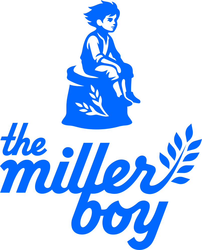
An illustrated boy seated on a flour sack sits above a script wordmark reading 'the miller boy,' with a stylized wheat sprig integrated into the text for warmth and authenticity.

Slide 3 · Application idea

Mockup idea 1

Shopfront signage with the illustrated mark above the entryway.

Slide 4

Wordmark

'the miller boy' is written in a custom, friendly script, featuring flowing curves and a wheat motif for a handcrafted, approachable feel.

Slide 5 · Application idea

Mockup idea 2

Bakery packaging such as bread bags or pastry boxes with the full logo.

Slide 6

Logomark

A silhouette-style illustration of a young boy sitting on a flour sack adorned with wheat, evoking tradition and friendliness.

Slide 7 · Application idea

Mockup idea 3

Social media profile images using the boy mark alone for recognizability.

Slide 8

Design rationale

The boy on the flour sack instantly signals a bakery's story and heritage.
Wheat sprig seamlessly integrates with the script, reinforcing the bakery connection and visual flow of the brand name, 'the miller boy.'

Try your own review

Wondering how your logo performs?

Get a clear logo score, key risks, and priority fix ideas before your client or audience sees it.

Review my logo