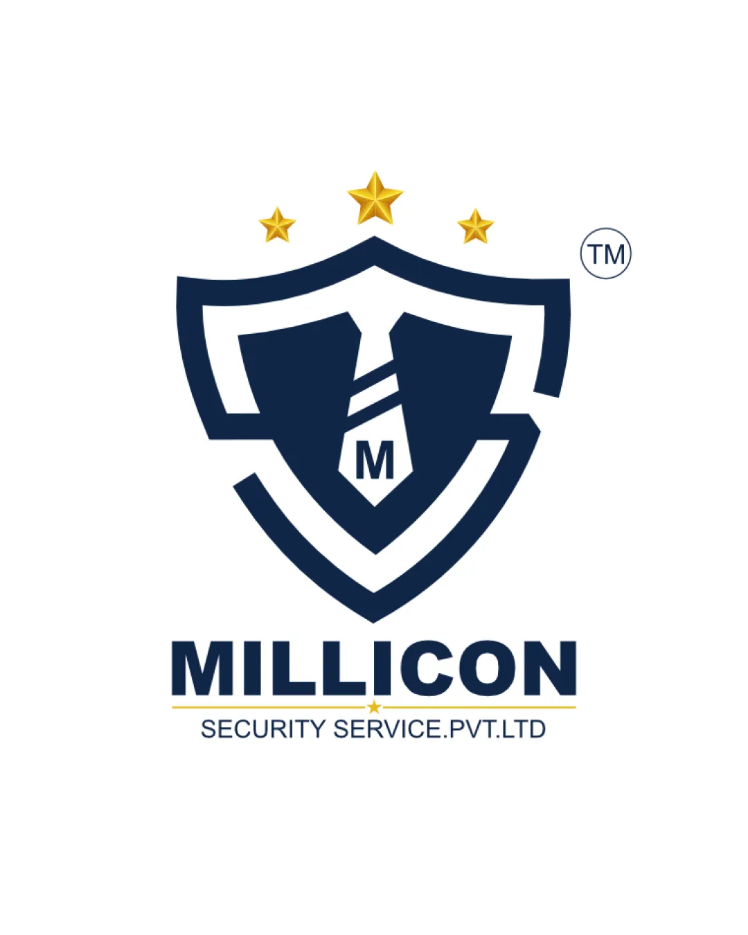
MILLICON SECURITY SERVICE.PVT.LTD M logo review
3.6 / 5
Logo score
Logo review of

Millicon Security Service.pvt.ltd M

Functional and clean, but lacks unique character needed to elevate it beyond standard security sector logos.

Combination Mark Corporate Shield Badge Security
5/5
Legibility
3/5
Originality
5/5
Misread
4/5
Balance
4/5
Scale
Action plan

What to fix first

The most important fixes to handle before polishing the full presentation.

1

Refine and simplify the star and tie details for even better scalability and distinctiveness.

Medium priority

The stars and interior tie could merge or blur at small sizes, and originality is currently average.

Impact: Improves Clarity At All Sizes And Helps The Logo Stand Out From Common Shield Designs. · Effort: Low

Detailed review

Logo performance breakdown

5/5

Legibility

Checkmark icon All text is clear and highly readable

3/5

Originality

Checkmark icon Shield-tie concept is appropriate

Warning icon Generic shield design is widely used in security logos

4/5

Color harmony

Checkmark icon Color palette fits security theme and has good contrast

Warning icon Mild clash between gold and blue could be further refined

Midnight Blue
#19243F

Goldenrod
#F6C036

White
#FFFFFF

Your palette is close. Refine the color roles and combinations before updating the logo.

Build brand colors
4/5

Balance alignment

Checkmark icon Good centering and proportion between mark and text

Warning icon Heavy top with stars could be visually lighter

logo 200x250 pixels scalability test alignment grid overlay
4/5

Scalability

Checkmark icon Simple forms, clear at smaller sizes

Warning icon Fine lines in stars and text may lose clarity at very small scale

logo 200x250 pixels scalability test

200x250 px

logo 100x125 pixels scalability test

100×125 px

logo 50x62 pixels scalability test

50×62 px

5/5

Misinterpretations

Checkmark icon No inappropriate or confusing visual misreads detected

Beta

No AI design signals found

Likely designed by a human

Logo structure and details show deliberate and typical human-crafted construction.

  • Consistent geometry in shield and tie
  • Clean, logical text placement

Visual assessment; not definitive proof of authorship.

5 / 5

Logo structure & brief match

Checkmark icon Mark and wordmark visually and thematically consistent

Checkmark icon Industry: Shield, stars, and authoritative font style align with security sector requirements.

Try your own review

Wondering how your logo performs?

Get a clear logo score, key risks, and priority fix ideas before your client or audience sees it.

Review my logo