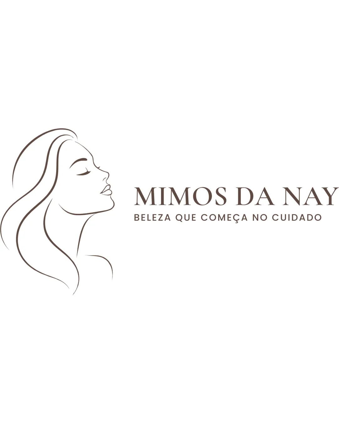
MIMOS DA NAY
BELEZA QUE COMEÇA NO CUIDADO logo review
4/5
Logo score
Logo review of

Mimos Da Nay Beleza Que Começa No Cuidado

This logo strongly fits a feminine beauty salon, with elegant execution and minor balance and scalability issues to test and refine.

Combination Mark Elegant, Minimalist, Feminine Beauty Salon
5/5
Legibility
3/5
Originality
5/5
Misread
4/5
Balance
3/5
Scale
Your next steps

What to fix first

Focus on the changes that matter. Keep what makes the logo work.

1

illustration (woman's profile)

Test legibility and presence of the illustration at reduced dimensions.

Worth testing High priority Medium effort
Area to inspectApproximate location

Thin outline strokes may lose clarity at very small sizes.

How to check

Print or render the logo at small sizes to ensure the profile remains distinguishable.

See the category review
2

overall composition (illustration and text lockup)

Explore slight resizing or repositioning of the elements for improved balance, especially for social or square formats.

Optional refinement Medium priority Low effort

The visual weight between the large profile illustration and the text could be better balanced for some applications; the left mark dominates when scaled down.

How to check

Compare lockups in different formats and assess visual harmony and centering.

See the category review
Detailed review

Logo performance breakdown

5/5

Brief & logo match

Based on your brief
Compared with

salão de beleza, feminina

Logo embodies femininity and beauty care as described in the context.

  • Feminine, Elegant Image

    Graceful woman's profile and classic serif type reinforce a feminine and refined beauty message.

  • Salão De Beleza (beauty Salon)

    Profile motif and clean styling instantly communicate personal care and beauty services.

5/5

Legibility

  • Wordmark and tagline are fully clear and readable.
  • Classical serif type is elegant and appropriate.
3/5

Originality

  • Feminine profile motif is tasteful.
  • Typography pairing is classic for beauty salons.
4/5

Color harmony

  • Soft brown is appropriate and harmonious.
Brown#6C5A51
White#FFFFFF

Estimated colors. Use the original design file for exact values.

Create a full color palette using these colors

Create new palette
4/5

Balance alignment

  • Elegant flow between illustration and text.
  • Good initial arrangement for brand messaging.
  • The visual weight between the large profile illustration and the text could be better balanced for some applications; the left mark dominates when scaled down.

    Optional refinement overall composition (illustration and text lockup)

    Try: Explore slight resizing or repositioning of the elements for improved balance, especially for social or square formats.

    Check: Compare lockups in different formats and assess visual harmony and centering.

Uploaded logoAlignment guide overlay

Inspect spacing with the guide. Optical balance may differ from geometric centering.

3/5

Scalability

  • Mark is simple and elegant at standard sizes.
  • Thin outline strokes may lose clarity at very small sizes.

    Worth testing illustration (woman's profile)

    Try: Test legibility and presence of the illustration at reduced dimensions.

    Check: Print or render the logo at small sizes to ensure the profile remains distinguishable.
    Area to inspectApproximate location
Uploaded logo at 200 pixels wide
200 × 250 px
Uploaded logo at 100 pixels wide
100 × 125 px
Uploaded logo at 50 pixels wide
50 × 63 px

Compare the detail at different sizes. Labels show the full image dimensions.

5/5

Misinterpretations

  • No negative or ambiguous secondary readings.
4/5

Symbol & text fit

  • Profile illustration matches brand's feminine, elegant theme.

Black & white

Does the shape still work without color?

These tests are available only for logos uploaded in vector (SVG) format.

Background contrast

Find the surfaces where your logo stays clear.

These tests are available only for logos uploaded in vector (SVG) format.

Blur & silhouette

A 3px blur softens fine details so you can check whether the overall shape stays recognizable. If key gaps close or elements merge, the logo may rely too heavily on detail.

These tests are available only for logos uploaded in vector (SVG) format.

Try your own review

Wondering how your logo performs?

Get a clear logo score, key risks, and priority fix ideas before your client or audience sees it.

Review my logo