Abstract geometric linework forming a symmetrical,.. logo review
4/5
Logo score
Logo review of

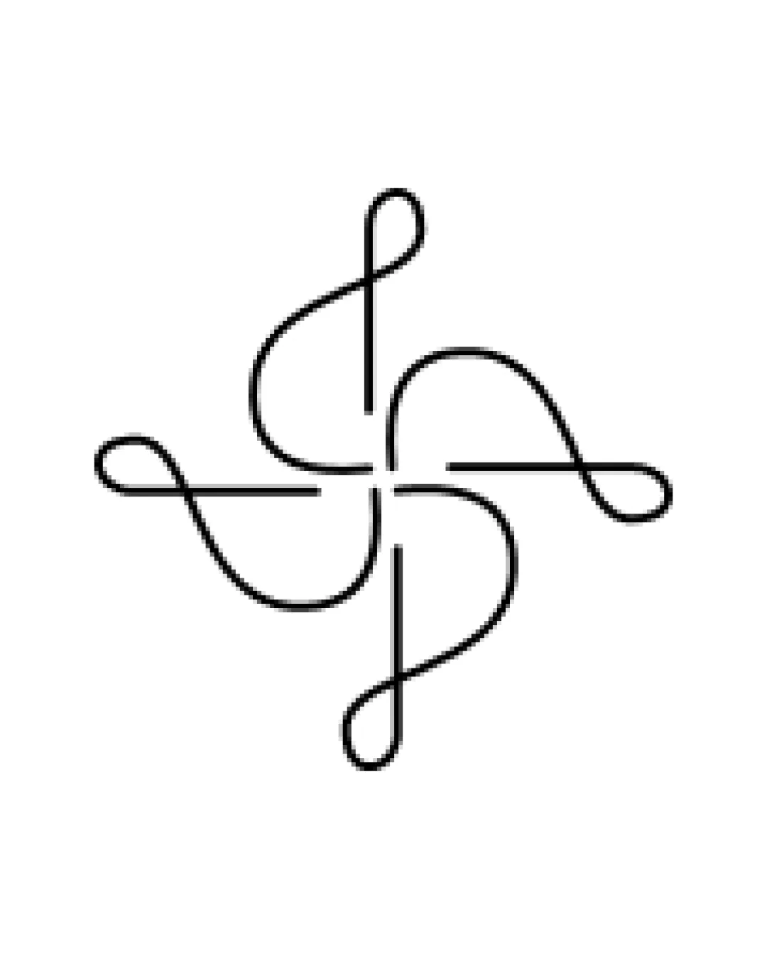
Abstract Geometric Linework Forming A Symmetrical,..

A refined, abstract mark that requires slight adjustments for practical usability.

Standalone Mark Minimal Line Art Interior Design
4/5
Originality
5/5
Misread
4/5
Balance
2.5/5
Scale
Your next steps

What to fix first

Focus on the changes that matter. Keep what makes the logo work.

1

Standalone mark

Test at small sizes and consider increasing line thickness.

Visible issue High priority Low effort
Area to inspectApproximate location

The very thin line weight may become hard to see or lose detail at small sizes or when printed poorly.

How to check

Confirm lines remain clearly visible and distinct at reduced sizes and various print methods.

See the category review
2

Standalone mark

Review and fine-tune each stroke for absolute symmetry and even spacing.

Optional refinement Medium priority Medium effort
Area to inspectApproximate location

The swirling arms are generally balanced, but extremely precise geometric alignment would enhance the sophisticated appearance.

How to check

Visually verify flawless alignment by overlaying mirrored versions or using grid guides.

See the category review
Detailed review

Logo performance breakdown

4/5

Brief & logo match

Based on your brief
Compared with

Interior Designer

Design and concept fit an interior design brand, with elegance and flexibility.

  • Aesthetic Appeal

    Thin, elegant lines align with contemporary interior design aesthetics.

  • Timelessness

    Abstract, symmetrical mark feels modern yet adaptable to changing styles.

4/5

Originality

  • Distinctive swirling form.
  • Abstract mark avoids clichés.
4/5

Balance alignment

  • Strong geometric balance.
  • Even negative space.
  • The swirling arms are generally balanced, but extremely precise geometric alignment would enhance the sophisticated appearance.

    Optional refinement Standalone mark

    Try: Review and fine-tune each stroke for absolute symmetry and even spacing.

    Check: Visually verify flawless alignment by overlaying mirrored versions or using grid guides.

    Area to inspectApproximate location
Uploaded logoAlignment guide overlay

Inspect spacing with the guide. Optical balance may differ from geometric centering.

2.5/5

Scalability

  • Minimal design helps versatility.
  • The very thin line weight may become hard to see or lose detail at small sizes or when printed poorly.

    Visible issue Standalone mark

    Try: Test at small sizes and consider increasing line thickness.

    Check: Confirm lines remain clearly visible and distinct at reduced sizes and various print methods.
    Area to inspectApproximate location
Uploaded logo at 200 pixels wide
200 × 250 px
Uploaded logo at 100 pixels wide
100 × 125 px
Uploaded logo at 50 pixels wide
50 × 63 px

Compare the detail at different sizes. Labels show the full image dimensions.

5/5

Misinterpretations

  • No unintended shapes detected.

Black & white

Does the shape still work without color?

These tests are available only for logos uploaded in vector (SVG) format.

Background contrast

Find the surfaces where your logo stays clear.

These tests are available only for logos uploaded in vector (SVG) format.

Blur & silhouette

A 3px blur softens fine details so you can check whether the overall shape stays recognizable. If key gaps close or elements merge, the logo may rely too heavily on detail.

These tests are available only for logos uploaded in vector (SVG) format.

Try your own review

Wondering how your logo performs?

Get a clear logo score, key risks, and priority fix ideas before your client or audience sees it.

Review my logo