What to preserve
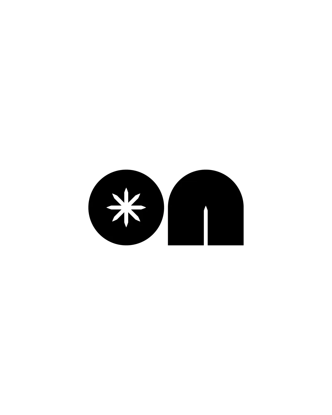
Clever use of abstract shapes to spell 'on' with the 'o' as a circle containing an asterisk and the 'n' created from solid geometric forms. The design focuses on negative space and simplicity for instant recognition.
Highly distinctive, modern logo—refinement will further boost clarity and universal appeal.
Focus on the changes that matter. Keep what makes the logo work.
Clever use of abstract shapes to spell 'on' with the 'o' as a circle containing an asterisk and the 'n' created from solid geometric forms. The design focuses on negative space and simplicity for instant recognition.
Ensures clarity for broad audiences without sacrificing originality.
Improves instant recognition and minimizes misreading.

Inspect spacing with the guide. Optical balance may differ from geometric centering.
Get a clear logo score, key risks, and priority fix ideas before your client or audience sees it.
More credits needed
Add credits to continue without losing your work.
Then $7/month. Cancel anytime.
Essential logo review with AI
Estimated progress