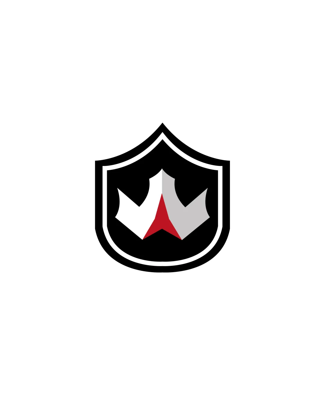
stylized crown in a shield logo review
4.0 / 5
Logo score

Logo review ofStylized Crown In A Shield

Suitable for client use with only minor areas for clarification or differentiation.

Emblem Minimalist Geometric Sports
3/5
Originality
4/5
Misread
5/5
Balance
4/5
Scale
Review next
Action plan

What to fix first

The most important fixes to handle before polishing the full presentation.

1

Fix possible misinterpretation

High priority

Central red element may be ambiguously interpreted but does not strongly suggest anything problematic.
Impact: High · Effort: Medium

2

Explore slight tweaks to the red shape if central interpretation risk is a concern, or add supporting detail to make the crown read more distinctly.

Medium priority

Enhances clarity and reduces ambiguous readings.

Impact: Moderate · Effort: Low

3

Consider palette differentiation if seeking a more distinct or unique brand presence within the industry.

Low priority

Improves distinctiveness in a crowded visual space.

Impact: Minor · Effort: Low

Detailed review

Logo performance breakdown

3/5

Originality

Checkmark icon Crown and shield combination is slightly stylized.

Warning icon General combination is common in sports and competitive branding, risking some generic feel.

4/5

Color harmony

Checkmark icon Classic tri-color palette is bold and readable.

Warning icon Palette is standard for competitive/sports imagery; could be more distinctive.

Black
#000000

White
#FFFFFF

Red
#C8102E

Light Gray
#A7A9AC

Your palette is close. Explore sharper color combinations with Colorfly.design before updating the logo.

Explore palettes
5/5

Balance alignment

Checkmark icon Symmetrical composition and centered mark create visual stability.

logo 200x250 pixels scalability test alignment grid overlay
4/5

Scalability

Checkmark icon Bold shapes and minimal detail work well at small sizes.

Warning icon Fine lines of the inner shield may become less prominent at extremely small sizes.

logo 200x250 pixels scalability test

200x250 px

logo 100x125 pixels scalability test

100×125 px

logo 50x62 pixels scalability test

50×62 px

4/5

Misinterpretations

Checkmark icon No inappropriate or offensive shapes detected.

Warning icon Central red element may be ambiguously interpreted but does not strongly suggest anything problematic.

Brief match

Checkmark icon Detected Industry: Suitably aggressive and strong for sports or competition branding; conveys strength and authority.

Try your own review

Wondering how your logo performs?

Get a clear logo score, key risks, and priority fix ideas before your client or audience sees it.

Review my logo