 View review
Logo score
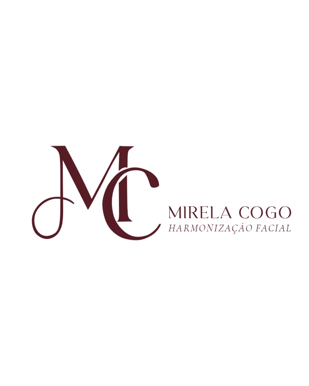
Logo review ofMirela Cogo Harmonização Facial
Suitable for a luxury or heritage-oriented personal brand, but requires adjustment for best versatility and usability.
Legibility
Originality
Misread
Balance
Scale
Action plan
What to fix first
The most important fixes to handle before polishing the full presentation.
1
Increase monogram stroke weight or simplify overlaps to improve clarity at small sizes.
High priorityCurrent thin flourishes and overlaps risk loss of detail when scaled down.
Impact: Logo Will Be More Flexible For Various Media And Easier To Reproduce Clearly. · Effort: Medium
2
Resolve minor tension where the 'C' overlaps the 'M', enhancing smoothness and optical harmony.
Medium priorityEnhances visual flow and balance, which is crucial for a luxury/heritage aesthetic.
Impact: Improves Overall Polish And Harmony Of The Monogram. · Effort: Medium
Detailed review
Logo performance breakdown
Legibility
![]() Main text is readable and clear
Main text is readable and clear
![]() Ornate monogram curves may be less legible at small sizes
Ornate monogram curves may be less legible at small sizes
Originality
![]() Monogram has a custom, elegant feel
Monogram has a custom, elegant feel
![]() Approach is somewhat common in personal brands and cosmetic logos
Approach is somewhat common in personal brands and cosmetic logos
Color harmony
![]() Limited palette communicates professionalism
Limited palette communicates professionalism
![]() Logo may lack vibrancy or warmth depending on context
Logo may lack vibrancy or warmth depending on context
Dark Red
#54181D
White
#FFFFFF
Your palette is close. Explore sharper color combinations with Colorfly.design before updating the logo.
Explore palettesBalance alignment
![]() Wordmark and monogram are generally balanced
Wordmark and monogram are generally balanced
![]() Slight visual tension where C overlaps with the M's flourish
Slight visual tension where C overlaps with the M's flourish

Scalability
![]() Simple two-color palette aids versatility
Simple two-color palette aids versatility
![]() Thin flourishes and overlaps in monogram could lose clarity when scaled down
Thin flourishes and overlaps in monogram could lose clarity when scaled down
200x250 px
100×125 px
50×62 px
Misinterpretations
![]() No inappropriate or confusing shapes detected
No inappropriate or confusing shapes detected
Logo structure & brief match
![]() Font families and color palette are well-matched
Font families and color palette are well-matched
![]() Level of detail in the monogram slightly contrasts with simpler wordmark
Level of detail in the monogram slightly contrasts with simpler wordmark
![]() Authenticity And Heritage: Serif typography and bespoke monogram convey sophistication and a classic sense, supporting the brief's desire for heritage.
Authenticity And Heritage: Serif typography and bespoke monogram convey sophistication and a classic sense, supporting the brief's desire for heritage.
Try your own review
Review my logo
Wondering how your logo performs?
Get a clear logo score, key risks, and priority fix ideas before your client or audience sees it.
Keep exploring


