Wondering how your logo performs? 🧐
Get professional logo reviews in seconds and catch design issues in time.
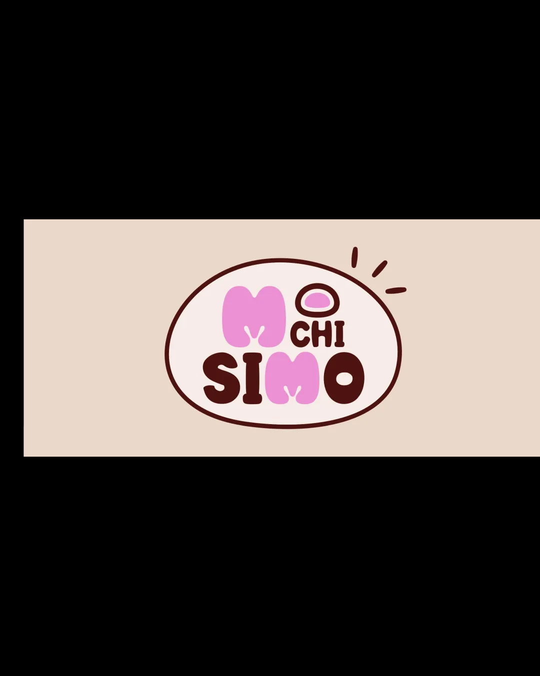
Try it Now!Logo review of MOCHISIMO
 Logo analysis by AI
Logo type:
Style:
Detected symbol:
Detected text:
Business industry:
Review requested by Mik314
**If AI can recognize or misinterpret it, so can people.
Structured logo review
Legibility
![]() Main text is generally readable.
Main text is generally readable.![]() Contrast between dark brown and pink shades aids recognition.
Contrast between dark brown and pink shades aids recognition.
![]() Soft, playful letters cause 'M' and 'O' in pink to be slightly less clear on smaller sizes.
Soft, playful letters cause 'M' and 'O' in pink to be slightly less clear on smaller sizes.![]() Spacing is tight between elements, risking confusion at smaller scales.
Spacing is tight between elements, risking confusion at smaller scales.
Scalability versatility
![]() Simple shape without intricate details aids recognition at moderate sizes.
Simple shape without intricate details aids recognition at moderate sizes.![]() Bold, chunky letterforms stand out well for most use cases.
Bold, chunky letterforms stand out well for most use cases.
![]() Thin accent marks and small word 'CHI' may disappear or blur at very small sizes, such as on favicons or embroidery.
Thin accent marks and small word 'CHI' may disappear or blur at very small sizes, such as on favicons or embroidery.![]() The varied letter sizing and overlapping lines could be difficult to reproduce in monochrome or single-color print applications.
The varied letter sizing and overlapping lines could be difficult to reproduce in monochrome or single-color print applications.
200x250 px
100×125 px
50×62 px
Balance alignment
![]() Centered overall composition appears visually contained.
Centered overall composition appears visually contained.![]() The oval and accent marks help group text.
The oval and accent marks help group text.
![]() Uneven weight distribution due to the pink 'M' and 'M' in different size and bolder than other letters.
Uneven weight distribution due to the pink 'M' and 'M' in different size and bolder than other letters.![]() Top-right accent marks feel disconnected and are not mirrored elsewhere in the design.
Top-right accent marks feel disconnected and are not mirrored elsewhere in the design.

Originality
![]() Playful custom letterforms, especially with the mochi-shaped 'M', are distinctive.
Playful custom letterforms, especially with the mochi-shaped 'M', are distinctive.![]() Fun integration of hand-drawn elements.
Fun integration of hand-drawn elements.
![]() Hand-drawn, playful food logo style is increasingly common in dessert branding.
Hand-drawn, playful food logo style is increasingly common in dessert branding.![]() No breakthrough dual-meaning or unexpected twist in the illustration.
No breakthrough dual-meaning or unexpected twist in the illustration.
Logomark wordmark fit
![]() Logosymbol and wordmark feel coherent through color and style.
Logosymbol and wordmark feel coherent through color and style.![]() Hand-drawn feeling is carried across all elements.
Hand-drawn feeling is carried across all elements.
![]() Relative sizing between 'CHI', 'MO' and large letters creates slight imbalance.
Relative sizing between 'CHI', 'MO' and large letters creates slight imbalance.
Aesthetic look
![]() Warm, inviting colors and playful forms are visually appealing.
Warm, inviting colors and playful forms are visually appealing.![]() Hand-drawn style feels genuine.
Hand-drawn style feels genuine.
![]() Slight busy-ness from overlapping letters, accent marks, and multiple font styles.
Slight busy-ness from overlapping letters, accent marks, and multiple font styles.
Dual meaning and misinterpretations
![]() No inappropriate dual meanings or visual confusion on first glance.
No inappropriate dual meanings or visual confusion on first glance.
Color harmony
![]() Color palette is harmonized—warm tones and pink convey sweetness and fun.
Color palette is harmonized—warm tones and pink convey sweetness and fun.![]() Good contrast between letters and background.
Good contrast between letters and background.
Beige
#F6DDD0
Pink
#E7A4CA
Dark Brown
#50251A


