What to preserve
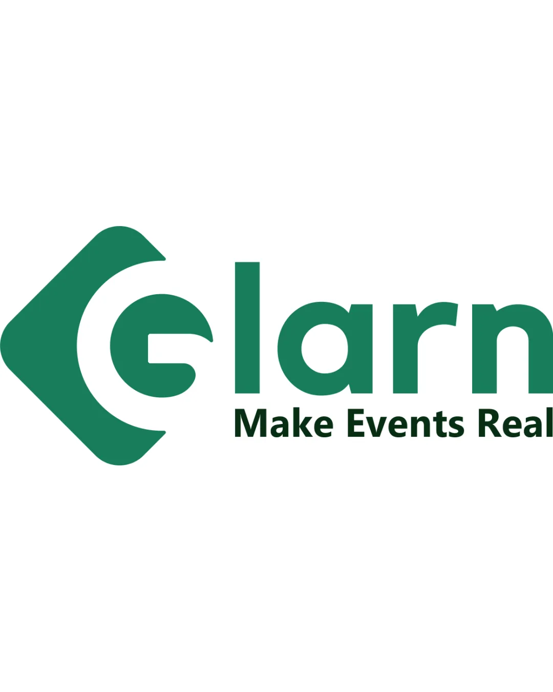
An abstract monogram 'G' incorporates an upward arrow and a dot, suggesting growth, direction, or achievement in a modern, memorable form.

A visually striking and well-balanced monogram that communicates motion and achievement, with very minor risks regarding instant letter recognition.
This monogram shows strong execution, supported by distinctive construction and clarity at smaller sizes.
Focus on the changes that matter. Keep what makes the logo work.
An abstract monogram 'G' incorporates an upward arrow and a dot, suggesting growth, direction, or achievement in a modern, memorable form.
Logo preview unavailable. The written feedback is still available on this card.
upper right terminal and dot
The dot detached from the stroke could be interpreted as a separate mark or confuse the 'G' reading for unfamiliar viewers.
See the category reviewThere isn't enough brand context to assess the match.
The dot detached from the stroke could be interpreted as a separate mark or confuse the 'G' reading for unfamiliar viewers.
Try: Test at various sizes to ensure the 'G' and arrow are easily recognized.
Logo preview unavailable. The written feedback is still available on this card.
The combination of a 'G' letterform with an integrated arrow and dot is visually distinctive, though arrows as symbols for growth/movement are relatively common.
Estimated colors. Use the original design file for exact values.
Create a full color palette using these colors
Create new palette
Inspect spacing with the guide. Optical balance may differ from geometric centering.
Get a clear logo score, key risks, and priority fix ideas before your client or audience sees it.
More credits needed
Add credits to continue without losing your work.
Then $7/month. Cancel anytime.
Essential logo review
Usually takes under a minute