View review
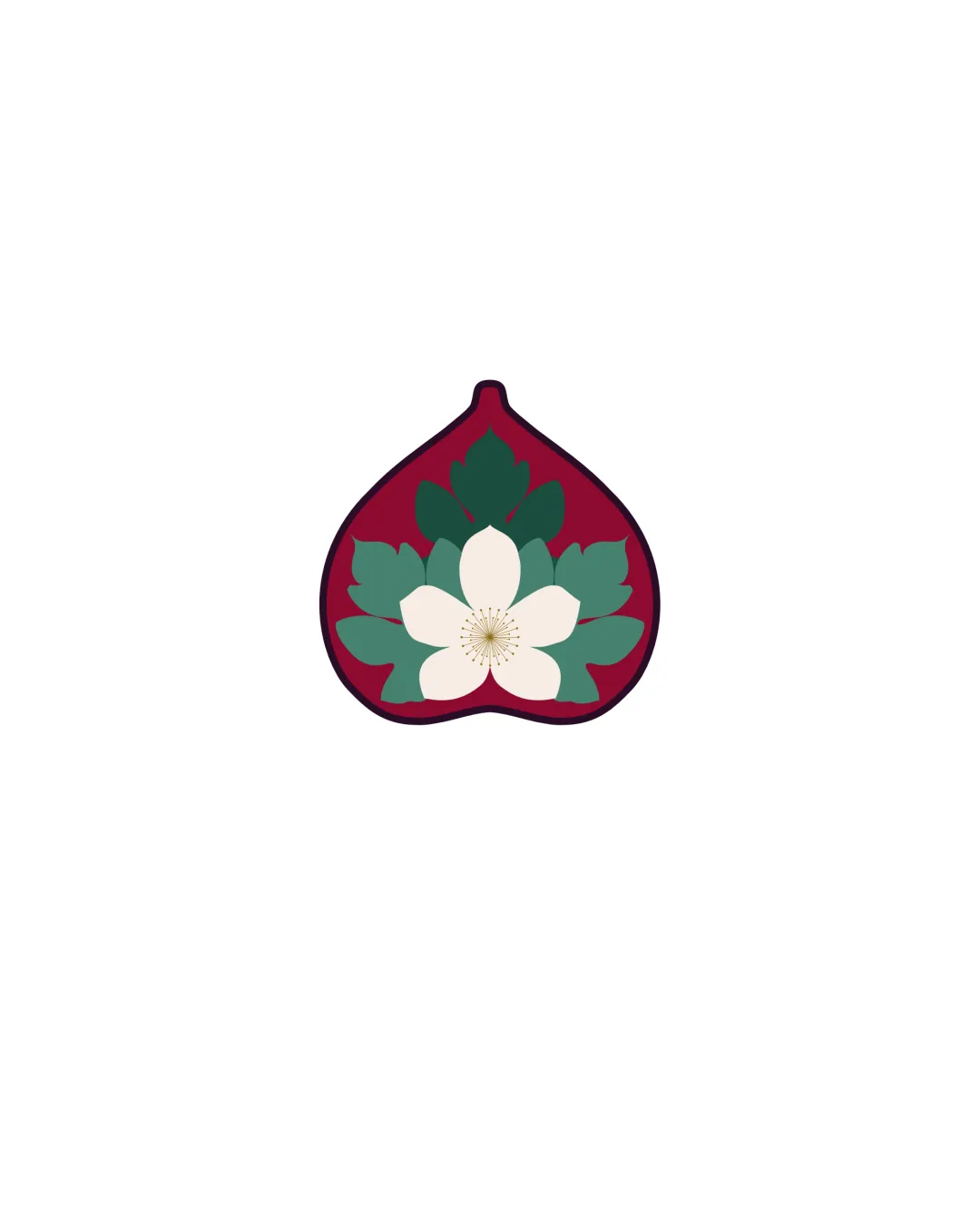
Stylized Fig Shape With Central White Flower And L..
Distinctive and attractive symbol with strong relevance to the brand story and target market. Only modest refinement required for optimal versatility.
Objective AI feedback. Your creative decision.
What to fix first
The most important fixes to handle before polishing the full presentation.
Develop an ultra-minimal alternate version for tiny use (favicon/social icon) that simplifies flower detail.
High priorityThe detailed flower center may blur or disappear at very small sizes.
Impact: Improves Clarity And Recognizability At Small Sizes For Digital Applications. · Effort: Medium
Logo performance breakdown
Originality
Distinct shape for the fig
Clever fusion of flower and fruit motif
Flower-within-fruit is a recognizable trope, but well-executed here
Color harmony
Rich color palette with good contrast
Colors evoke femininity and natural themes
Palette is not highly unique in fashion sector
Dark Burgundy
#8B1731
Dark Green
#3C7462
Off White
#F7F3EB
Your palette is close. Refine the color roles and combinations before updating the logo.
Build brand colorsBalance alignment
Symmetrical composition
Good weight distribution
Slight crowding at the tip may affect outline clarity
Scalability
Recognizable silhouette at most sizes
Simple color blocking aids clarity
Fine flower stamen detail may be lost at very small sizes
200x250 px
100×125 px
50×62 px
Misinterpretations
No plausible negative interpretations
Brief match
Fig And Flower Symbolism: Logo visually combines fig shape with floral motifs, matching the brand's core concept.
Hourglass/body Metaphor: Rounded lower part of the fig references fullness and curves, subtly supporting the hourglass idea.
Target Audience (women): Organic, soft forms and flowers are appealing and appropriate for a women's fashion label.
Wondering how your logo performs?
Get a clear logo score, key risks, and priority fix ideas before your client or audience sees it.