Wondering how your logo performs? 🧐
Get professional logo reviews in seconds and catch design issues in time.
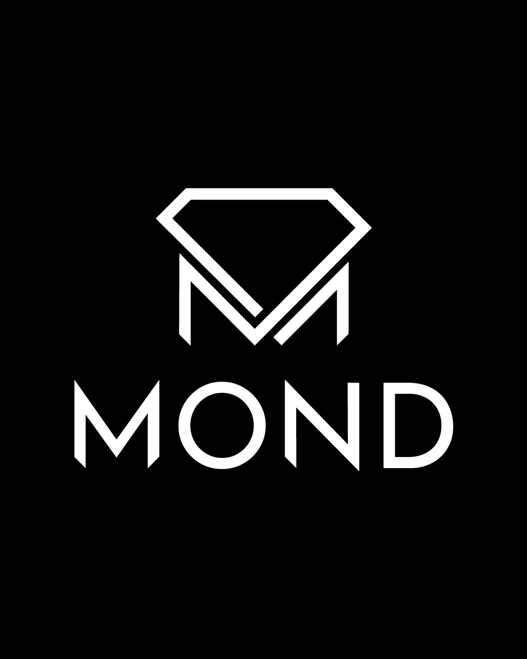
Try it Now!Logo review of MOND
 Logo analysis by AI
Recognized style:
Logo type:
Detected symbol:
Detected text:
Business industry:
Review requested by Graphstorm
**If AI can recognize or misinterpret it, so can people.
Structured logo review
Legibility
![]() The lettering is clear and easy to read, with a modern typeface.
The lettering is clear and easy to read, with a modern typeface.
Scalability versatility
![]() The bold lines ensure the logo is versatile across different sizes.
The bold lines ensure the logo is versatile across different sizes.
200x250 px
100×125 px
50×62 px
Balance alignment
![]() The symbol and text are aligned, creating a balanced look.
The symbol and text are aligned, creating a balanced look.
![]() The diamond shape may feel slightly heavy above the wordmark.
The diamond shape may feel slightly heavy above the wordmark.

Originality
![]() The integration of the M into a diamond shape is unique.
The integration of the M into a diamond shape is unique.
![]() Diamond shapes are common in luxury branding.
Diamond shapes are common in luxury branding.
Logomark wordmark fit
![]() The symbol and text complement each other, creating a cohesive unit.
The symbol and text complement each other, creating a cohesive unit.
Aesthetic look
![]() The logo looks sleek and professional, providing an upscale vibe.
The logo looks sleek and professional, providing an upscale vibe.
Cultural sensitivity dual meaning
![]() No cultural sensitivity issues detected.
No cultural sensitivity issues detected.
Color harmony
![]() The black and white color scheme is classic and sophisticated.
The black and white color scheme is classic and sophisticated.


