Increase contrast of 'CAFÉ' diacritic or adjust tracking for clarity at small sizes.
Ensures clarity and brand consistency in all applications.
improves minimum size legibility, especially on signage and merch
Highly original and appropriate for a coffee shop; suitable for client presentation after small technical refinements.
Focus on the changes that matter. Keep what makes the logo work.
Ensures clarity and brand consistency in all applications.
improves minimum size legibility, especially on signage and merch
Prevents detail loss and ensures recognizability across all use cases.
boosts icon scalability for favicons, social, and small prints
Allows for adaptation to various brand touchpoints without compromising design integrity.
expands usefulness across signage and digital layouts
The relaxed sitting figure and sun radiate a calm, laid-back atmosphere.
Sun, plants, and coffee convey a positive, uplifting mood.
Geometric illustrative style reads as creative and art-inspired.
Estimated colors. Use the original design file for exact values.
Create a full color palette using these colors
Create new palette
Inspect spacing with the guide. Optical balance may differ from geometric centering.
Compare the detail at different sizes. Labels show the full image dimensions.
Does the shape still work without color?
Find the surfaces where your logo stays clear.
A 3px blur softens fine details so you can check whether the overall shape stays recognizable. If key gaps close or elements merge, the logo may rely too heavily on detail.
Distinctive within coffee shop segment
The logo stands out for its expressive, illustrative quality but fits expected coffee shop aesthetics through its palette and iconography.
Strongly fits coffee shop scene—warm brown, coffee beans, relaxed theme.
Blend of illustration and coffee references aligns well.
Highly differentiated—unique geometric mark and custom letters.
Visual storytelling and artsy style set it apart.
Conveys welcoming and creative brand, ideal for local café culture.
No signals suggesting wrong industry.
How the logo may work in practice, and what to check before production.
Full mark and wordmark lockup is suitable.
Use simplified symbol for clarity at small size.
Abstract mark may need further simplification for legibility.
Design scales well for print with good contrast.
Simple palette and shape enable effective one-color reproduction.
A practical checklist of the logo versions to prepare before sending the final files to a client or team.
Core logo lockup shown and necessary for branding.
Boosts flexibility for website/mobile layouts.
Needed for avatars, app icons, and stamps.
Ensures logo works on all background types.
Essential for digital touchpoints.
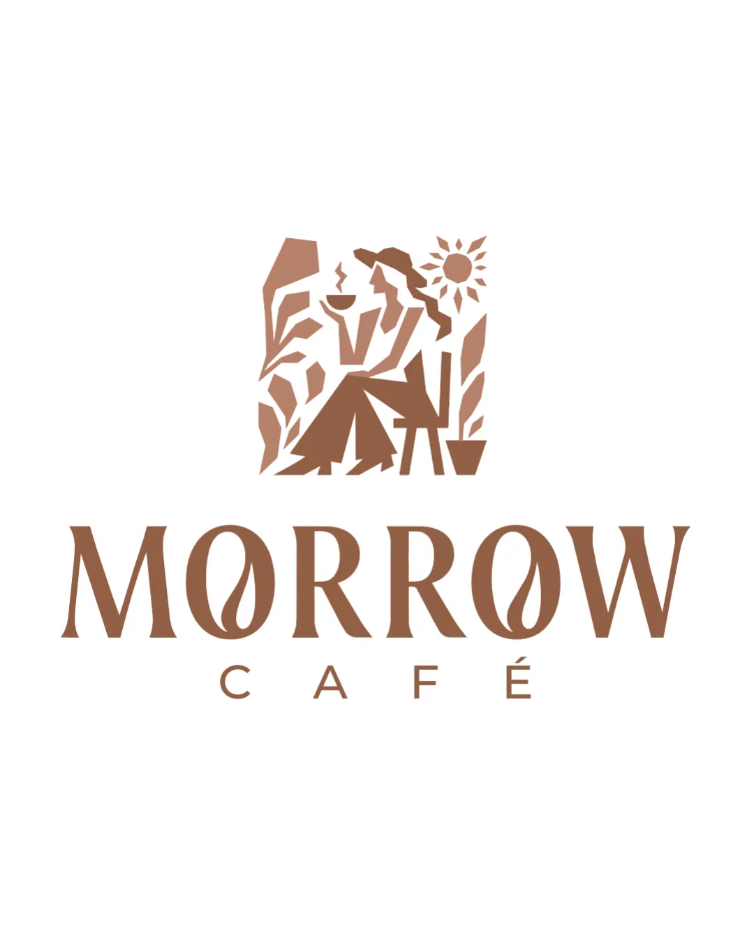
The logo features a geometric illustration of a relaxed woman with coffee, plants, and a radiant sun above the sophisticated wordmark 'MORROW CAFÉ'.
The wordmark uses serif capitals with custom 'O's, each incorporating a stylized coffee bean, and 'CAFÉ' is spaced below for clarity.
The abstract mark visually narrates a tranquil café experience, evoking art, daylight, and nature in harmonious balance.
A single warm coffee-brown shade reinforces the café's comforting, artisanal vibe and ensures visual consistency.
An inviting, artsy brand mark evoking relaxation and upbeat, creative days at your café.
The abstract illustration communicates a relaxed and welcoming vibe, matching your vision for a chill, happy café.
Coffee bean details in the wordmark signal quality and uniqueness without sacrificing legibility.
Get a clear logo score, key risks, and priority fix ideas before your client or audience sees it.
More credits needed
Add credits to continue without losing your work.
Then $7/month. Cancel anytime.