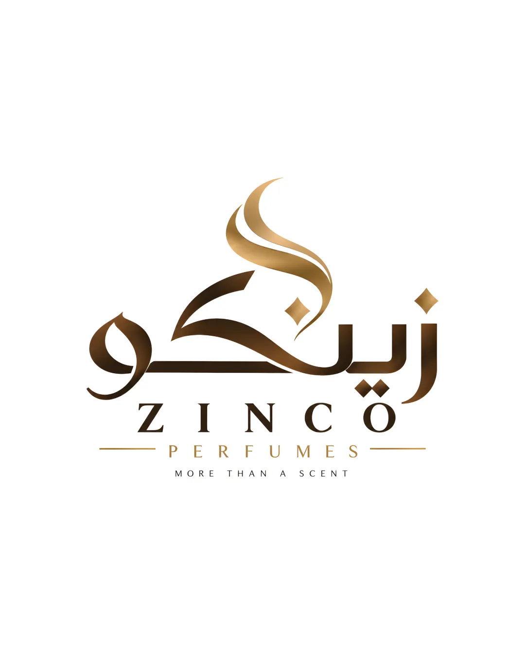
ZINCO PERFUMES MORE THAN A SCENT logo review
4/5
Logo score
Logo review of

Zinco Perfumes More Than A Scent

A refined, high-end perfume logo with strong luxury and multicultural appeal, needing only minor balance and scalability adjustments.

Combination Mark Luxury, Modern, Bilingual Perfume/cosmetics
4/5
Legibility
3/5
Originality
5/5
Misread
4/5
Balance
3/5
Scale
Your next steps

What to fix first

Focus on the changes that matter. Keep what makes the logo work.

1

swirling abstract mark above Arabic letters (main mark, horizontal band 1)

Test the logo mark at small sizes to ensure lines remain clear.

Worth testing High priority Medium effort
Area to inspectApproximate location

Thin curves in the swirl may lose clarity or appear indistinct at very small sizes.

How to check

Print or view the mark at small digital and print sizes to confirm stroke visibility.

See the category review
2

'PERFUMES' subline and dividing lines (horizontal band 2)

Increase the weight or adjust the spacing of 'PERFUMES' and lines for better visual hierarchy.

Optional refinement Medium priority Low effort
Area to inspectApproximate location

The thin gold lines and 'PERFUMES' spacing may feel visually light compared to the bold marks above, reducing subline impact and cohesion.

How to check

Assess if the subline remains prominent and balanced with the main logo when viewed quickly.

See the category review
Detailed review

Logo performance breakdown

4/5

Brief & logo match

Based on an inferred industry
Compared with

Perfume/cosmetics branding with multicultural and upscale cues.

The logo clearly expresses the luxury perfume sector, with a meaningful fusion of cultures and elegant execution.

  • Multicultural Representation

    Arabic and English are balanced, signaling inclusivity and international reach.

  • Luxury Positioning

    Elegant lines, gradient, and serif type create a high-end perception suitable for perfumes.

4/5

Legibility

  • Both English and Arabic text are highly readable.
  • The tagline is clear at standard sizes.
3/5

Originality

  • Stylish, refined execution of multicultural cues.
  • Combining Arabic calligraphy and Roman serif is common in high-end perfume branding, limiting distinctiveness.

    Optional refinement overall logo concept

    Try: Consider a unique typographic treatment or subtle detail in the Roman type to further individualize the wordmark.

    Check: Compare the logo with other luxury perfume brands for originality of the Roman wordmark element.

4/5

Color harmony

  • Rich bronze-to-gold gradient gives a premium impression.
  • Palette is harmonious with the sector.
Bronze#B88538
Black#000000
White#FFFFFF

Estimated colors. Use the original design file for exact values.

Create a full color palette using these colors

Create new palette
4/5

Balance alignment

  • Clean alignment between elements.
  • Central composition is visually stable.
  • The thin gold lines and 'PERFUMES' spacing may feel visually light compared to the bold marks above, reducing subline impact and cohesion.

    Optional refinement 'PERFUMES' subline and dividing lines (horizontal band 2)

    Try: Increase the weight or adjust the spacing of 'PERFUMES' and lines for better visual hierarchy.

    Check: Assess if the subline remains prominent and balanced with the main logo when viewed quickly.

    Area to inspectApproximate location
Uploaded logoAlignment guide overlay

Inspect spacing with the guide. Optical balance may differ from geometric centering.

3/5

Scalability

  • Mark and type are generally compact.
  • Contrast is strong on white.
  • Thin curves in the swirl may lose clarity or appear indistinct at very small sizes.

    Worth testing swirling abstract mark above Arabic letters (main mark, horizontal band 1)

    Try: Test the logo mark at small sizes to ensure lines remain clear.

    Check: Print or view the mark at small digital and print sizes to confirm stroke visibility.
    Area to inspectApproximate location
Uploaded logo at 200 pixels wide
200 × 250 px
Uploaded logo at 100 pixels wide
100 × 125 px
Uploaded logo at 50 pixels wide
50 × 63 px

Compare the detail at different sizes. Labels show the full image dimensions.

5/5

Misinterpretations

  • No unintended interpretations; abstract swirl evokes fragrance.
5/5

Symbol & text fit

  • Swirl mark aesthetically supports the brand theme and pairs well with both scripts.

Black & white

Does the shape still work without color?

These tests are available only for logos uploaded in vector (SVG) format.

Background contrast

Find the surfaces where your logo stays clear.

These tests are available only for logos uploaded in vector (SVG) format.

Blur & silhouette

A 3px blur softens fine details so you can check whether the overall shape stays recognizable. If key gaps close or elements merge, the logo may rely too heavily on detail.

These tests are available only for logos uploaded in vector (SVG) format.

Try your own review

Wondering how your logo performs?

Get a clear logo score, key risks, and priority fix ideas before your client or audience sees it.

Review my logo