View review
Logo review ofMovopay
Review the detailed scores below to see what is working and what should be refined first.
Logo performance breakdown
Legibility
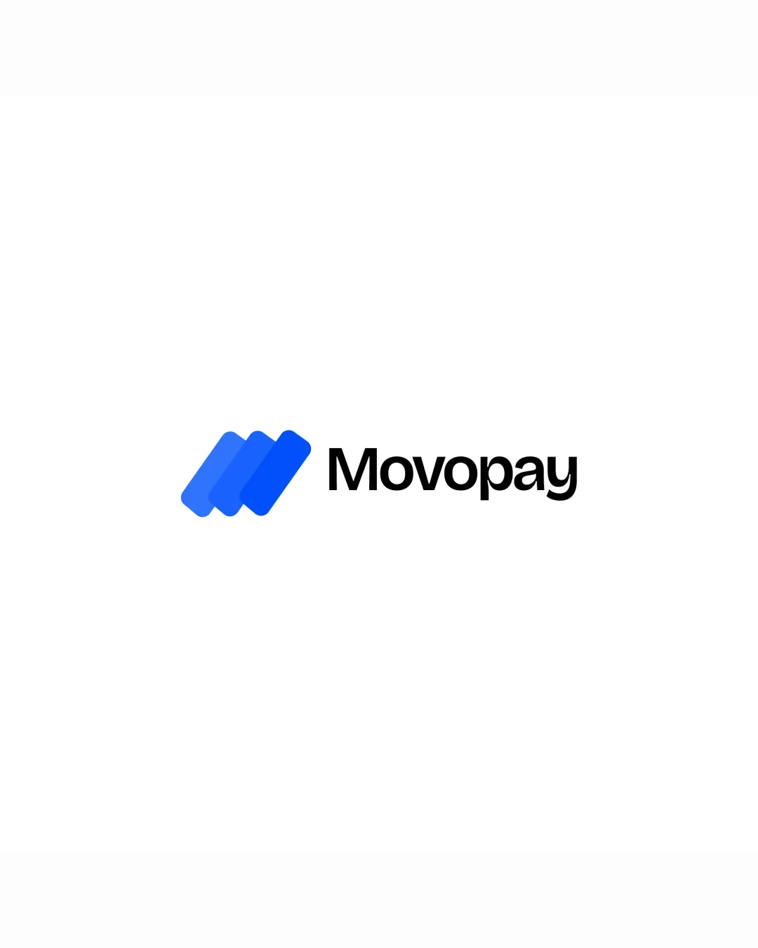
The wordmark 'Movopay' is set in a clean, sans-serif font making it highly readable.
Letter spacing and weight are well-adjusted, ensuring no confusion between characters.
Originality
The overlapping parallelogram concept reflects abstract movement suitable for fintech or payment solutions.
Minimal symbol avoids overused finance icons like coins or credit cards.
The geometric approach is somewhat generic and reminiscent of existing tech/fintech marks, with little unique identity beyond color and stacking.
Color harmony
Strong use of analogous blue tones creates harmony and signifies trust.
Excellent contrast between blue icon and black text for readability.
Blue
#1767EB
Blue
#0076FF
Black
#020202
White
#FFFFFF
Balance alignment
Excellent visual balance between the bold symbol and the wordmark.
Good alignment and proximity, establishing a cohesive and professional composition.
Scalability
The geometric symbol and simple wordmark will scale well for most applications.
Works efficiently on digital platforms such as websites or mobile apps, and retains clarity in print layouts and on business cards.
Very thin negative space between parallelograms may merge at small sizes, reducing clarity, especially for embroidery or as a favicon.
200x250 px
100×125 px
50×62 px
Misinterpretations
No inappropriate or confusing alternate meanings detected.
Abstract shape is safe and universally acceptable.
Symbol & text fit
Color style and weight of the symbol harmonize well with the clean, modern wordmark.
Both elements share a geometric, minimal aesthetic.
Wondering how your logo performs?
Get a clear logo score, key risks, and priority fix ideas before your client or audience sees it.




