View review
Mrida
Review the detailed scores below to see what is working and what should be refined first.
Objective AI feedback. Your creative decision.
Logo performance breakdown
Legibility
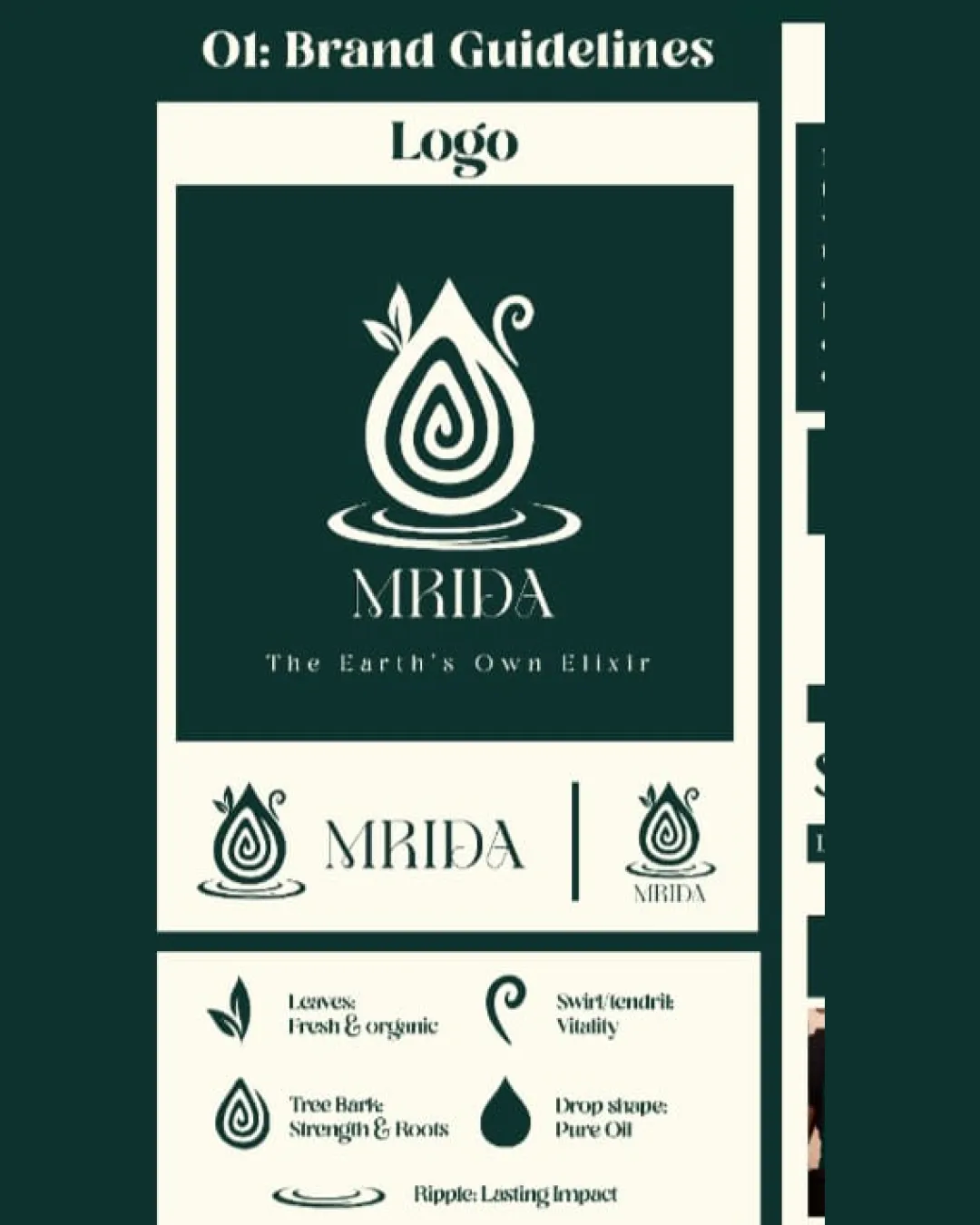
Main wordmark 'MRIDA' is attractive, modern, and spaced adequately for easy reading.
Supplemental tagline uses clear, high-contrast serif text.
The decorative illustrated 'R' in 'MRIDA' reduces instant legibility, especially at smaller scales.

Originality
Clever incorporation of organic motifs (leaf, drop, swirl) to create a thematic symbol.
Subtle integration of multiple concepts results in a recognizable brand mark.
Teardrop/oil drop marks are common in the wellness, oil, and natural product industries, so the general shape lacks strong distinctiveness.
Color harmony
Restrained two-color palette ensures high contrast and visual clarity.
Fits wellness/natural product standard expectations.
Deep Jungle Green
#10332C
Beige
#EEEBD0
Balance alignment
Elements within the logomark are thoughtfully aligned.
Logomark and wordmark are visually balanced, with consistent symmetry.
Scalability
The primary logomark is bold and simple, ensuring basic adaptability.
Logo can work for packaging, headers, or business cards due to its relatively simple form.
Fine decorative details (e.g., swirl, leaves) may not render well at very small sizes like favicons or apparel embroidery.
Tagline becomes illegible below medium size.
200x250 px
100×125 px
50×62 px
Misinterpretations
Symbolism is clear and avoids any awkward misinterpretations.
Symbol & text fit
Logomark style matches the modern, organic vibe of the wordmark.
Both components share a refined, natural look.
Wondering how your logo performs?
Get a clear logo score, key risks, and priority fix ideas before your client or audience sees it.