Concept & direction
A clear, literal depiction of a tire/wheel paired with a clean, readable name presents an immediate connection to tire services.
Spelling & grammar
No obvious issue foundAll text is readable and correctly spelled.
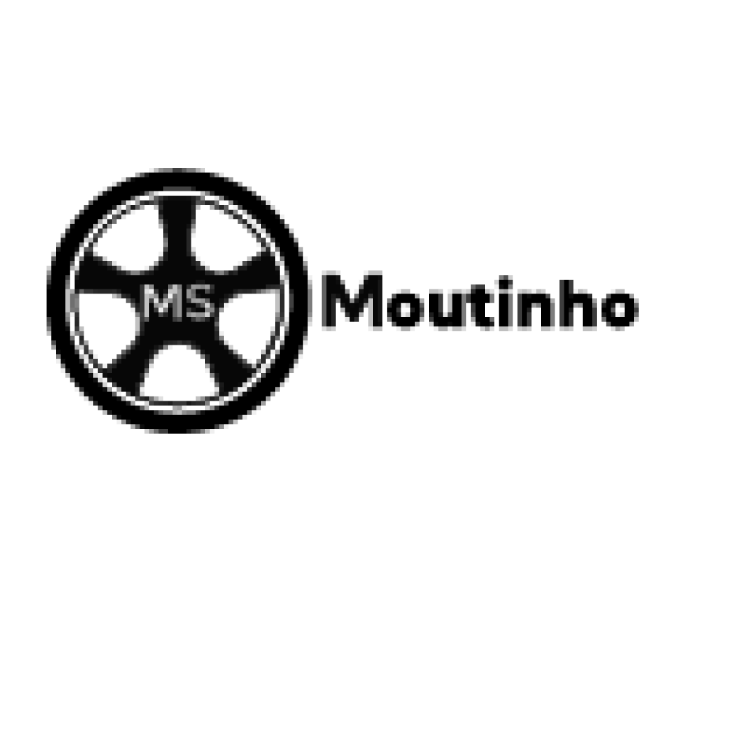
A serviceable, clear logo needing a more ownable, unique tire mark and fine-tuning for scaling and personality.
Focus on the changes that matter. Keep what makes the logo work.
A clear, literal depiction of a tire/wheel paired with a clean, readable name presents an immediate connection to tire services.
All text is readable and correctly spelled.
Logo preview unavailable. The written feedback is still available on this card.
Standalone mark
The wheel and tire depiction is quite generic, using common forms without unique detail or personality.
Compare against competitors to assess distinctiveness.
Logo preview unavailable. The written feedback is still available on this card.
Standalone mark
The thin lines and fine detail inside the wheel could be difficult to reproduce at small sizes or on rough surfaces.
See the category reviewThe logo clearly indicates a tire business and uses the family name, but the icon is visually generic and misses personal warmth.
The wheel and tire depiction is quite generic, using common forms without unique detail or personality.
Try: Explore a more distinctive treatment of the tire or wheel to create stronger brand recognition.
Check: Compare against competitors to assess distinctiveness.
Logo preview unavailable. The written feedback is still available on this card.
The thin lines and fine detail inside the wheel could be difficult to reproduce at small sizes or on rough surfaces.
Try: Test the icon at small sizes and consider simplifying linework.
Logo preview unavailable. The written feedback is still available on this card.
The icon and wordmark are balanced horizontally, but the visual weight to the left may slightly outweigh the text.
Try: Adjust spacing or sizing for better equilibrium between mark and wordmark.

Inspect spacing with the guide. Optical balance may differ from geometric centering.
Get a clear logo score, key risks, and priority fix ideas before your client or audience sees it.
More credits needed
Add credits to continue without losing your work.
Then $7/month. Cancel anytime.
Essential logo review
Usually takes under a minute